Home 3D Art Showcase & Critiques

Abandoned mental institution - UDK

Hey guys, I was using another thread to show this scene but it started to get a little too big. I'll be using this first post to hold my latest images, and leaving the old ones in my photobucket account if you're interested.

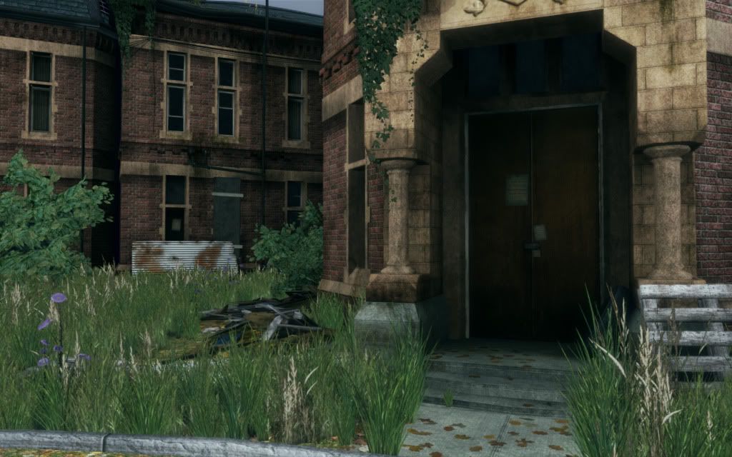
I've recently started a new job so I've had less time to work on this than I'd have liked. I've been chipping away whenever I have time. I'd love to get some more crits!

ScreenShot00012-1.jpg
ScreenShot00011-1.jpg
ScreenShot00010-2.jpg
ScreenShot00009-2.jpg
ScreenShot00008-1.jpg
ScreenShot00007-1.jpg
ScreenShot00006-3.jpg
ScreenShot00005-3.jpg
ScreenShot00004-3.jpg
ScreenShot00003-2.jpg
ScreenShot00002-2.jpg
ScreenShot00001-3.jpg
ScreenShot00000-1.jpg

Still to come:
- Some sort of foreground element(s). I'm thinking an old hospital bed or maybe a wheelchair (most likely in place of the car tire leading on the front door)
- roots hanging from the small trees growing in the gutters
- More ivy hanging on and around the door arch
- Material tweaks (?)

Replies

  • Limewax
    Options
    Offline / Send Message
    Limewax polycounter lvl 6
    Assuming that you're trying to go for a more realistic approach (or as realistic as possible) the saturation of the greens seems to be off... especially in that ivy. Also, the lighting isn't particularly dramatic and believable, which will basically make a good scene look like not-so-believable really quick.

    +Strengthen your light source and give us a clear idea where its coming from

    +Desaturate a lot of your textures, mainly that ivy.
  • biofrost
    Options
    Offline / Send Message
    biofrost polycounter lvl 12
    I agree with Limewax, the lighting seems to be lacking, I get you want ot go with a gloomy mood but it almost makes it hard to see the great work you have done on the building
  • SirCalalot
    Options
    Offline / Send Message
    SirCalalot polycounter lvl 10
    The modelling and texture work looks really great, b1skit - but as others have mentioned, the lighting is really not showing off your work enough.

    Perhaps the main light source would do well to have its colour adjusted to better represent the sky - such as a blue-grey - and it's intensity increased.
    You can still get a good night-time look by increasing the Light Intensity, but darkening the light and environment colour.

    Have you built the lighting using Lightmass yet?
    If you have, try upping the Normal Influence to about 0.7 and the Indirect Lighting Bounces to about 6 and building it again.

    I hope that helps, this piece is really looking good :)
  • b1skit
    Options
    Offline / Send Message
    Hey guys, thanks for the feedback. After a lot of reading, I realized I'd set my light rig up incorrectly. I was using a skylight in an attempt to control the indirect lighting and give the effect of a cloudy day... And it wasn't working very well. I've since realized I could adjust the dominant directional light I was using (*facepalm*), and I'm liking the results much more:

    ScreenShot00019.jpg

    ScreenShot00018.jpg

    ScreenShot00017.jpg

    ScreenShot00016.jpg

    ScreenShot00015-1.jpg

    ScreenShot00014-1.jpg
  • aaronaton
    Options
    Offline / Send Message
    aaronaton polycounter lvl 6
    This looks very much like the mental hospital in Mapperley, Nottingham. Especially the windows, although the building now has been turned into flats. People living in an old mental home!
  • b1skit
    Options
    Offline / Send Message
    Right on, good to hear!!! My scene is heavily based of reference from Cherry Knowle Mental hospital, which is actually in the UK as well (probably not far away).

    Love to hear some crits from people (stuff you like, stuff you don't?), I'm going to be starting my polish pass soon (after maybe adding 1 or 2 more assets).
  • SirCalalot
    Options
    Offline / Send Message
    SirCalalot polycounter lvl 10
    That's looking much better :)

    There doesn't appear to be much definition to your shadows though - is the lightmap resolution on the floor in particular set high enough?
    Failing that, you could turn on Cascaded Shadow Maps in the DominantDirectionalLight properties to get some nice dynamic shadows =)
    Settings of:

    Whole Scene Dynamic Shadow Radius - 1024
    Num Whole Scene Dynamic Shadow Cascades - 10 (Max)
    Cascade Distribution Exponent - 1


    Should yield some nice results.
    Edit: Of course, that might not be the overcast look you are trying to achieve.

    Keep up the good work!
  • teaandcigarettes
    Options
    Offline / Send Message
    teaandcigarettes polycounter lvl 12
    Lighting is definitevly better, but there's something about it that makes your scene look like a cheap 3ds max render. It would be great if you could show your lighting setup in more detail; that will make it easier to give you decent tips.


    Personally, I would probably skip the overcast look altogether. I find it extremely difficult to nail in UDK. If you're using low-res lightmass, then all those subtle differences in shading will be lost. Also, I have a feeling that your diffuse textures are very dark and that makes it difficult to see the lighting properly. Generally, I make my textures very light, almost milky as recommended here The results will be very washed out at first, but you can tweak the contrast via postprocessing to get the results you want. Also, your sky is very dark and doesn't fit the current lighting setup.

    I'm guessing that you're trying to make it look creepy and I feel that's entierly possible even with strong lights and bright sky.

    Have a look at this photo:

    12613600912jNATXV.jpg

    The contrast between light and dark values is very strong and yet it has that cold, desolate feel.


    I would probably spend more time tweaking the color of your textures. Currently they're very warm and saturated.


    when it comes to modelling if thinks it's good. The only things that bother me, are the trees and grass. Trees feel very thick. I would make the branches thinner and frail and more twisted. I would also scale some clumps of grass to make them look more chaotic. You might also want to reduce the brightness of those dry tips.


    This scene has a lot of potential, you just need to present it a little better :)


    edit:

    Another idea I just had. You could try bending the roof inwards just a little bit. It should make the silhouette a little bit more interesting. Also, you might want to displace some of the tiles as seen here
    http://wiki.polycount.com/ModularMountAndBlade?action=AttachFile&do=view&target=Modular_MountBladeMod_02.jpg
  • Flat Face
    Options
    Offline / Send Message
    Flat Face polycounter lvl 10
    Looks fantastic but as the guy above me said, it's just missing something.. all I can think of is shadowing and colour correction but, I've never used UDK so I'm not sure :/
  • locater16
    Options
    Offline / Send Message
    locater16 polycounter lvl 8
    I'd say the cold, grey lighting from your first examples is a bit better, but could still use some work.
    E.G.
    2304yg.jpg
    Upped the contrast, sucked out much of the red, green and blue saturation (from the perspective of Photoshop's Hue/Saturation tool).
  • b1skit
    Options
    Offline / Send Message
    Hey guys, time for another update. I've been working overtime 6 days a week, so I only get an hour or 2 every other day to make changes... yikes. Biggest changes are to lighting, also I've started a damage pass on my geo (it's not done yet, I'm still planning to bevel a bunch of edges and add a little variation to the remaining straight edges). The changes are minor but the work is pretty substantial... But the results look better. Hit me with your crits!!

    ScreenShot00003-3.jpg

    ScreenShot00004-4.jpg

    ScreenShot00002-3.jpg

    ScreenShot00007-2.jpg

    ScreenShot00009-3.jpg

    ScreenShot00008-2.jpg

    ScreenShot00006-4.jpg

    ScreenShot00005-4.jpg

    ScreenShot00001-4.jpg

    ScreenShot00000-3.jpg
  • b1skit
    Options
    Offline / Send Message
    Wow, for some reason I didn't notice the awesome replies after my last post. Thanks for the feedback guys! Those are some great ideas, I kind of went in an opposite direction with my latest shots though... Might have to do some more tweaking! :)
  • CandyStripes05
    Options
    Offline / Send Message
    CandyStripes05 polycounter lvl 9
    i suggest doing something more to the scene to make it pop... especially from the far away shots it feels boring and lacks props and such
    what may make a big difference is the grass, instead of having it all overgrown and thick - try the patchy look, example would be this screenshot you took:
    b1skit wrote: »
    ScreenShot00008-2.jpg
    i find it much more visually appealing then the others simply because there is more going on
    but all the thick grass you put in everywhere else hides this
  • Lee3dee
    Options
    Offline / Send Message
    Lee3dee polycounter lvl 18
    I think decals would greatly enhance this scene, they are pretty easy to setup in UDK and that way you could add a little more grime to the environment without touching the textures. At the moment, it looks too un-weathered to be abandoned imo.

    http://www.hourences.com/tutorials-ue3-decals/
    http://udkc.info/index.php?title=Tutorials:Decals
  • b1skit
    Options
    Offline / Send Message
    There is already a bunch of grunge decals all over the building - but I could definitely place more (around the towers, I'm thinking). Check the grunge and grime behind the pipes, bleeding out of some of the window ledges and also around the door archway.
  • SirCalalot
    Options
    Offline / Send Message
    SirCalalot polycounter lvl 10
    Looking good :)

    I can't wait to see your next update.

    Other than just reiterating what others have said, my only crit' would be that the grass is looking a bit too lush and green for the type of area its in. Perhaps adding another, more dry looking material to a lot of the meshes would help?
  • Thermidor
    Options
    Offline / Send Message
    Thermidor polycounter lvl 18
    I used to live down the road from a old Victorian workhouse that had been an asylum too.

    Looks pretty nice, but all the downstairs windows should be boarded up if you are going for any sort of realism.
  • SirCalalot
    Options
    Offline / Send Message
    SirCalalot polycounter lvl 10
    Thermidor wrote: »
    I used to live down the road from a old Victorian workhouse that had been an asylum too.
    0_o

    That's pretty grim.
  • Thermidor
    Options
    Offline / Send Message
    Thermidor polycounter lvl 18
    It was an amazing place.
    Funnily enough it was called Hill house (which i believe has been used as a name for such places in multiple movies)

    The model is a great start, more detail and some lighting tweaks will really make it shine!
  • konstruct
    Options
    Offline / Send Message
    konstruct polycounter lvl 18
    looking good!
    for the subject matter it just seems too saturated. the greens, reds, tans, are all SO warm.
    The scene would probably benefit from a global cooling of those colors.
  • b1skit
    Options
    Offline / Send Message
    More updates! Mainly lighting changes, plus I've also half completed a 'randomizing' pass, to remove any perfectly straight edges and faces. The change is subtle but it works. I also removed the previous images from the thread, it takes too long to scroll past them.

    Anyways, I'd love to hear your thoughts.

    ScreenShot00019.jpg

    ScreenShot00018.jpg

    ScreenShot00016.jpg

    ScreenShot00015.jpg

    ScreenShot00013.jpg

    ScreenShot00008.jpg

    ScreenShot00010.jpg

    ScreenShot00009.jpg

    ScreenShot00011.jpg

    ScreenShot00006.jpg

    ScreenShot00007.jpg
  • b1skit
  • l.croxton
    Options
    Offline / Send Message
    It looks good but a bit too simplistic. You have around 6 colours being (grey, light green, dark green, red yellow/bage and dark grey/blue). It reminds me of a tutorial level in one of my 3DS max books which also uses a mental hospital.

    Maybe try and balance out some of the colours by adding in maybe a rusted out car or like you said some beds or something. The sky looks rather cloudy and there appears to be some mist yet the yellowly brick work seems to still pop out almost if it were shiny. Good example is the bottom picture just above the right column it looks like its gold brickwork :P.

    I would maybe also think about adding some trees to it so you are almost hiding the building as it looks sort of out of place.

    Sorry if my crit is useless. I am new to this artist type of thing and its something I am super passionate about, although my words fail me at times haha.

    So basically in short. It looks good but it just lacks something to give it a reason. If that makes any more sense? :P. If not Ill come back afterwards (after I have had food) to try and explain more and show the tutorial example I mentioned to see if that helps :).
  • b1skit
    Options
    Offline / Send Message
    Okie dokie, some more tweaks... Mainly lighting. I'm finally starting to feel like this is getting closer.

    ScreenShot00021.jpg

    ScreenShot00019-1.jpg

    ScreenShot00018-1.jpg

    ScreenShot00017.jpg

    ScreenShot00016-1.jpg

    ScreenShot00015-1.jpg

    ScreenShot00013-1.jpg

    ScreenShot00011-1.jpg

    ScreenShot00003.jpg

    ScreenShot00000.jpg

    Thoughts?
  • b1skit
    Options
    Offline / Send Message
    I gotta stop posting early in the morning... I get dropped to the bottom before anyone can reply!

    ...Bump!
Sign In or Register to comment.