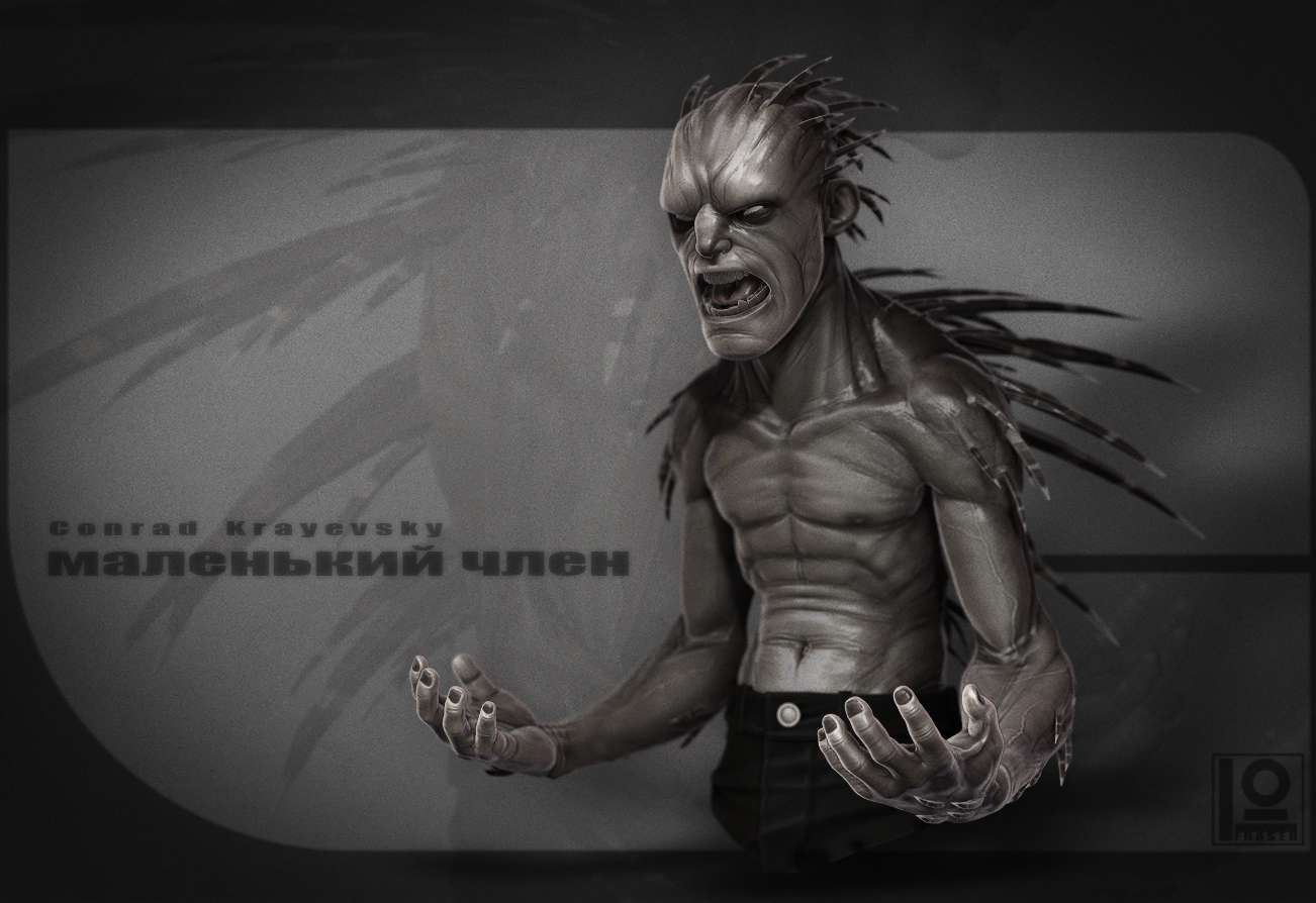
THE INCREDIBLE HULK... I guess.
I am just coming out of a bad creative low, so I have decided to get stuck into a alternate version of The Incredible Hulk (just a bust). Wish me luck :poly134:
Latest Update:
Finally calling him done, There is more I would change on him but I am just too sick of looking at him so I decided to call it quites. I made him Russian, no reason why just plucked it from the air.
(I hope the Russian means what I wanted it to mean)

Latest Update:
Finally calling him done, There is more I would change on him but I am just too sick of looking at him so I decided to call it quites. I made him Russian, no reason why just plucked it from the air.
(I hope the Russian means what I wanted it to mean)

Replies
Abs start blatantly too low
Thanks everyone
@ frell : Thanks, yeah it was just a quick idea that needed some fixing :poly108:. Thanks for the feedback
@ BeserK : hahahah awesome name. Wish I had of thought of it.
@ Tadao215 : hahaha yeah I almost wanted to get as far away from the origional as possible. Just a little twist.
@ MeintevdS : hahahahaha BIG thanks:). I hear you. Zombies are wicked cool, but not quite what I am after this time (could be a good idea though) :poly103:. I hope I can turn it around.
Got some shits done on this fella over the weekend. Still all wippy and stuff but I am starting to find his vibe.
Thanks again everyone.
At the moment the head feel a bit big compared to the body, but I'm not sure if you're going for "realistic" proportions or not. Also for a hulk he might be a bit skinny, but you're going for an alternate / your own version, so it's fun to see a new kind of hulk
@ MeintevdS : Cool, yeah I may scale down his head a bit, good point, but I am in no way trying to go for "realistic" style wise, just a bit more believable.
@ LRoy : Nah. Z-spheres all the way.
@ Sirdelita : hehe thanks.
Bit more work on this guy.
Btw! Where are his nipples?!
Got sick of the Hulk and figured this guys proportions were better suited to Wolverine. so I swapped em.
I also played around with the Z-Sphere rig to pose him before I continue with the sculpt.
It could turn into a fun project where you use that same body base and turn it into a whole variety of Marvel superheroes.
I have to say the proportions do fit wolverine a bit better, and at least wolverine has nipples. But I agree with BrontoThunder, just do them all
@ JFletcher: Thanks man.:)
@ TorQue[MoD]: No worries man. The way he is going at the moment I am sure he will become the hulk again. :poly142:
@ BrontoThunder: hahaha thanks. now there is an idea.
@ MeintevdS: I actually thought of joining the two a while back but decided not to no idea why might come back to it though :poly132:
@ Tadao215: hahaha If I keep going like this a series will probably not be too far away :poly134:
SO I have flipped again. Wolverine has become whatever the hell this guy is. Some kind of mutated Echidna I think... I am liking the shapes and possibilities of this guy so I will probably stick with him for a bit.
If he changes too much more I will need to start a new thread. Oh well, I will tumble a little further down the rabbit hole.
Thanks again everyone.
Keep it up, looking forward to seeing your next flip around
Awesome as usual Duncan, not much to crit atm. Do you have block-ins for his legs? It might help to get a better feeling for the whole guy, and may even help you stick with a design.
It will be interesting to see where it ends up
@ MeintevdS: hahaha beat you to it
@ ScudzAlmighty: Thanks man. Yeah he is just a bust of sorts. I would never get him done if he was a whole character :poly105:
@ kevlar jens: Thanks
@ afisher: hahaha BIG thanks man. I am looking forward to seeing where he ends up too
Bit more work. Added more spikes. Just trying to figure out the skin treatment. Plenty of work still to go but I am being a gentleman with this one and taking it slow.
The poly paint adds a lot to the character, black around the nose might be a bit much at the moment for my liking. For some reason I imagined the the spines on the arms to go the other way, towards the elbow. But I have to say I do like the way you've done them now, it's really replacing his hairs this way.
I wouldn't mind seeing a tiny bit more color on him though. At the moment the darks seem to be a really desaturated brown, maybe make those a bit more saturated?
Keep it up, really like where this is going.
You may want to rework the way the bicep inserts into the forearm area. It looks slightly off to me. Also, the bellybutton is really wide. That seems a little distracting.
Thanks guys.
@ MeintevdS: pssssssssshhhhhhhhh post times mean nothing when I am lazy and don't have any internets at home.
@ jmt: Good call. I think the arm is rightish, but his bicep just needs to be lifted a wee bit. It is not looking tense enough. I will get stuck into that belly button too. Thanks
As I said not to much longer left on this guy before I loose all interest.
Thanks again everyone
@ gibson543: I was thinking about it, but I don't think I could be bothered. Lazy I know.
@ roosterMAP: Thanks
@ pinkbox and Jessica Dinh: Thanks for the crits
Finally calling him done, There is more I would change on him but I am just too sick of looking at him so I decided to call it quites. I made him Russian, no reason why just plucked it from the air.
(I hope the Russian means what I wanted it to mean)
Thanks again for all the comments and crits everyone.
No but serious, that's looking awesome, like how he turned out.
What exactly does it say in Russian?
his name is Conrad Krayevsky but since he is covered in spikes I thought an apt nick name might be "little prick" as I said I hope that comes through in the translation, one guy on DA cracked it a bit... i think.