3 handpainted shields
Hey ya'll PC'ers. I've been making some sheilds you may have seen in the WAYWO thread. So for the sake of practice, I laid out 3 sheilds on a single texture sheet and got to work - here is the results:
(original concept by the talented Artyom Vlaskin: http://cghub.com/images/view/90613/)
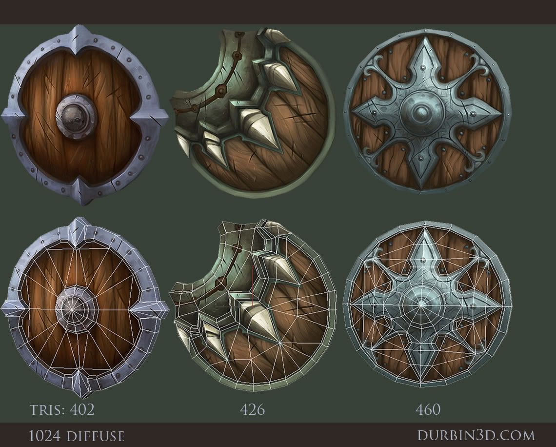
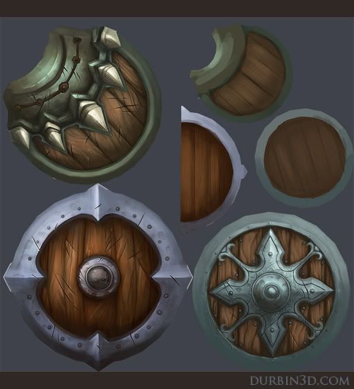
texture sheet, original is 1024.
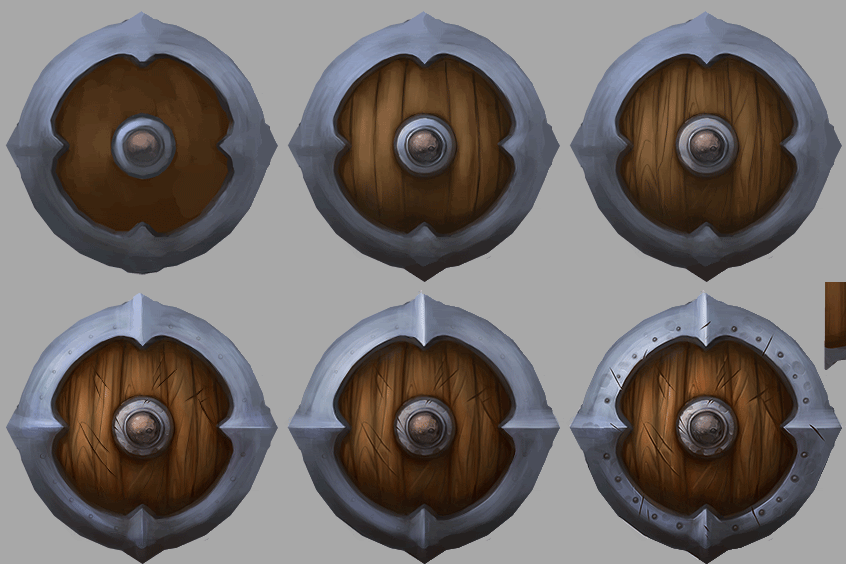
and a little bit of a breakdown on the last shield.
crits welcomed, and I'm no pro so any tips would be super sweet. Also, anyone have any tips on model presentation for this sort of asset? Right now, these are simply full ambient - screengrabs from max. Is that the best approach or what??
. . .lolz, while adding the link to the concept, I noticed I forgot to add the painted symbol on the last shield. . . I'll get to that tomorrow - derp.
(original concept by the talented Artyom Vlaskin: http://cghub.com/images/view/90613/)

texture sheet, original is 1024.

and a little bit of a breakdown on the last shield.

crits welcomed, and I'm no pro so any tips would be super sweet. Also, anyone have any tips on model presentation for this sort of asset? Right now, these are simply full ambient - screengrabs from max. Is that the best approach or what??
. . .lolz, while adding the link to the concept, I noticed I forgot to add the painted symbol on the last shield. . . I'll get to that tomorrow - derp.
Replies
Keep it up sir.
Pop the metal with some brighter highlights a bit more. That surface is hard to distinguish from other surfaces.
Great designs with these though. Can't wait to see some more stuff.
only crit is could you have gone down to 512 maps
just wondering
but great job dude
Some updates:
-added the painted red symbol
- worked in some stronger highlights to bump up that contrast
- added some more details to the bottom rim of the greenish sheild
- added some tonal variation to the deep cuts to give them some more depth.
- new screen grabs sans gizmo :P
- also tightened up the brush strokes for the backsides.
and to answer some questions.
Danielmn- all 3 do hold up pretty well if I drop the map down to a 512(as you can see, the texture flat I uploaded at 512), but I felt like the 1024 was prettier for folio purposes.
itismario- It was only the simple round brush set to a hard setting and some small tweeks to the falloff and whatnot - ultra simple.