Halcyon - The Burning Sky
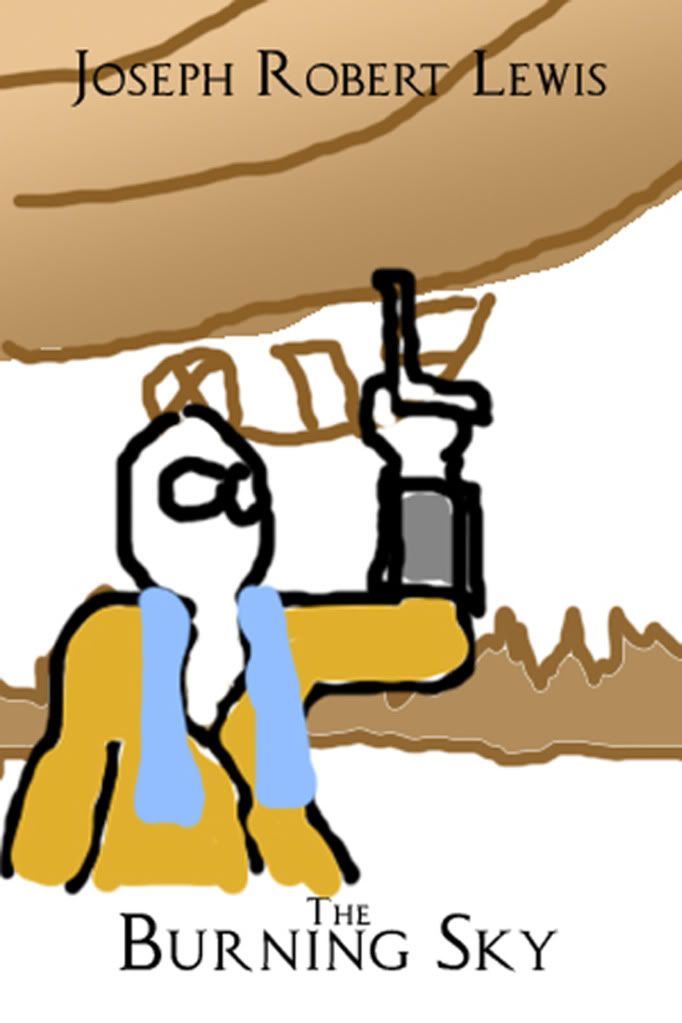
Not game art, but still relevant. So, I picked up a small freelance job doing cover paintings for an indie author. The pay sucks, but so do I, so I figured why not. Right now I'm working on the first of three covers in a series. I've done one previous painting for him and it turned out okay. I'm not really happy with it, but it fit his needs so booyah. Well done. Anyways, I'd love some feedback so far. He gave me this as a layout as well as some back story to run with:

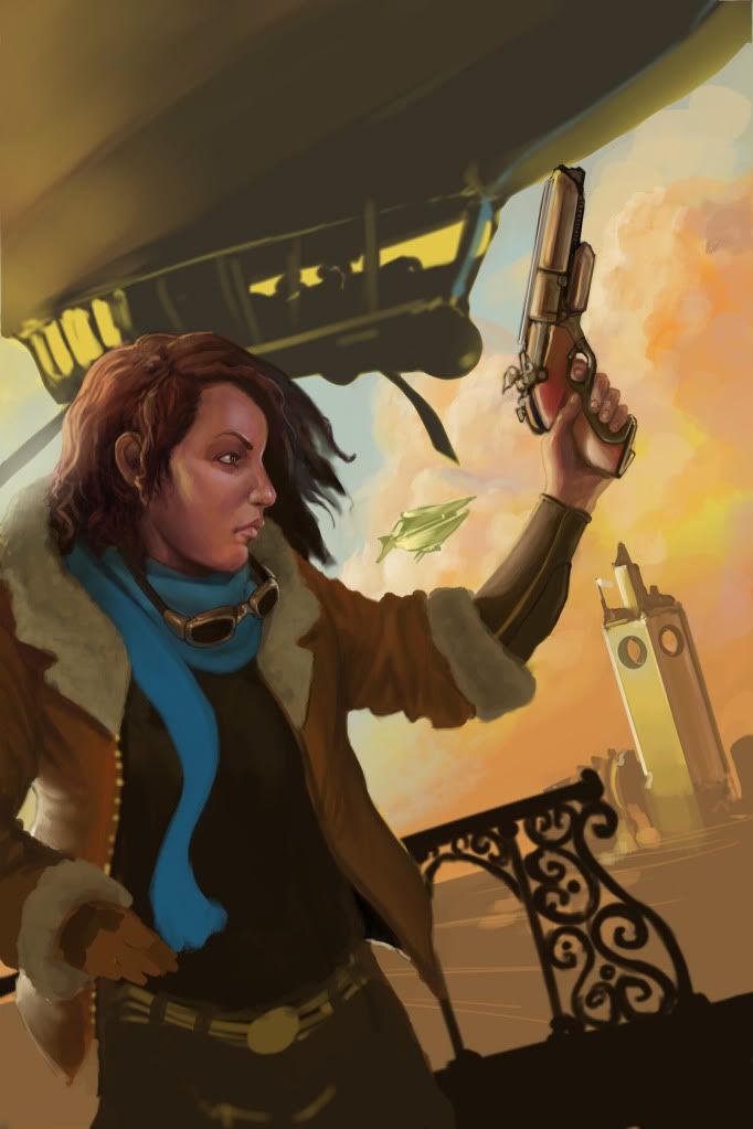
And this is what I've got so far:

I guess mostly what I'm worried about is how engaging and detailed I can make this piece. I'm still working on my rendering and color theory but I'm only 2-3 hours into it. Any feedback on my composition, my angles, lighting, material definition, even individual elements would be awesome. Thanks guys and keep up the good work.

And this is what I've got so far:

I guess mostly what I'm worried about is how engaging and detailed I can make this piece. I'm still working on my rendering and color theory but I'm only 2-3 hours into it. Any feedback on my composition, my angles, lighting, material definition, even individual elements would be awesome. Thanks guys and keep up the good work.
Replies
a smile would make the character more appealing.
it looks like the chin and cheek bone could do with some work.
light wise it looks like shes in a light area looking at the bg,
but her face makes it look like shes behind one single light source when the sky dome should be creating a strong secondary bounce light source.
the composition makes my eye fall of the page - i see the face, then i follow her line of sight to the gun, the the line of the gun combined with the line of the tower leads my eye of the page when you want to keep it on it.
you could probably fix this by emphasizing the ship more to try to lead back to the face.
if anything her shoulders look a bit high, and while her face and torso and gun hand are good, her right hand doesn't appear to be really doing anything yet. But you're an awesome artist so I wouldn't be surprised if you got her waist, legs, and that right hand are up to snuff by the next update.
As for her smiling, I don't think it should be a smile but it would hurt to see some teeth.
It could the conflicting lines of actions? The direction through which the ship seems to going to, vs. the slopes around the girl aren't flowing one into another, as well the direction she is looking into.
One easy hack for this method is to put the smaller ship closer to her and for it point into the same direction the girl is looking into, maybe even several of them, and leave the bigger ship be as it is, so that it gives the picture some movement and controlled chaos.
Also, kinda have to agree with Pickle, straight on side face isn't very flattering for many characters, while in this case, it can work and you're pulling off the details very nicely, I think it would be faster just to give her that 3/4 view in the long run.
If she was leaning, the angle of the arm holding the gun looks a little bit awkward, it feels like the elbow needs to have that "sharper" V-shape to it for the arm to look more relaxed and not constantly strained in with that angle.
Hopefully you'll understand what I mean
this piece has the same potential.
the 2nd pass is m favorite, her features are more famine.
i really do not like the 3rd pass.
i don't think she should be looking at us like shes posing for a picture.
shes holing a gun and looking off frame which invokes the idea there is more than just what we see.
clouds are beautiful too. well done
Maybe you could try looking at reference of egyptian or algerian girls. I think black hair and more feminine facial features would help...
The way she holds the gun should be a smaller angle like chris said.
I like the idea of the city in the background.
keep it up.
smoothed the edge of her face as it was a bit too defined, shrank the chin just a bit, moved the corners of her mouth up a bit so her frown isn't so defined, and smoothed the nasal labial folds a bit.
So here's a couple of pointers to keep in mind and some suggestions as well.
- Soften up her jawline and the chin. It's one of the things that makes her look really masculin
- Her left eye is disproportionate in size compared to her right
- Her right eye is too far to the outside imho
- That nose of hers is quite bulky, but I think that's a personal preference. You do have women with large bulky noses, but if you're aiming for something more classical beauty, I would suggest slendering it up a bit.
- Go easy on the plane changes! The female face has very little harsh plane changes compared to the male
- Mouth look a tad weird perspective wise.
- I made her smile (sort of), but you need to put down what kind of emotion you want to bring across to the public. I suggest going over that with the person you're doing the job for.
Keep going at man, your arts rock.