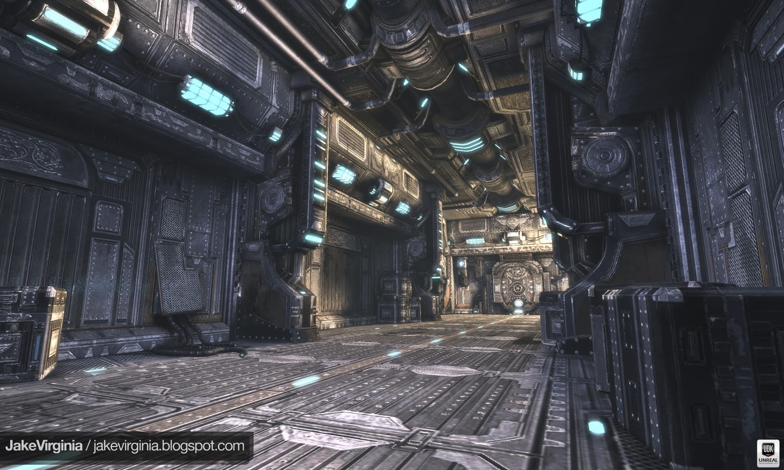
SCIFI Hallway Full UDK Environment!
Hey Everyone,
This is an environment I have been working on for about 4 weeks now
and I finally decided to submit it to get some feedback from all of you.
sorry if its too far along but any feedback helps this scene can always be
improved!
Thanks for your time.
This is an environment I have been working on for about 4 weeks now
and I finally decided to submit it to get some feedback from all of you.
sorry if its too far along but any feedback helps this scene can always be
improved!
Thanks for your time.
Replies
Other than that, the models look very nice.. great work dude.
As with every environment the devil is in the detail, some more medium and small sized props in the scene will really make this space come to life. But once again nice start and I hope to see more.
I like the details in the textures -- they work very well with the brightly lit scene.
However, your scene is losing some points with all the monocrhomatic glowy bits.
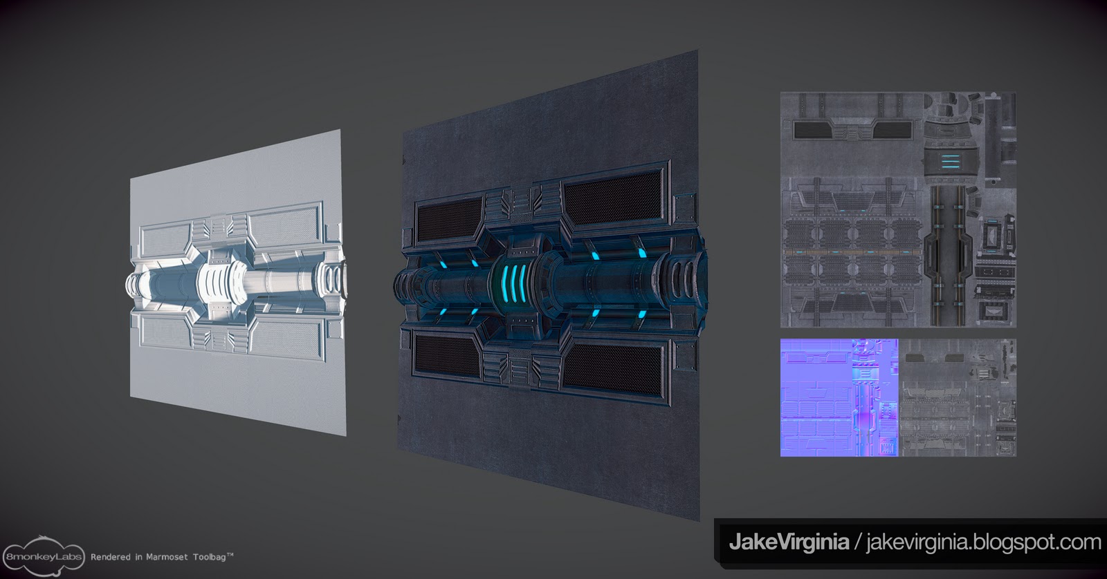
The scene is lit very white/yellow -- yet all the visible light sources are extremely vibrant turquoise
Unless you plan on changing the lighting in the scene -- kill the big glowy lights, and make them white or slightly yellow.
If the bright yellowish light at the end of the hallway is coming from off-screen, which would be cool, you should try and sell it with shadows. Currently it looks to just be hovering above the door to the right a bit.
You have some cool shadows from the pillar next to the boxes in the background/center... but I'd expect those shadows to be sharper with such a bright light.
Pump up your normals on the ground texture, it looks extremely flat, even adding in some geo to that center strip would help a lot.
Currently the shadows across the board seem very soft, sharper ones will add some cool constrasting details, especially in the ceiling pipes!
Your specs all seem flat, adding some higher contrast and interesting edge highlights will help sell the shapes you have and accent the normals you baked down. Avoid making rivets look shinier than the panels they are attached to.
Also, possibility of a reflection mask? I think it would very much so help sell the metallic nature of everything. It doesn't have to be strong, but it will also help break up some of the repitition.
Having a few edges of specular that are almost pure white will help things look very metallic, that way you don't have to pump your lights up so bright to compensate, which reduces your color range, making things look flat and bland.
Considered doing a nice tight AO on the scene? UDK's AO is pretty good, and with enough geometry detail could help make the shapes pop, especially the floor with some added geometry details, even if it's just following the normals you have, making metal plates pop up up a tiny bit.
-- Though a flat floor is more realistic, and reasonable, the scene has to look cool across the board, your walls are suffering a bit from the same issue, while the ceiling and door in the back look great.
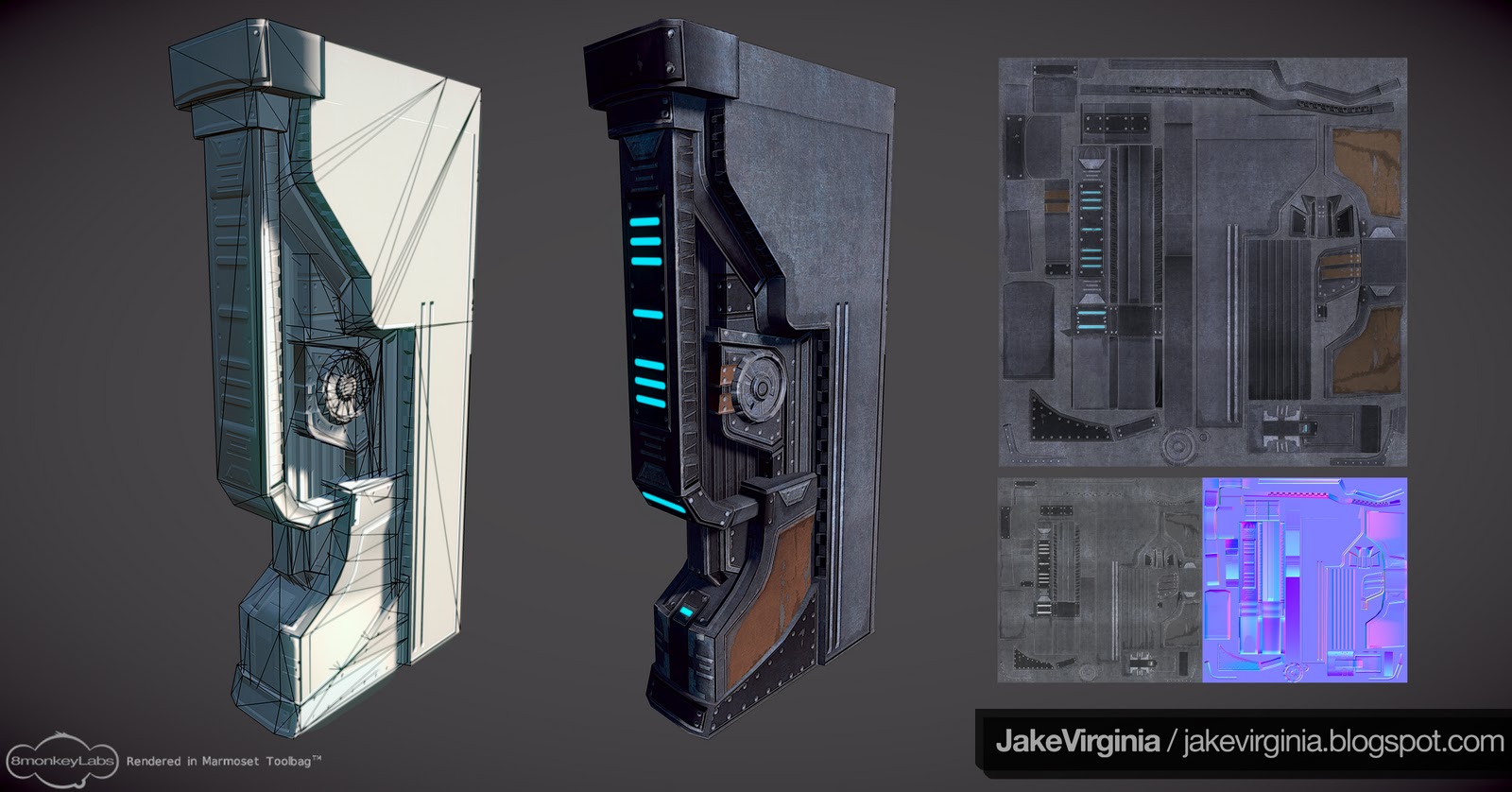
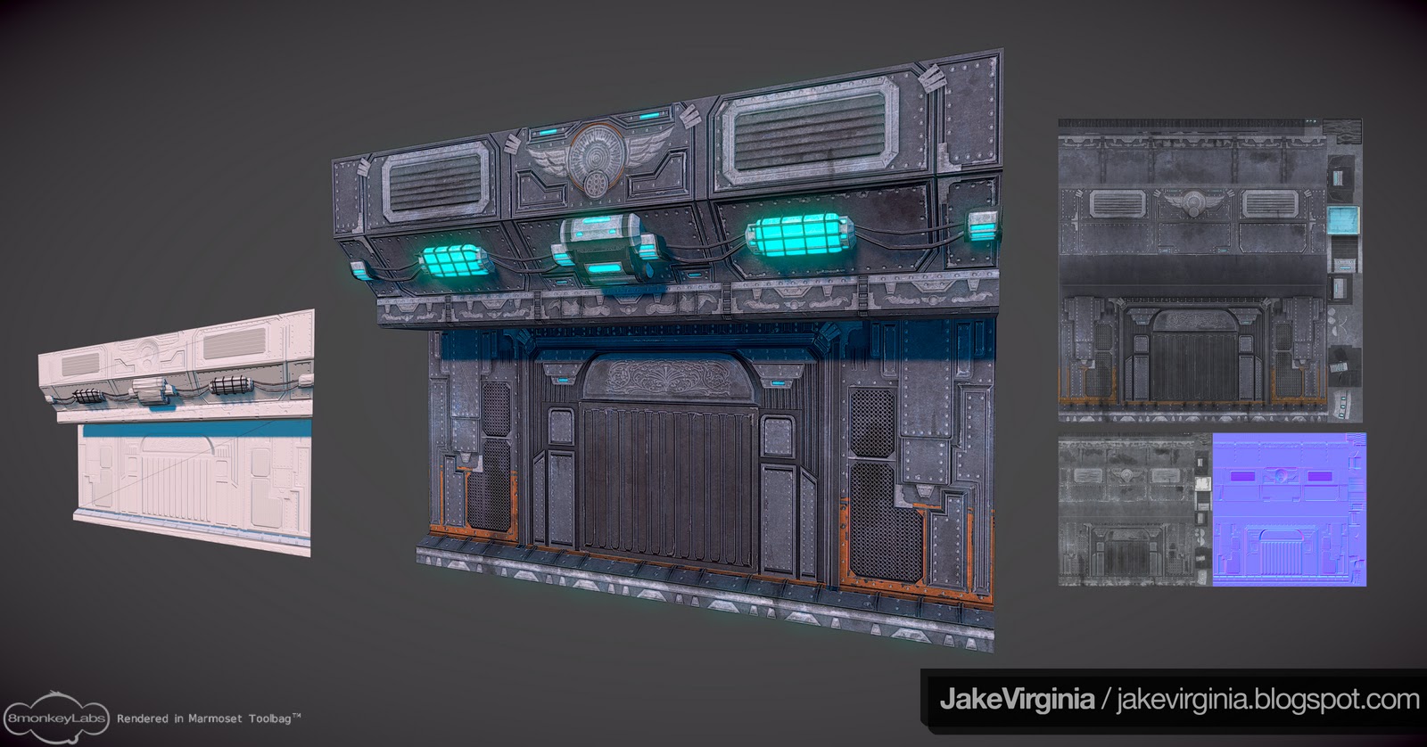
Let's also see a closer-up shot of the door, it looks like you put a lot of work into it, but it's tiny on your beauty shot. Think of 3 or 4 slightly different angles -- doing this will also allow your normals/spec/reflections to show more! A single shot doesn't allow for a lot of the real interesting materials to show.
I also almost expect some kind of fog, or smoke/dust particles to be present. This place looks well used, old even. With the wires popping out of the wall, a bit more of that kind of story-oriented detail will certainly make the scene more convincing, especially if you do multiple beauty shots that showcase those details in your modular set.
All in all, I really do like the color pallette, composition, and the scale. The scene reads well and makes sense, it just needs some relatively easy/fast tweaks to get it to pop and encourage the "wow!" factor.
this is too exposed
but really cool work
I think I will also get some other views of the door because that is supposed to stand out.
so this is a paintover I just did i changed the lighting to a more turquoise lighting and added some more interesting factors to the scene. Is this the wow factor? By adding the steam in the corner and adding some more smaller shapes to break up the flat areas should fix it?
Lighting needs work, The work itself.... TITS!
Oh... and I must add... smaller rivets! They're far too large.
The blue in those lights too for me is too much, I'd have a white spot in the center of them bleeding out to that blue.
Looking great though
cool I like what you did with the contrast i think that is what my scene was lacking and changing the bigger lights from blue to yellow should work just fine I will definately give it a try i like how it brought out some of the color in my metal so its not just grey thanks for the paintover
keep the feedback coming more screenshots to come
Any Ideas for something cool but not over the top?
Just a thought. I'd worry about making the walls/floor not so flat first.
As far as the floor goes I was going to add some geometry to the center orange piece on the floor and making a channel in the floor so you could see underneath it which I think will help any other suggestions ?
The wall probably just adding some geometry to some of the panels might help?
Also their is a reflectivity shader on all my materials but I would like it to be more prominent on the floor any good tutorials on reflectivity shaders or masks in udk?
While you're doing a material pass -- perhaps some vertex blending? That might be an interesting way to add in some cool grunge details, and break up the repeating textures, allowing you to more confidently show multiple wall sections that are the same geo/textures.
If you feel up to showing stuff below the floor, go for it! But make sure you keep the floor looking nice and solid -- I like the very solid feel.
I can't see the reflection at all -- I used the Alpha channel from my specular textures as a mask for reflection, diffuse alpha for any emmisive if the texture has no transparency to bother with.
I have a bunch of stuff bookmarked/saved at home, but nothing at work in regards to UDK material tutorials, but Google is really your friend, just be specific, watch videos and pick and choose things that you're looking to add. Trial and error is a great way to learn UDK's material editor.
Luckily I can just take the middle piece from my high poly floor and just put that on my low poly so all I have left to figure out is the walls.
I will have the fixed screenshots by the end of this week and hopefully that will fix everything.
and thanks to everyone for the critiques so far you have all been very helpful!
Reiterating what has already been said, the lighting could use some work but I think that the materials could be cranked up another notch as well. Try thinking of the metal as wet and then work on the spec. That's what helps me out when I create materials.
I am excited to see the newest renders you have, keep up the great work!