Sketchbook: Blaisoid
this newborn sketchbook will probably contain:
-textures
-props/modular sets
-more textures
-concepts?
note: feedback will be always appreciated.
Looking at all those fancy threads i thought i gotta give those stylized textures a try as well.
Hand painted stuff would definitely make a cool addition to my rather homogeneous portfolio.
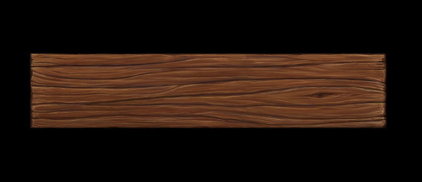
here's my first attempt, made today:

took me about 45 minutes.
note: it's meant to be a thick beam, not a flat plank.
next i'll probably make a texture with stone wall on bottom and timbers on top.
If you know any good inspirations for more complex handpainted textures (that mix different materials or have a complex design), share them plz.
I don't really play games with this kind of textures so i don't have many references.
-textures
-props/modular sets
-more textures
-concepts?
note: feedback will be always appreciated.
Looking at all those fancy threads i thought i gotta give those stylized textures a try as well.
Hand painted stuff would definitely make a cool addition to my rather homogeneous portfolio.
here's my first attempt, made today:

took me about 45 minutes.
note: it's meant to be a thick beam, not a flat plank.
next i'll probably make a texture with stone wall on bottom and timbers on top.
If you know any good inspirations for more complex handpainted textures (that mix different materials or have a complex design), share them plz.
I don't really play games with this kind of textures so i don't have many references.
Replies
in meanwhile i decided to color the B&W concepts from my portfolio.
these are current wips:
Good job so far!
recently i've been trying to switch to more painterly techniques for concepts, this way there's no need for outlines and shitload of small strokes.
anyway, here's the progress:
also, i started a quick painting today:
perspective is crappy, i'll try to fix that
probably final. i'm not 100% happy with it yet but i gotta pimp the other pics as well.
glad you like them, i see that you also have some cool bizarre characters in your folio.
btw, your environment stuff looks familiar. i'm sure i stumbled upon those pics before, maybe i even have them in my 'concept art reference' folder.
i agree, it's been bugging me as well.
soldier chick's arm feels especially stiff.
sadly, i don't have much time to practice the basics so various fundamental issues still pop out in my works from time to time. perspective, anatomy and all that jazz.
Finished (afaik) portfolio versions of above concepts can be found here:
http://shownd.com/bkaczmarek/45466/CONCEPT-ART---CHARACTERS
i kinda miss the graphical impact of b&w linart but i guess it was a necessary sacrifice.
if you want to give me some feedback on portfolio itself, I encourage you to do so in this thread:
http://www.polycount.com/forum/showthread.php?t=90337
Whenever you do a study make sure you pay attention to what the important parts are why are you doing this study in particular, sometimes nice just to focus on a part of it more then the rest to really get the information to sink in then test out what you have learn't and keep pushing it!
Good job so far gogogogo
i actually started drawing quick sketches again, perhaps this way i'll get back in shape a little. might post some soon.
anyway, here's a new almost finished prop for my portfolio:
polycount: about 1700 tris
texture: 1024x1024
it still has an annoying mirroring seam that appears at some angles in max viewport shader, tried to fix that using a tutorial from a fellow polycounter but it didn't change anything. gotta see how it looks in other renderers/engines.
----
btw, since i have better luck with getting feedback here than in my portfolio thread, can you guys help me with layout?
these are the two available layout options in the site that hosts my portfolio:
https://lh6.googleusercontent.com/-D599bmLGne8/TrLdm1yYYDI/AAAAAAAAB2k/Lu3VbkG2qYk/s912/PFscreen1.jpg
https://lh6.googleusercontent.com/-BzEaeqpif0I/TrLdmR3CQII/AAAAAAAAB2g/sDs-l41cw-8/s912/PFscreen2.jpg
i can't change the crop. so the first one has cooler layout but on the second one thumbnails show bigger areas of pics.
which one looks better?
also, good point about an odd number Jessica. i knew that something's wrong but couldn't tell what exactly.
in meanwhile, i'm re-discovering the fun of sketching and speed painting:
I decided to work some more on an old painting:
...as well as on this concept/painting from about 1 year ago:
-general vibe was influenced by Tsutomu Nihei's works.
-today i added a bit on the right by clone stamping it, original crop was less wide.
-Some areas seem messy when it comes to depth, i'm struggling to make it look more clear
i was thinking it could be just a symbol of status or affilation with the group he belongs to.
But if I were to push it into a more practical direction it'd be some kind of a demon repelling gear or just a general mystical protective item.
It's been a long time since i last looked at his stuff, but I guess my subconsciousness could have remembered those color schemes.
Enki Bilal most likely influenced my colors as well.
i'd say what u need to work on r material definitions
cloth vs stone vs metal vs flesh... make'em more distinct
i started with soft cloth type of material but later went in a more leathery direction.
for now i don't have time to improve this piece but if you have any references for properly defined fantasy clothing that would certainly help.
i decided to give hand painted textures one more try:
(WIP)
the axe was originally designed for purpose of illustrating a short book that my grandpa wrote. the book is in print right now, i'm curious how my pics turned out.
i spent a lot of time drawing those patterns on blades so i thought it would be cool to see it in 3D.
i cleaned that area up a little.
also, i added some details and did some experiments with color palette:
do you think it's an improvement, or is it too dissonant?
yellow kinda makes him look more tribal, i think colors of african art inspired me here.
Yeah, I like it.
good point about the shadow.
and the 3d items look awesome
keep them coming
here's a concept that i made recently:
it's a paintover based on model, which was based on a much less detailed sketch.
the one on the right is an older version, i was going to keep it like this i but i thought it's kinda bland so i added colors. i dunno if that's actually an improvement though.
probably final.
i added more leather stripes on the grip to break the monotony of pattern and tweaked few things.
until now i've been rendering it with 1024 texture, but it turned out that downsized 512 texture looks slightly clearer so i used it on this shot.
poses are disgustingly stiff again, i can't seem to get them right.
So yeah, anatomy and poses are definitely my weak sides. i've been doing some 2 minute sketches using that online tool and there is some slight improvement.
and I'm happy that you find my art so appealing, it's always encouraging so see such comments.
anyway, here are latest WIPs on the female character (i dunno if it was clear that it's a female)
new concept:
i think my postures/silhouettes are getting slightly better. looking at pic from post #41 i've been drawing feet with a weird perspective distortion.
ps: which boot design looks cooler? i mean left (bolts) or right boot (no bolts).
some new guns:
If I have one crit about your stuff, although you make some awesome/beautiful details, I wouldn't put them all over the place! So your work is a little bit busy. I think your stuff would look super pro if you add in some areas of rest, for balance :] Keep it up, I like your work a lot
A has a good flow where as B looks downbent and hunched.
you also tend to have to short arms. the point where forearm meets hand should be able to reach under the crotch.
the contrast is also a bit to high. i would use more midgreys and save the black and white for deep shadows and highlights.
aside from all this i think you have supercool and original ideas and a very nice style. keep it up!