Sketchbook: Jason Hickey
polycounter lvl 7
Hello,
I've just joined here because I heard great things about Polycount and want to get back into doing some homework (2D and 3D). I'll be posting some of my older work here first which is mostly 2D and life studies until I start practising 3D again.
I'm always looking for feedback so leave any comments you like as long as they are constructive.
Look out for plenty of 2d concept and illustration, nude life drawing, still life studies and some experiments in 3D game environments.
Thanks for reading!
Replies
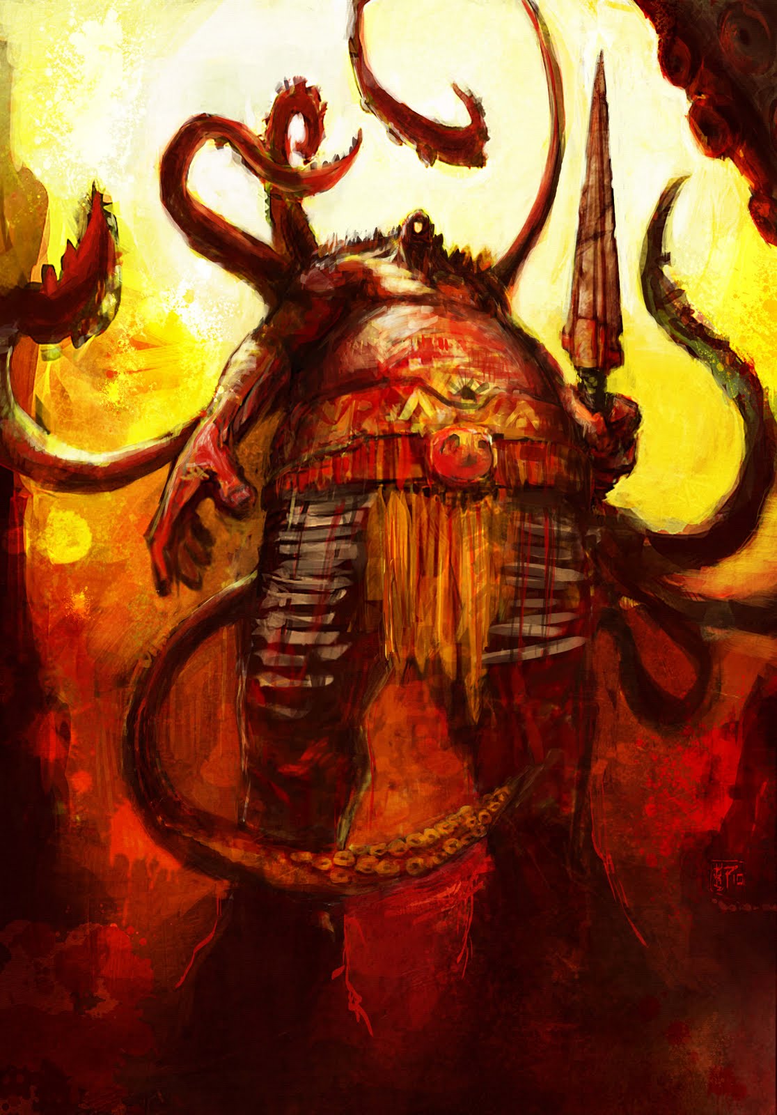
-the face and eye look weird. the eye looks like hole and its positioning seems unnatural as well. i wasn't even sure if he's a cyclops till i checked pic's name. The face doesn't have any recognizable features, don't forget that faces are always focal points for us humans.
-since it's a big size painting it could use more detail, for example the belt which also draws attention
-the lower body seems to have a different perspective than upper body. they don't really fit together
Blaisoid - The eye crit is the first I've heard! I brought it to show a load of concept guys (not friends) and they all knew he was a Cyclops without any pic title. Belt and face do need extra detail in the edges alright.
Perspective was originally fish eye lens to add scale. I agree it's a bit messed up but I still prefer it to a full upshot or face on.
SupRore - Cooler tones is the way forward. I didn't think about that kind of thing when I was painting this (stupid me).
Thanks again for the crits, sorry this stuff will all be old and I won't be going back to fix it but all the input is valuable for future work.
Here's some life drawing:
I'm a fan a bold colours and strokes, but would love to see more detail.