Home 3D Art Showcase & Critiques

[WIP] First UDK Environment

DirtyMrDucky
polycounter lvl 12
Offline / Send Message
DirtyMrDucky polycounter lvl 12
Hey everyone,

I started a thread for this when I had a lot less progress but didn't get any comments, hopefully its not a problem for starting this one.

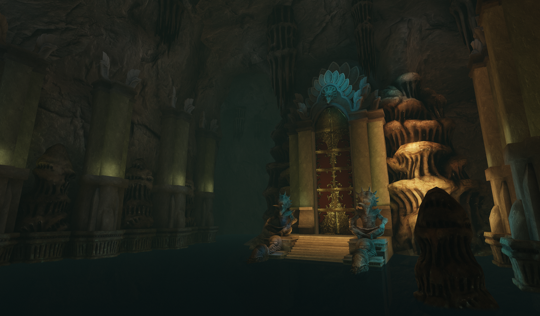
I'd really really appreciate any CnC you guys could shoot my way. Needless to say I'm struggling with the lighting. I dunno whether I should follow the concept image, which looks great but doesn't make much sense, or light more realistically which would make it more dark, i think.
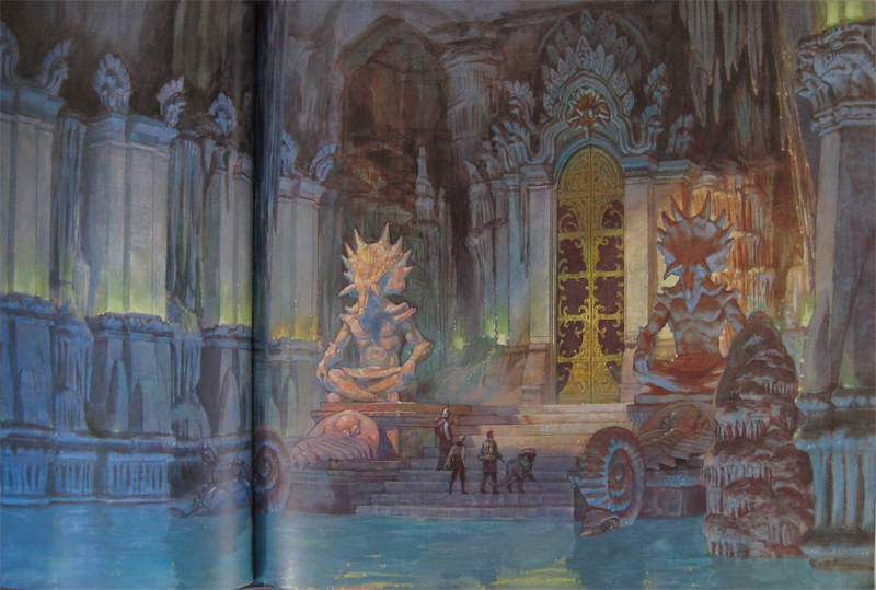
Highres_Screenshot_00002.png
Highres_Screenshot_00003.png
Highres_Screenshot_00004.png
The concept pic:
cotg_art.png
I really would love to hear what you guys have to say, where I could improve, etc. I can provide pics showing whatever else you guys think is important. Thanks!

Replies

  • bgoodsell
    Options
    Offline / Send Message
    I think the key here is to isolate whats generating the light in the scene and build it from there. The light contrast near the door is a good start, but needs to be applied toward more of the map.

    I also would revisit your water as it doesn't read very well from the screen shots you posted.
  • ranger_park
    Options
    Offline / Send Message
    Looking really good so far! needs more light i think
  • Fnitrox
    Options
    Offline / Send Message
    Fnitrox polycounter lvl 6
    well the lighting in the concept doesn't look so unrealistic actually...

    it's an underground cave with ligth coming from top where maybe there's a hole in the cieling or something like that and light also coming from the bottom of the water, where there might be some sort of access to the cave itself and so light shine trough the tunnels.
    I like the colors in the concept too, give a hint of mistery to the scene

    the only thing that look really strange is the light on the side pillars which could be produced by fires (?) and still it doesn't look that there's enough space there to actually put torches or whatever : /

    anyway the scene looks cool, but the enviroement itself might need some more contrast maybe with some AO like the statues. As of now the coloumns near the door seem to lack the love that was given to the door and the statues.

    hope this help and keep up the good work :D
  • DirtyMrDucky
    Options
    Offline / Send Message
    DirtyMrDucky polycounter lvl 12
    @bgoodsell Yea, I'll try lighting the right of the door first and try to keep a similar scheme throughout the scene. I was hopping back and forth, lighting different areas. . . prolly wasn't the most practical way to do things. and yea, ill work on the water /tear

    @Saso & ranger ty guys, the encouragement always helps

    @Fnitrox that does help, actually. even though in the story, this is just one cave in a network of underwater caverns completely cut off from sunlight, it's prolly lit similar to what you said. ill try and grab some references that have limestone caverns like how you said, maybe some light coming from underwater.

    Also, yea, the pillars need some love. i tried to get away from any more sculpting using a tileable, guess ill have to sculpt it regardless.


    thanks guys. much appreciated!
  • Alex3d
    Options
    Offline / Send Message
    Alex3d polycounter lvl 9
    Guys don't be cynical :P In the world of 3D magic is possible, maybe there some Gandalf crap at the base of those pillars XD? Anyways, the colour scheme in the concept isn't too bad. The reason it doesn't look too good in the concept is because it is too vibrant, no dramatic shadows; therefore my eyes keep flying around in hope to find something to look at. However, your lighting is not vibrant enough! Play around with vibrant hues, make the falloff exponent higher so you have more control over the lighting. Set up camera for a beauty shot, make at least 4 different lighting samples and save the maps as separate files. Save screenshots for all the lighting extremes you went for and pick the one you like most, or even post them here, so we could help ya out :P Good luck!
  • DirtyMrDucky
    Options
    Offline / Send Message
    DirtyMrDucky polycounter lvl 12
    Thanks alex. ill go ahead and try to get some different lighting setups going over the next couple days and see what you all think. thanks, bro.
  • achmedthesnake
    Options
    Offline / Send Message
    achmedthesnake polycounter lvl 17
    hah only saw this now! dinotopia yeah!
    just a suggestion - with the lighting maybe introduce some caustics from the cave water?
    (it seems that there are light sources from under the water - as well as possible crystals adjacent to the doors as well).

    good luck and keep cracking!
  • DirtyMrDucky
    Options
    Offline / Send Message
    DirtyMrDucky polycounter lvl 12
    heh, who DOESNT love dinotopia? i have caustics attached as a light function on a couple spotlights. ill try bumping the brightness up more so they're more visible. thanks
  • DirtyMrDucky
    Options
    Offline / Send Message
    DirtyMrDucky polycounter lvl 12
    So i found some good tuts for water creation and redid mine, but something weird is going on. If i take a screenshot using the console command "tiledshot" the reflections in the water aren't visible. If i straight up do a printscreen, they are. see the screens below.

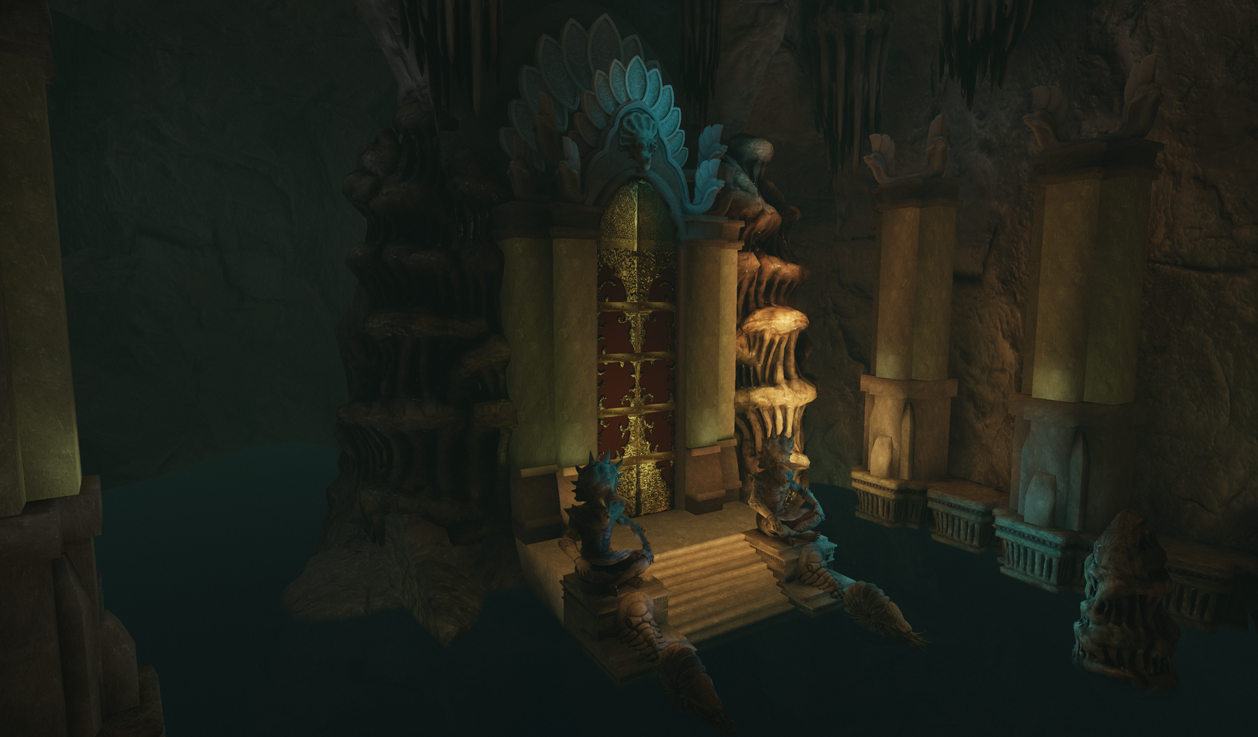
    I also doubled the spotlight brightness for the caustics, hopefully they're more visible now.

    Still banging my head against the wall for lighting. I can't seem to get light really intense, sort of blown out looking, at the center and fade out. I kept playing around with brightness and falloff to no avail. I tried using separate spotlights with a really high brightness value, but regular ones aren't visible after building my lighting. Only dominant spotlights seem to work, and they're iffy at that. Notice the furthest back left pillar with a highlight vs the others with none. . . they all have dominant spotlights on them, but only one shows?
    new_water_flec.png
    no reflection?
    new_water_noflec.png
  • DirtyMrDucky
    Options
    Offline / Send Message
    DirtyMrDucky polycounter lvl 12
    k, so more ripples in the reflection and i tried not shying away from color. . . i dunno if some of it is too supersaturated. i also bumped up the indirect lighting scales so the scene isn't as dark. i need some new eyes to tell me where i've gone wrong or what looks good that i might've been obsessing over.
    newlights.png
  • ClayMeow
    Options
    Offline / Send Message
    Haven't read what everyone else has said, but I love the statues - very unique and I like that you show some wear and tear. My only critique would be that it doesn't seem you put the same amount of effort into the columns around the door - they look too plain to me. I dunno.
  • kelli
    Options
    Offline / Send Message
    This is really nice. The green lights on the pillars seem like they are just floating points, not coming from below like in the original image. I love the statues too that you made, but they seem small in comparison to the original, where they are overpowering and grand, like guardians.
  • DirtyMrDucky
    Options
    Offline / Send Message
    DirtyMrDucky polycounter lvl 12
    @clay yea, im gonna have to sculpt out the pillars. since itll be the least of my headaches, ill redo them last. the lighting is what's making me want to cry, gonna try to nail that first.

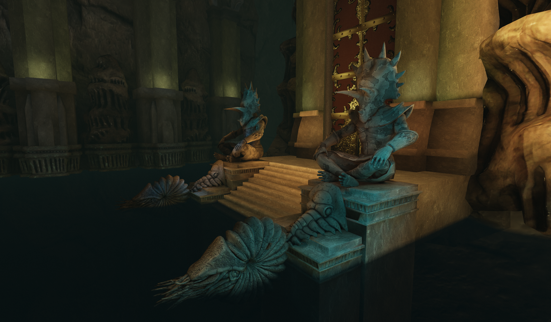
    @kelli i see that now, ill work with the scales so that the guardians look for imposing.

    Regarding the pillar lights. . . those are another thing im trying to figure out. i have some hidden planes at the base of the pillars that are using their emissive channel to light. im having a little trouble finding boost and falloff values so that its more intense at the base of the pillar and fades properly at the top.

    i appreciate the input. it helps guide my focus.
  • DirtyMrDucky
    Options
    Offline / Send Message
    DirtyMrDucky polycounter lvl 12
    k, so i scaled up the front statues and the guardians more than the others, hopefully it looks a lil better.

    after bringing the concept into photoshop and desaturating it, i changed the brightest point in the scene to the left trike, and toned down the rest trying to sort of match the values.

    i also went ez on the green and tried to get more of a blue hues showing. also changed the fog to follow through with this.
    cotg3.png
    so whaddya guys think? the lighting decent enough to leave be and move on to sculpting the pillars and other rock formations?
  • kelli
    Options
    Offline / Send Message
    The statues look much better bigger. :)

    Just one question, why have one statue the focal point? It seems like the door, or at least the entire platform area, you would want to focus the most on. I think you could make the lighting a bit more contrasted too. Even though you looked at it in greyscale, the value contrasts almost equally all over the place, especially on the one statue and the little stony bit on the right of the other statue.

    focalpoint.jpg

    I thought there was sun coming in through the cave but I read one of your old posts, and I guess not, so I'm not sure how you would want to get a brighter light there, but I think something a little more bold in that area would make it pop out a lot better.
  • DirtyMrDucky
    Options
    Offline / Send Message
    DirtyMrDucky polycounter lvl 12
    aye, i kinda like brightening up the whole platform. . . itd help pop the door some.

    in regard to contrast, how does this look? just discovered LUTs . . . frakking amazing!
    contrastmoar.png
  • NautalusX
    Options
    Offline / Send Message
    It's looking much better, light up the other statue as well and it'll improve alot. I like the higher contrast. I'd brighten up the lights a bit more on the green ones. Just in general I'd like to see the statues and door really bright up like the picture in the previous post.
  • Leodido
    Options
    Offline / Send Message
    Love this secene, it reminds me of some instance boss hideout in WOW can't remember which tho :p
  • DirtyMrDucky
    Options
    Offline / Send Message
    DirtyMrDucky polycounter lvl 12
    @kelli I tried brightening up more of the stage, but I really want to get that glow you made. I have no idea how to achieve this in udk. I've been looking and only find things on bloom and glow which aren't really what I'm going for. I saw somewhere here on PC about fog volumes, but i'm not sure how to get the fog to look like. . .well . . . a glow. it looks kind of muddy right now. :(

    @naut brightened up and saturated the green lights a little. better?

    @saso there ya go, bro.

    @leo Deadmines? lol
    contrastmoar2.png
    I went easy on the blue this time but tried to keep the contrast and vibrancy.
  • DirtyMrDucky
    Options
    Offline / Send Message
    DirtyMrDucky polycounter lvl 12
    its something that happens in the editor viewport with water. it doesn't show up in game, so I ignore it. it's normal.

    i don't take screenshots while in game because for some reason, when i type "tiledshot" in the console for a highrez screenshot, the water reflections don't show up. . . something I need to resolve.
  • chriszuko
    Options
    Offline / Send Message
    chriszuko polycounter lvl 12
    The pillars on the left really look boring and flat. I know that you are mimicking the concept, but they need some love. Maybe if you went in and textured some scratches or cracks along the edges to help make the middle of the pillar pop out more.

    Or it could be something as simple as beveling the edges where you would normally harden them so that they don't come off as being roundish.

    I really like the organic pieces in the scene. Nice work so far keep going!
  • Drav
    Options
    Offline / Send Message
    Drav polycounter lvl 9
    Ye the pillars need taking into zbrush or have the texture reworked. One thing might be, if theyre marble, whey would be a little bit shiny. Might work well with the lighting.
  • DirtyMrDucky
    Options
    Offline / Send Message
    DirtyMrDucky polycounter lvl 12
    i know, the pillars, the two pillar base types, and the platform will all get some sculpting love. . . lol, i pwomise! that and decals for whatever other weathering effects might look nice.

    right now i just want to get the lighting spot on for the mood, but ultimately because that's the most work for me. There's a lot I'm unfamiliar with in UDK, so I wanna tackle it and get it out of my hair. e.g., trying to find a way to get that glow on the platform that kelli painted over for me. Not sure how to accomplish it. Glow doesn't really work, i dont think i can get a bloom without an object eclipsing the lightsource. i think i can do it with a fog volume, but im trying to find out how i can get it to glow with falloff instead of looking like a dust cloud, like it does atm.
  • DirtyMrDucky
    Options
    Offline / Send Message
    DirtyMrDucky polycounter lvl 12
    Skyrim is evil!!! I've been engrossed in the game for the past week and hadn't worked much on this with the exception of the last day.

    I got the bloom working on the center platform and sculpted the pillars and bases some. Hopefully this is acceptable because I really really want to move on.
    cotg_shot1.png

    cotg_shot2.png

    cotg_shot3.png
  • SirCalalot
    Options
    Offline / Send Message
    SirCalalot polycounter lvl 10
    Even though the bright green effect isn't as visible in your current shots, I thought I'd post this little tidbit from the UDN - Why are there bright green areas in my reflections?.
    It's a problem where the engine doesn't use the entire render target texture to produce the reflections, leaving the 'default' pixels of [0,255,0]. To solve this, clamp the texture coordinates in your material as described in the link :)

    With regards to your scene, it looks pretty good but it really isn't given justice by the lighting.
    The water in the original concept is producing more than 60% of the lighting in the room:

    cotg_art.png

    Whereas your water - while more realistic - doesn't produce any light.
    Try a few aqua/blue coloured spotlights under the water to light the scene from beneath.
    Or if you fancy getting your hands dirty, change the Emissive of the water by 'Adding' (hold 'A' and click in the material editor) a 'Constant3Vector' of values [R 0.35, G 0.55, B 0.66] to what is currently pugged into the Emissive node.
    Then go to the properties of your water by selecting it and hitting 'F4' and changing the 'Use Emissive For Static Lighting' option to 'true'.

    You might want to tweak the colour to be darker or lighter, but see how that works for you :)
  • DirtyMrDucky
    Options
    Offline / Send Message
    DirtyMrDucky polycounter lvl 12
    @sir thanks much! i prolly went overboard screwing with the color lut, ill ez up on it so some of the warmer colors are back in there. when you provide me with steps, id be an ass not to get my hands a lil dirty. ill try it out.
  • DirtyMrDucky
    Options
    Offline / Send Message
    DirtyMrDucky polycounter lvl 12
    i know its still not like the concept, but im having a hard time getting the blue to look like that. the scene end up looking really blown out or the water looks like some murky ooze to match the brightness of the walls. i dunno, is this a little better?
    rework.jpg
  • SirCalalot
    Options
    Offline / Send Message
    SirCalalot polycounter lvl 10
    That's looking a lot better! :D
    Water is a very tricky subject to get 'right', but no matter what the values in the Emissive channel, as long as the transparency is set right, it should look clear.

    To get more intense lighting from the water like in the concept, try adding a 'Multiply' node (hold 'M' and click in the material editor) and plug a 'Constant1Vector' of 5 (hold '1' and click in the material editor) into one of the multiply's channels.
    Then plug your current Emissive channel into that and the 'Multiply' into the Emissive node.
    (I hope I explained that clearly).

    This should multiply all of your Emissive values by a factor of five, increasing the lighting in the process.
    You can try using another value in the 'Constant1Vector' as that was literally just off the top of my head.

    What you might find here is that the Bloom effect is also increased, but if you want, you can tone that down by adjusting the BloomScale in the map's 'World Properties'.

    As well as that, try making the 'Constant3Vector' I mentioned in my other post a bit paler, like a light pastel-blue.

    I hope that helps and I love the detail on the 'guardians' by the way :)
Sign In or Register to comment.