The BRAWL² Tournament Challenge has been announced!
It starts May 12, and ends Oct 17. Let's see what you got!
https://polycount.com/discussion/237047/the-brawl²-tournament
It starts May 12, and ends Oct 17. Let's see what you got!
https://polycount.com/discussion/237047/the-brawl²-tournament
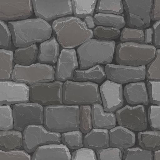
My dive in to hand painted texture work.
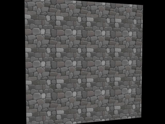
I like to hand make all my textures and now I want to get the hand painted look and here is my attempt. This first texture is a wip and I can see some too obvious repetitions in the pattern - so I plan on break that up a bit. I am looking for some critiques as I plan on updating this thread for a while.


Enjoy


Enjoy
Replies
I'd say it's pretty good but I have a few notes :
- 3 to 4 bricks are way brighter than the others which make the tiling obvious. Try to equalize a bit the overall lighting. Making variations is good but don't over do it.
- Your texture is kinda divided into 2 area : one half with rounded shaped bricks and the other half with a more rectangular shaped bricks which make the tiling even more obvious. I'd say make only rectangular bricks or rounded bricks, not both. Or do both but randomize their positions.
- I'd put a little color and also lighting variation instead of a pure gray/black between the bricks.
- Edge Highlight looks good too but it's not that strong. I'd say you could overdo it a bit to add some contrast.
- Also, try to add some lighting variation along with color variation with a bigger brush inside each bricks. Right now each bricks has a specific color/lightness but it remains almost the same for the whole flat surface of the brick. You did put some cracks there but bricks contains more lighting and color variations than that.
Hope it will be hopeful !
Cya !
-Cremuss, these are great suggestions and will continue to work on them.
Now back to the stone work for me.
The textures as a result of skipping the large details read as being very flat.
More contrast on the rocks.
Completely black shadows? Tone those back.
Not sure if this is in Maya, Max, UDK, whatever. But it looks like you're getting some apparent texture filtering with this making things read a bit blurry. I'd say remove that or make sure the UV scale ratio is even across the surfaces.
Your Ivy looks great for one simple texture, will keep that in mind for when I add Ivy to my work.
texture. Thanks for the desaturation tip, I shall try that.
Gannon- Will do.
Jeffro- Thanks for all the help, I will work on these things. The black shadow is simply a result from the default lift in the 3ds max viewport.
Jenn0-Bing- More contrast in the texture is a good idea, I will see what I can do.
Thanks again everyone, you are all most helpful.
One thing I notice: in your stone you tried to add color, but your strokes look very timid and a little splotchy. Don't be afraid to use the full pressure of your pen, just make sure the color you use is less saturated. Brush the pure color lightly over the base color of your stone (to make a sort of palette), then sample from that! Looking forward to improvements
Thanks for the advice Jessica I will try do that when I make more adjustments.
I have only a small update to my test scene. When I get more of the textures done then I will create an actual scene, sort of a backwards way of doing things but It has been interesting. Once the textures are more finished I will place a bunch on one texture map to map evironmental objects from. I managed to get some dirt on the ground but will push the contrast on it more. I added moss to a part of my wall texture but think more moss is still needed, at least at the bottom of the wall.
I made some grass and plan on adding a different color for variation purposes. I also started a water texture but is in is very early stages of creation. Anyway I hope you enjoy it so far.
The grass bottom looks like it was just cut off at the root, if you look in nature they grow out of the ground at different points not like you have in your texture map, I assume its an alpha. Just make those different lengths and make the end of the rope more rounded. Right now it seems like it just got cut off too. But other than those little things it looks great and hand painting textures are being a trend now, so keep up the good work.
frell- I like the hand crafted look.
UltraLrod and Paunescu.Daniel - thank you both.
The rocky/dirt wall would be used for a mining tunel wall or perhaps other areas. I just need some fresh eyes.
Thanks all.