Home 3D Art Showcase & Critiques

Mummy character + environment

polycounter lvl 14
Offline / Send Message
Shiniku polycounter lvl 14
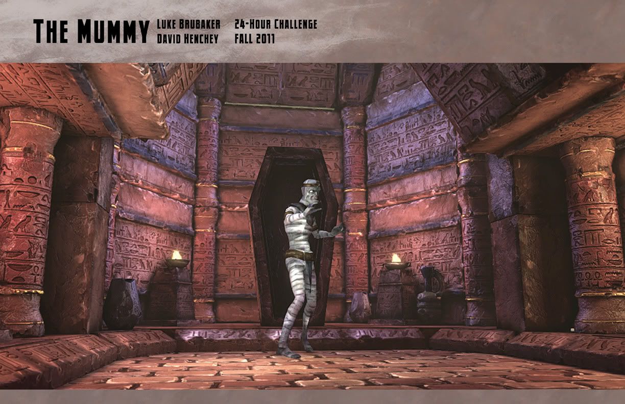
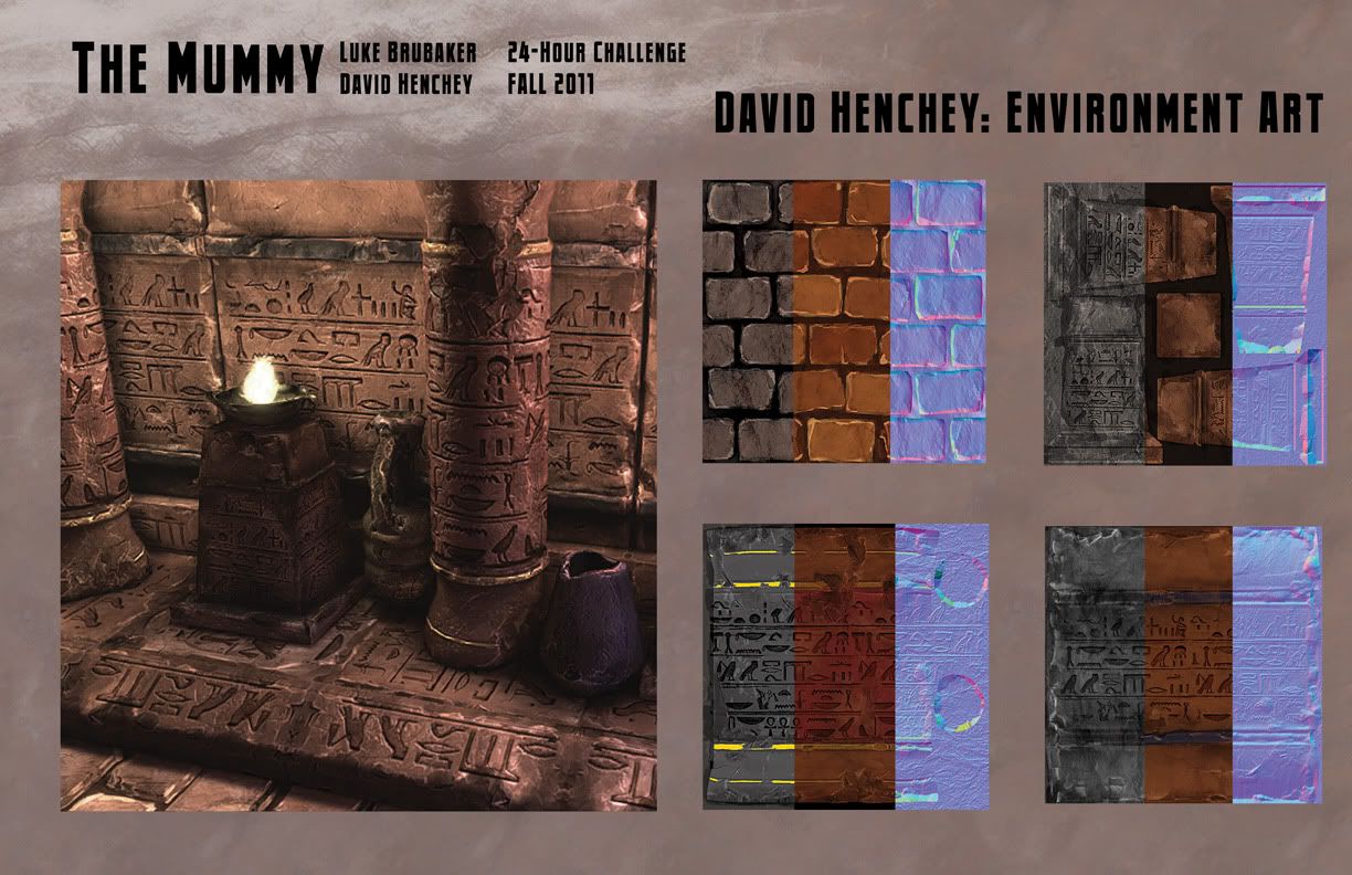
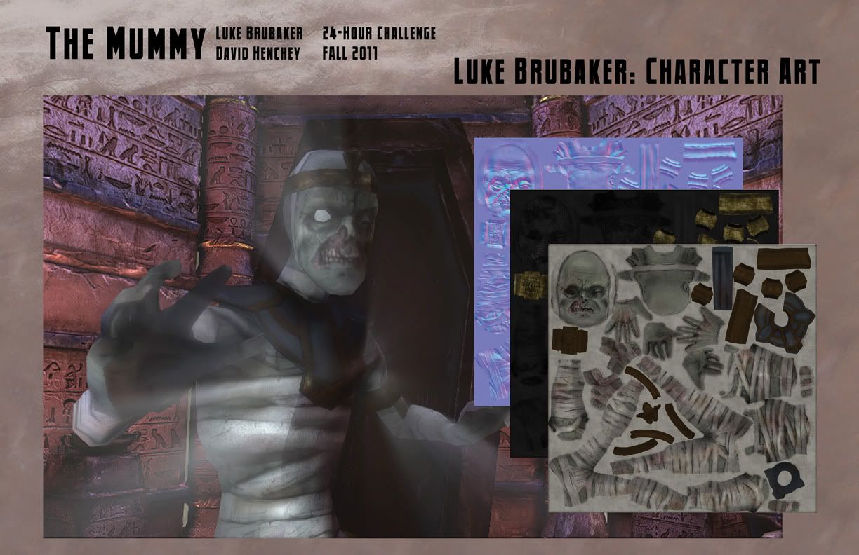
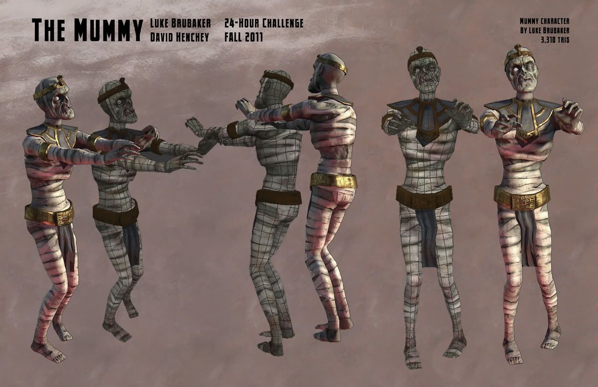
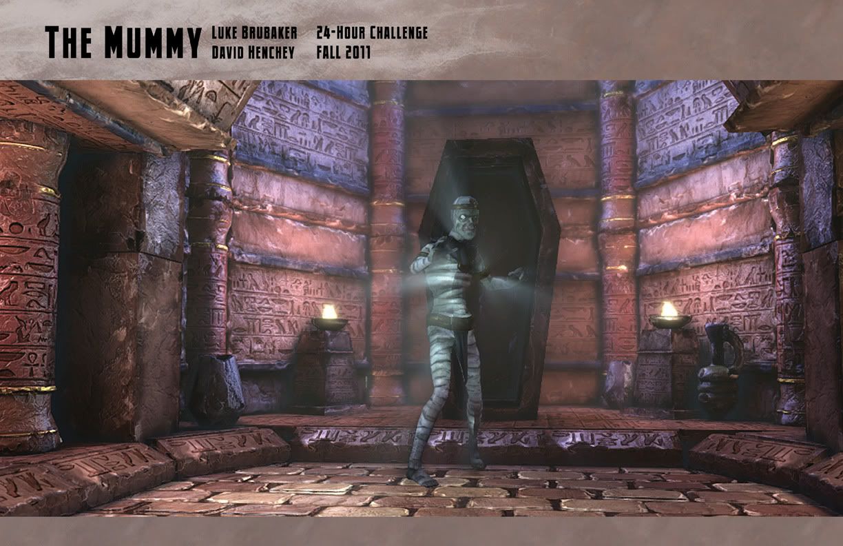
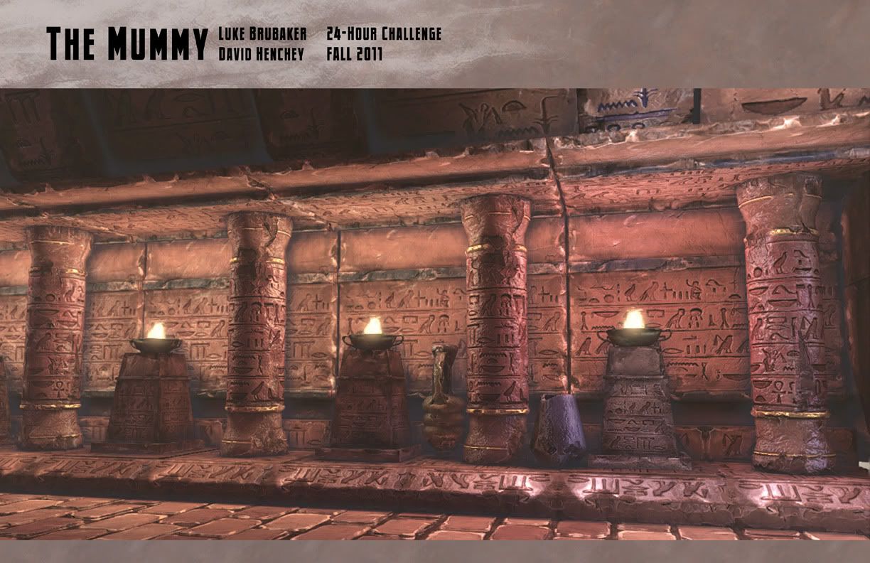
Howdy. There was a 24 hour art challenge with a horror monster theme that me and my buddy David (Razgriz as he's know around these parts) entered. We were assigned "The Mummy" as our creature. I did the character and David did the environment. (Oh, I did the fire bowl too.)

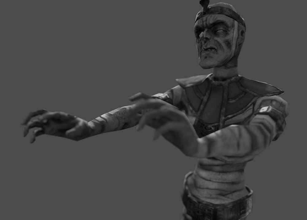
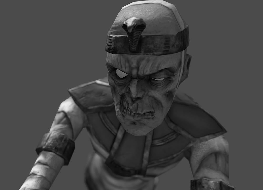
Here are some final 11x17s with screenshots taken in UDK. Plus a few of just the mummy taken in marmoset.
Page_01a.jpg
Page_02.jpg
Page_03.jpg
Page_04.jpg
Page_05.jpg
Page_06.jpg
screenshot3.jpg
screenshot4.jpg

Mummy is 3,310 tris and has 2048x2048 diffuse, norm, and spec.

Even though the challenge is over I think I'll polish up my piece some and put it in my portfolio, so critiques are encouraged..

Replies

  • Razgriz
    Offline / Send Message
    Razgriz keyframe
    Yep, we done did this! Also, another question for the pros out there: Is this worth putting in a portfolio? It's not the best thing I've done, but given that it was completed in a stretch of 24 nonstop work-hours, I wonder if it's something that studios like to see (being able to work as a slave without sleep).

    And, like Luke said, critiques are very welcome, for some polishing and fixes.
  • cholden
    Offline / Send Message
    cholden polycounter lvl 18
    Ah, you used to the Land of the Dead concept. Looks cool overall, but the stone-type (being so edge warn too) and the standing coffin there are very un-egyptian. Still pretty neat
  • Razgriz
    Offline / Send Message
    Razgriz keyframe
    I get what you're saying, I wish I had more time in the challenge to look at reference and do some concepting. I touched it up a bit, played with the lighting, and turned the spec maps down just a tad, before I throw it in my portfolio. Critiques still welcome.

    redo_01.jpg

    redo_02.jpg

    redo_06.jpg

    redo_07.jpg
  • Shiniku
    Offline / Send Message
    Shiniku polycounter lvl 14
    Looks good Raz, I like the changes. I think the one thing that could still use work is the floor he's standing on. I think the parallax might be a bit too extreme - it almost looks like the stones are just floating above an empty void, and it just looks a little weird. I think you should bring the crevices between the bricks up higher or maybe just make the floor so that it's stones pretty much right up against eachother. I think that would look the most authentic and would also make a little more sense in terms of the structures that are resting on top of it.
  • chrisradsby
    Offline / Send Message
    chrisradsby polycounter lvl 15
    Open ceiling, having some kind of weird moonlight shining in just to get some nice lighting contrast in there?

    5 second crappy paint-over

    crappypaintover.jpg
  • Rhoutermans
    Offline / Send Message
    Rhoutermans polycounter lvl 12
    a different light color to break up the brown everywhere helps a lot I think, nice idea! Very nice sculpting, proper lighting is already improving the scene. Can't wait for the final :)
  • Shiniku
    Offline / Send Message
    Shiniku polycounter lvl 14
    I like the idea of blue coming from the ceiling, thanks for the paint over. I think that was one of the initial ideas we had.. the light chaffs would be coming from above with a cool color as opposed to from the coffin. I think it's definitely an idea worth revisiting though, as it could use some color contrast.

    I've continued work on the mummy some... did some dangly bandages. Got some better screenshots. Take a look:

    mum_2.jpg
    mum_3.jpg
    mum_4.jpg
    mum_5.jpg
Sign In or Register to comment.