UDK Environment - RUIN STREET
Hi, everyone.
I am jongsoo Lee, 3D environment artist.
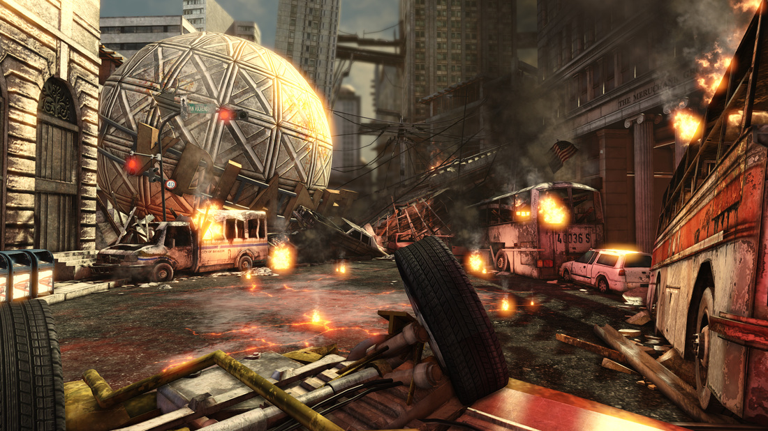
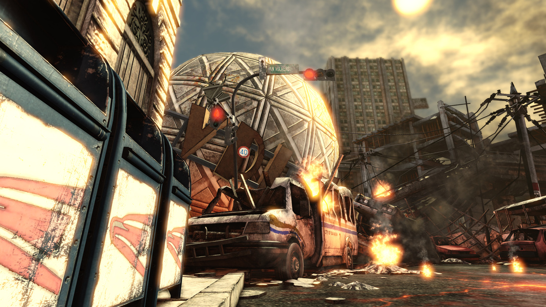
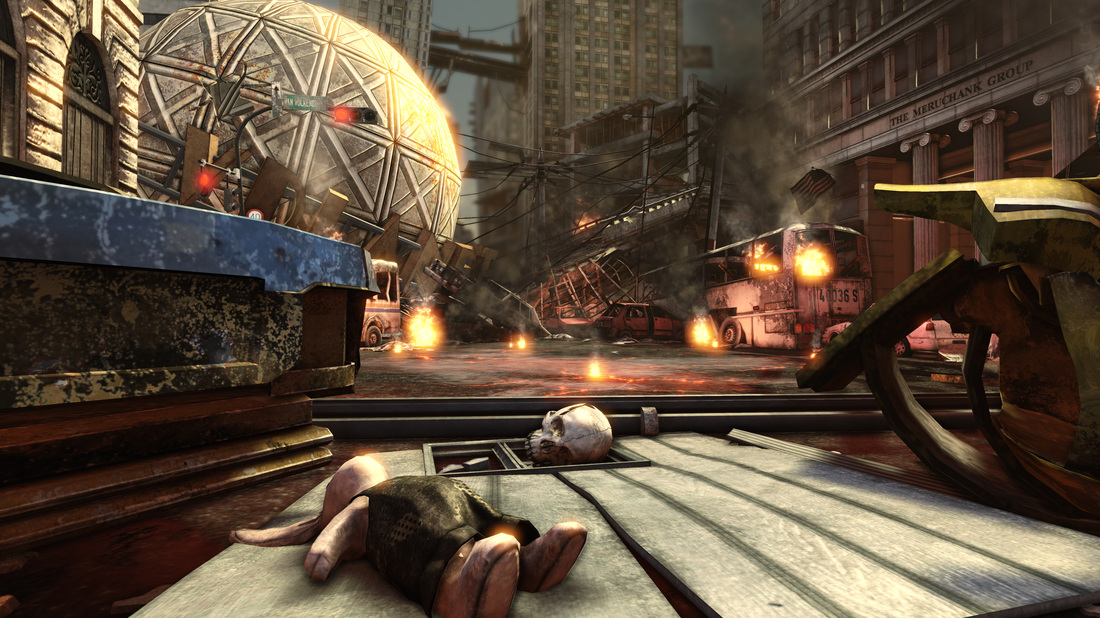
Here is my current artwork, ruin street. I was inspired by the concept art of the Game Mortal Kombat Vs DC Universe.
If you want to see more images, feel free to visit my website.
JONGOO LEE
environment artist
PORTFOLIO

I am jongsoo Lee, 3D environment artist.
Here is my current artwork, ruin street. I was inspired by the concept art of the Game Mortal Kombat Vs DC Universe.
If you want to see more images, feel free to visit my website.
JONGOO LEE
environment artist
PORTFOLIO
Replies
http://favim.com/orig/201102/24/Favim.com-1367.jpg
Shadows that have blue in them with golden highlights on everything touched by light, as well as dark areas where you can still make out form - that are randomly lit up by fires. I took the liberty of doing a quick paintover to help show you what I mean. Another issue is that everywhere you have a fire, there's this reddy pink light that just looks wrong and doesn't make anything look like it's illuminated by a fire. More atmosphere would really help sell the scene, along with heavy particles floating in the light (dust, ashes etc). Hope the paintover helps:
Then I saw the paintover and I have to agree... lighting could be better and the blue contrasts with the orange nicely so I definately think you should head that way with it. I don't see any particular specular shine or gloss, as mentioned before it seems to be replaced with bloom.
Nice work though, keep at it
I will try to put more particles as you mention and change some shadow color a bit.