Tokoyas Hand Painted Stuff
Hey everybody, little nervous about making me first WIP thread but I've been hugely inspired by Jessica Dinh's handpainted work and so I've been digging through some tuts here on PC, most of my experience is with realistic modelling and texturing, but feel like my attempts are missing that flair that makes hand painted textures so appealing.
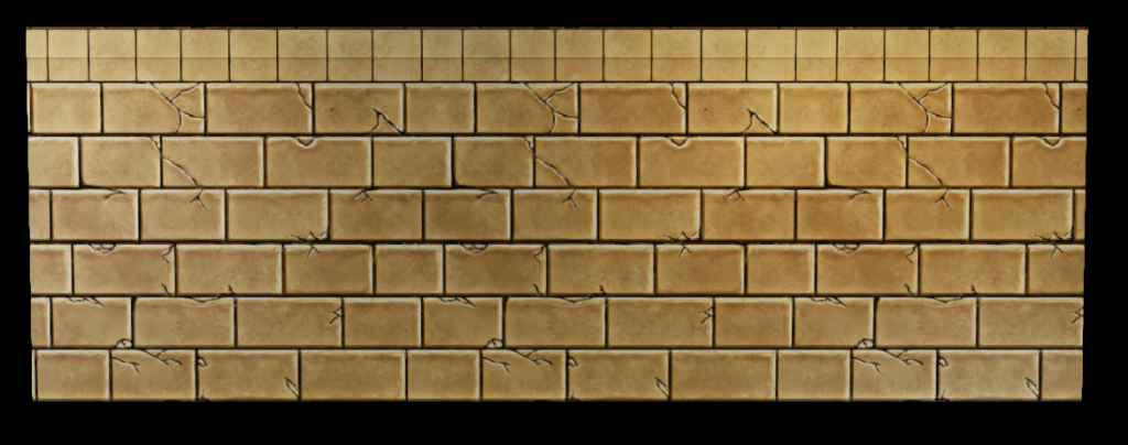
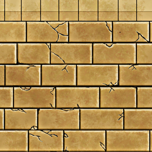
This texture is for an Egyptian themed project I'm working on with a few friends and I would love to get some crits from you guys


Hmm I should tweak the cracks, the tiling is pretty obvious
This texture is for an Egyptian themed project I'm working on with a few friends and I would love to get some crits from you guys


Hmm I should tweak the cracks, the tiling is pretty obvious

Replies
I would put some color in the grout or just remove it completely. Black just isn't a good idea because it tends to flatten out your textures.
Pull back the amount of cracks or get a more even distributed amount of them and that will make the tiling less noticeable. Try to find some reference of cracks to see what causes them and how they travel through surfaces.
Add in some color variation to your bricks, slightly lighter or darker ones here or there will make it a little more interesting.
Keep practicing, it's a lot of fun!
I'll post an update soon!
Don't be worried! i agree with Gannon above
Also, Smart Sharpen is a really handy feature but I don't want to rely on it too much as I'm trying to develop my painting skills
Also, currently all the bricks are perfectly aligned. You may want to break it up in terms of scale and overlapping, but without ruining the tiling aspect of it. Here's an example:
@RAWTalent: Great point, I pulled back the saturation and the yellow value a bit
The actual texture is much improved. Really nice to see your progress on this thread. I think there is a definite depth lacking with these bricks. But the concepts you're getting down (and rather fast too) which is awesome to see. Just keep at this you're making great strides.
@jeffro: I was planning on going with diffuse/spec only, is it normal for hand painted enviros (LoL, WoW etc) to use normal maps? Just curious because I always assumed it was diffuse/spec only. Also, I wasn't able to figure out what you meant by "blinn look", does that refer to the shading and lighting?
I went ahead and created a normal and spec, do you guys think I should go more extreme with the reflectivity on the spec?
The specular highlight in your 3d view that you're showing the texture on is really overblown for just diffuse maps. I would tone that back or add the normal/spec maps.
You might want to generate the normal map from a height map you painted instead of the diffuse map. It's not looking that hot.
Am I missing the point?
After numerous attempts and embarrassing results I've finally come up with something I feel like I can improve so I would love to get some crits and feedback from you guys again!
I know some parts are still pretty rough but I'll clean them up soon ^^
I tightened the texture a bit, but at this point maybe I should just start from scratch, I'm just not sure how to improve it at this point.
Oh well, it's a learning process!
Any Suggestions?
Establish light source. Right now it's kinda hard to tell where your lights are coming from. To practice maybe start with a basic top down lighting. Adding little cracks and nick-marks will give you further opportunity to emphasize the light source.
Added a little blue into the shadows. Maybe straighten some lines, you have mostly curves right now so it seems a bit noodly. Keep it up! Don't give up!
Confident strokes, more color variation, and increase the contrast (depth) of the texture.
At this point I'm not sure if it will be a full scene or just this table yet. I would love some crits so far, I'm mainly concerned the wood is lacking
Edit: on second though i'm going to completely rework the wood texture
Also I should be getting a Wacom Graphire Table this month that I'm super stoked about ^^
More props on the way :poly142:
The barrel needs some more depth. I would work on that more.
I guess everything but the table I would push more. The table is working really nice. Just needs some way those planks on top are staying together.
Tigerfeet and Jessica Dinh: I took your advice and made the map texture much darker and worn I think it makes it pop a bit more in contrast to the table but maybe It should be taken it further? I also increased the size of the map
This has been great practice for me so far, almost everything I have made up to this point has been made from reference so working completely from scratch is really forcing a whole different level of involvement
I like the coins . . . x] Though I hope you aren't planning to leave them just yellow like that, they will be awesome if you make them darker then paint the spec in.
Amd here is a shot of it tiled:
I'll post up some screenies of the dungeon textures soonish