Angler Squid !
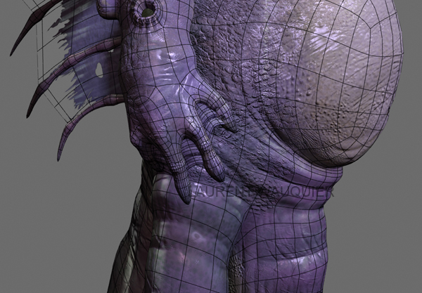
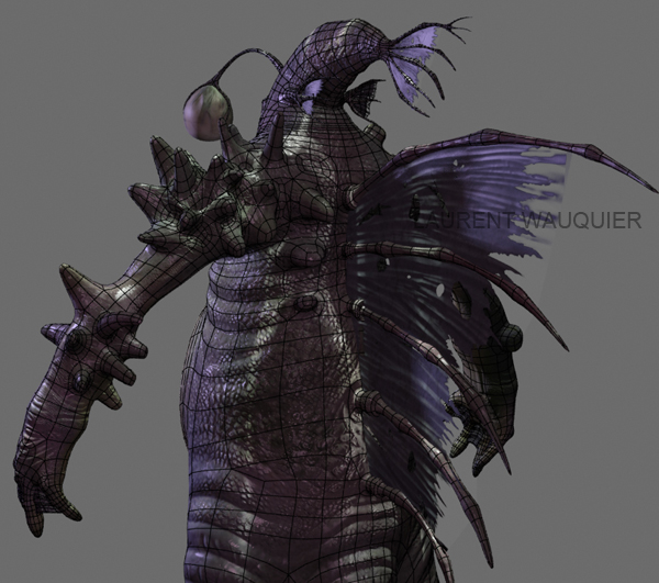
This "little" fellow is an Angler Squid.
[ame=" https://www.youtube.com/watch?v=h16G78W7nuQ"]Link to the Video ! [/ame]
 https://www.youtube.com/watch?v=h16G78W7nuQ"]Link to the Video ! [/ame]
-"This type of fish is named for their characteristic mode of predation, wherein a fleshy growth from the fish's head (the esca or illicium) acts as a lure/ bait to lure other predators close enough to devour them whole; this is considered analogous to angling."-

The whole idea came from a drawing I had on an old sketchbook that I drew when I was younger.

The base model was done in 3dsmax, then imported to ZBrush where I made all the sculpting/details and paiting and then imported back to 3dsmax to be rendered with MentalRay.
The caustics displayed on the character were generated with a tweaked Noise map in the Projector Map.
Some rendered images with / without wireframes will be posted on my blog for everyone to see the edgeflow and the base mesh.
Be sure to check them out !
http://laurentwauquier.blogspot.com
Character idea, Modelling, Texturing, Rigging, Animation and Compositing in After effects were done by me.
I'd love some feedback since this is pretty much my first time using Mental Ray.
Any critics are more than welcomed !

Thanks in advance!
Replies
Sorry to double post, but I'd really like to get some feedback on this guy. On any level really, wether it be design, edgeflow, anything really.
Here goes two new renders of the sea monster.
In your diffuse, everything, and I mean EVERYTHING is purple. At the bare minimum, the eyes and teeth should be a lighter, milky color; the angler globe should be a color to compliment the purple, and lighter.
Your specular map doesn't seem to be bad, but the overhead light with the water effect is killing your still frame presentation, and making it look like you just slapped some odd sort of material specularity instead of a proper map.
Your presentation is by far the weakest link of this project so far. Your turnaround render should be something simple where we can see the model, save the ocean render scene for a beauty shot. Your pose you've put him in has you cutting off portions of your model in every render, and I want to see dem tentacles. I love me some tentacles. Readdress your pose, something dynamic that will both attract the viewer's attention and also fit your render format. I'd suggest going into max, and using the bounding box display as a guide, make it more rectangular to fit your render size so we can see the model in all its fishy, tentacled, manboobed glory.
It's a great concept, and your modelling has been executed nicely, you just need to give it that extra TLC to really blow people's socks off.
Hey there !
Thanks alot for the critique and I do agree.
At first I thought that purplish feel looked good, but come to think about it and with your opinion, it really isn't doing the diffuse any favour.
I'll revise the light setup as soon as I get sometime.
As for the presentation, I do struggle a bit to get things right.
I'll try to post some new renders tonight.
May I ask you what you think is a good character presentation ? ( A link to a portfolio or something )
I really didn't want to put the same background that is on the video on the stillframes. I guess that didn't help to the dullness of the stillframes.
How about to emphasize small details like the hands ?
Are those wireframed screens I provided earlier good or should I completely discard them ?
Thanks alot for taking the time to look at my work !
@Snefer :
I'll try to add some glowing effect to the lamp !
Thanks !
I really like the design of the head, an actual angler(?) fish the evolves a fully body underneath its neck. I think the detail is very good on the body, though i perhaps agree with the colour scheme, too much purple, looks like you used the "noodling" method but the final coat of purple was too strong.
But all in all...
Good work. :thumbup:
I won't take your comment with a gigantic grain of salt haha.
All comments/critics are well received especially when it's constructive criticism and it comes from talented and accomplished artists.
You didn't bash my design, you gave an insightful explanation as to why you had problems with it, and I really appreciate and respect that.
As for the design aspects of this "creature", I didn't really give that much thought at what it was, or how did it get to be the way it was.
I guess the idea I had when I was sketching it out on my sketchbook was a character which gathered a lot of different elements from different forms of life which can be found in the sea.
Yeah... pretty much haha
Although I see that it's important to think about all the aspects you mentioned, and I sure will in my next projects.
As to composition, could you explain a bit further what you mean ?
One last thing, about the watermark...
As I spend more hours on my work, and see alot of people taking credit for things they haven't done... I just want to protect my work you know ?, as bad as it may be or as non stealable it may be xD.
I really don't see another way to deal with that other than to put a watermark.
I did try however to put it where it was less bothersome.
Thanks alot for your opinion.
@Ravanna : Thanks alot for your post.
I'll be sure to get rid of that purplish look tonight.
I'm pretty happy with the video too. But as said, I will look into the posing of the character to get rid of the cutted head!