The BRAWL² Tournament Challenge has been announced!
It starts May 12, and ends Oct 17. Let's see what you got!
https://polycount.com/discussion/237047/the-brawl²-tournament
It starts May 12, and ends Oct 17. Let's see what you got!
https://polycount.com/discussion/237047/the-brawl²-tournament
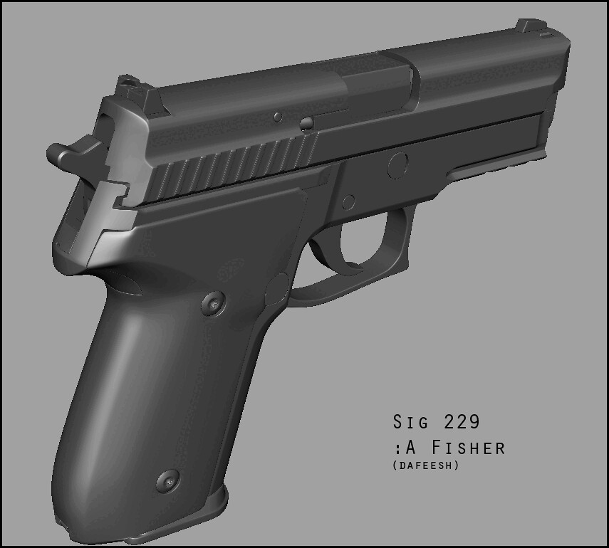
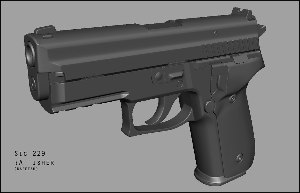
Sig Sauer p229 Wip
I'm trying to produce some work to make a new portfolio. When i graduated we weren't even covering normal maps in school. This project is intended to help get me used to the workflow and techniques for creating a weapon for a fps. The geometry in the pic is a smooth proxy i guess (pressed "3" in maya) so it is still quite editable. I have some mostly minor shading errors that i think would take longer to fix than would be worth it. I don't think they will be super noticeable or unfixable in the final product. I suppose after this i will start the in-game model when i am able to allocate some free time. I am thinking 6000 tris should be acceptable for a pistol in a modern fps, this is of course open for debate. Also any helpful links would be greatly appreciated in regards to modeling for fps's. My searches did not yield much helpful material. I have been 3d modeling for close to 8 years but I started my own non 3d business after school with my wife and I'm looking to get back into it on a semi professional level. Comments and crits welcome, thanks.


Replies
before the crits. in regard to your tri count.. id maybe aim for about 3-5k triangles if there's no attachments.
1. on the back of the gun. make the slide and grip seem like they uniformly fit together. youve got 1 area thats got a hard angle.. and the other has a soft one.
2. your bullet ejection area doesnt really match well with the slide.
3. this piece looks like theres a hole in it.
4. make this a bit more smooth.
aside from those just soften up your edges and you should be good to go. ill see if i can find that image around that everyone uses as an example of why to have soft edges.
EDIT: found it
Solid modelling so far, although I would second the thing about the sharp edges. (Although I'm usually guilty of that myself).
1. on the back of the gun. make the slide and grip seem like they uniformly fit together. youve got 1 area thats got a hard angle.. and the other has a soft one.
Fixed the right side, you were spot on. On the left side it is quite a bit smoother on the molded polymer grip than the metal body. Asymmetry.
2. your bullet ejection area doesn't really match well with the slide.
On the actual gun there is a gap there, however i narrowed it up quite a bit after you mentioned that it was a little obvious and distracting
3. this piece looks like theres a hole in it.
I added some more geometry to clean that up a smidge.
4. make this a bit more smooth.
I will make everything a bit more smooth if i can, but it will take some time.
Thanks again!
Seems pretty spot on, just noticed a few things.
[ame="
... So it is. My mistake.
You guys sure you know your shit though =]
This model is sick, looking forward to seeing this game-rez.
Also, normal details like text and the grip texture is usually easier to just add in photoshop.
I think you can cut half of those loops on the slide, same goes for the bottom part of the mag (its called magwell I think)....
Generally speaking, you can cut away all the loops/edges that arent important/neccesary to the silhouette, your normal map will take care of it later....
Other than that, looks pretty spot on. Nice Job :thumbup:
Greetings,
ToxiQ
1. you don't need to model the inner portion of the barrel because from first person view it won't be seen. just make it flat. by doing this you can also remove the hole in the slide to save some extra geo.
2. made a note in the image so you can cap it like you work at a soda bottling facility... man that joke was flat.
3. you can probably collapse a few loops in these spots.
4. this little lip isn't visible from person view and is such a tiny detail, so remove this from the low and let the normal map handle it.
5. this is the densest part of the mesh and is in need of some optimizing. keep in mind that if this is a first person weapon the only things that matter are silhouette and depth from first person.
6. you may be able to collapse some edges in this area, but it's not a big deal since the mesh is fairly clean.
the number one most important thing for an fps weapon is making sure that the silhouette is nice and round. tris are extremely cheap on modern gpus, so if you need to spend 6000 tris to make sure the silhouette is round then it's not a big deal.
character artists do the exact same for human anatomy, so just think of it as mechanical anatomy. most people seem to think "them crazy gun nerds" are insane when in reality it's no different.
I was thinking that if I duplicate the UV mapped low poly mesh with some extra geometry to "corral" the errors when i re-bake and then use that normal map on the original mesh, that may work. I will try this later when i have a bit more time.
the thing i would emphasize in the texture work is the disconnect in materials between the frame and the slide. sigs have mostly polymer frames, and like a lot of modern era small arms you can never quite get a solid match between polymer/plastics etc coloring and metal (the SCAR being probably the best example). so make sure to pay attention to that material disconnect when looking at the refs and i've no doubt you'll end up with a great looking asset. good work.
I was getting the same banding type errors your seeing when using the transfer maps tool in maya. Didn't end up finding a solution for it. Although i'm not sure how noticeable it will be on the final textured model, let us know if you do find a reason for it. Looking great btw.
@gauss this particular gun just has the polymer grip. the rest of the body, and the slide are black stainless. the colors match really well, but the texture and specularity are different enough to make note of. Thanks for the reply.
@TrevorJ I ended up adding a little extra geometry in some area so there wouldn't be big long, really acute triangles, That seemed to fix the problem mostly at the cost of a few extra poly's. Next model I do I think I will try xNormal and see how that goes. It did a fairly nice job on the ambient occlusion map for this model.