Another Sci-fi Corridor WIP
Hey there, don't normally post here but come for a sneak around sometimes... I thought I may need some technical help later on with this little project, and I really want to up my game to a better standard. I've been in the industry for a few years but sadly the games I've worked on have been poorly budgeted/financed and thus the artwork was always doomed to be rushed. I'm sure I am not the only one who has had this experience.
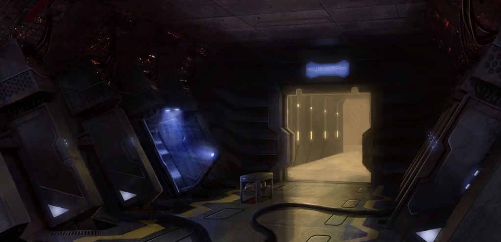
Anyway I saw this image some time ago on a blog - so credit to Julien Cabrera for the great concept, and thanks for inspiring me if you're reading some time.

Sooo... I'm going to give this plenty of effort and polish to get things as close to the concept as possible, with maybe a couple of minor changes at first. (I'm not too keen on the little pop-up food tray thing, for example). I will be doing the corridor past the cryo room, and maybe a communal-style kitchen/sitdown area (like alien or moon kinda-thing) beyond that if I can reuse enough textures.
I'm aiming to get this into UDK. This is where my knowledge lacks at the moment so I need to learn it properly. I will do an outdoorsy scene in Cryengine after this scene is complete.
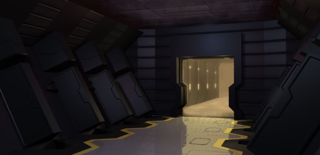
So far just done a blockout with a few base textures, nothing fancy. Just been playing around trying to get camera angle right, messing with some verts, messing with the camera some more etc. Everything will be pretty modular, as you would expect. This is where I'm leaving this for today.

Anyway I saw this image some time ago on a blog - so credit to Julien Cabrera for the great concept, and thanks for inspiring me if you're reading some time.

Sooo... I'm going to give this plenty of effort and polish to get things as close to the concept as possible, with maybe a couple of minor changes at first. (I'm not too keen on the little pop-up food tray thing, for example). I will be doing the corridor past the cryo room, and maybe a communal-style kitchen/sitdown area (like alien or moon kinda-thing) beyond that if I can reuse enough textures.
I'm aiming to get this into UDK. This is where my knowledge lacks at the moment so I need to learn it properly. I will do an outdoorsy scene in Cryengine after this scene is complete.
So far just done a blockout with a few base textures, nothing fancy. Just been playing around trying to get camera angle right, messing with some verts, messing with the camera some more etc. Everything will be pretty modular, as you would expect. This is where I'm leaving this for today.

Replies
At the moment I'm planning on using no more than 2 materials per modular asset. Any pointers, crits etc very welcome throughout this WIP by the way.
Cheers
Progress has been slow due to other commitments... but I've just made a start on the highpoly chamber mesh, with a view to make it a control mesh later for subdiv (lots of bevels missing just now). Not sure if I will keep the little arrow engravings or screen yet - was just a little test. I might do a couple of little sketches before I go testing things over and over in 3d
So far it's fairly on-concept but I'll be making a few little changes/adding details; nothing major mind you as I like the almost-fridge-like simplicity of them in the concept...
Hopefully another update tomorrow...
EDIT: My preference is with H so far.
EDIT: I agree it looks off on the bottom of I... i also like the 'lines' (not the grooves) of H.... ok, I think I got it now. Thanks Mike.
K last ones... refined H + I combinations. Prefer 1 but not sure about 1 or 2 segment lights, that was just an afterthought to make it more like the concept.
Hmm, yep I think you're right. Going to go for this now.
Thanks for the opinions guys.
Haha. As I'm not super experienced with high poly, and although this still needs to be run through a sub-div, I may have underestimated the size of my bevels somewhat XD I'll assume these won't be visible enough as is and make some adjustments to make them a little wider.
Gradually getting into the swing of this though... I think I'll be able to speed up significantly over the next few days.
Edit: I realise I've not got the little lights on it yet, looks odd without them balancing it a bit but pretty happy with how the design looks so far.
Those are some tiny bevels :P
Anyway posting my progress as I've had some time on this today. I've done a little on the inside as well but needs lots more work on it. Getting the hang of sub-d modelling has been a bit of a steep but useful learning curve for me.
I did a quick render and made some 'to do' notes and sketches for myself. My imagination can be a bit rubbish at times so any suggestions are welcome.
More soon.
hey that looks pretty cool so far, where have you been ? You HAVE to finish this !
(btw, I'm the one who did the original concept art piece you used :poly121: and that's always really inspiring to see his own concept fleshed out in 3D...)