Cute Monster
I did this in about 5 days total for an art test for a games company (I didnt get the job  )
)
for more detailed information here is my blog
Basically I was given some concept artwork (which I have been asked not to show) and told to make it cute, model, texture, rig and animate it (the walk cycle can be seen here).
quick orthographics: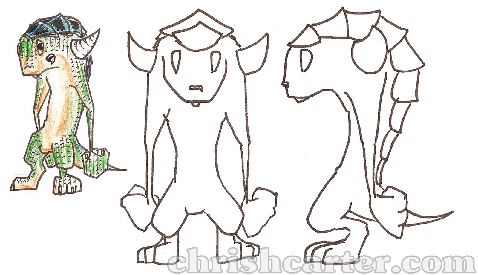
model:
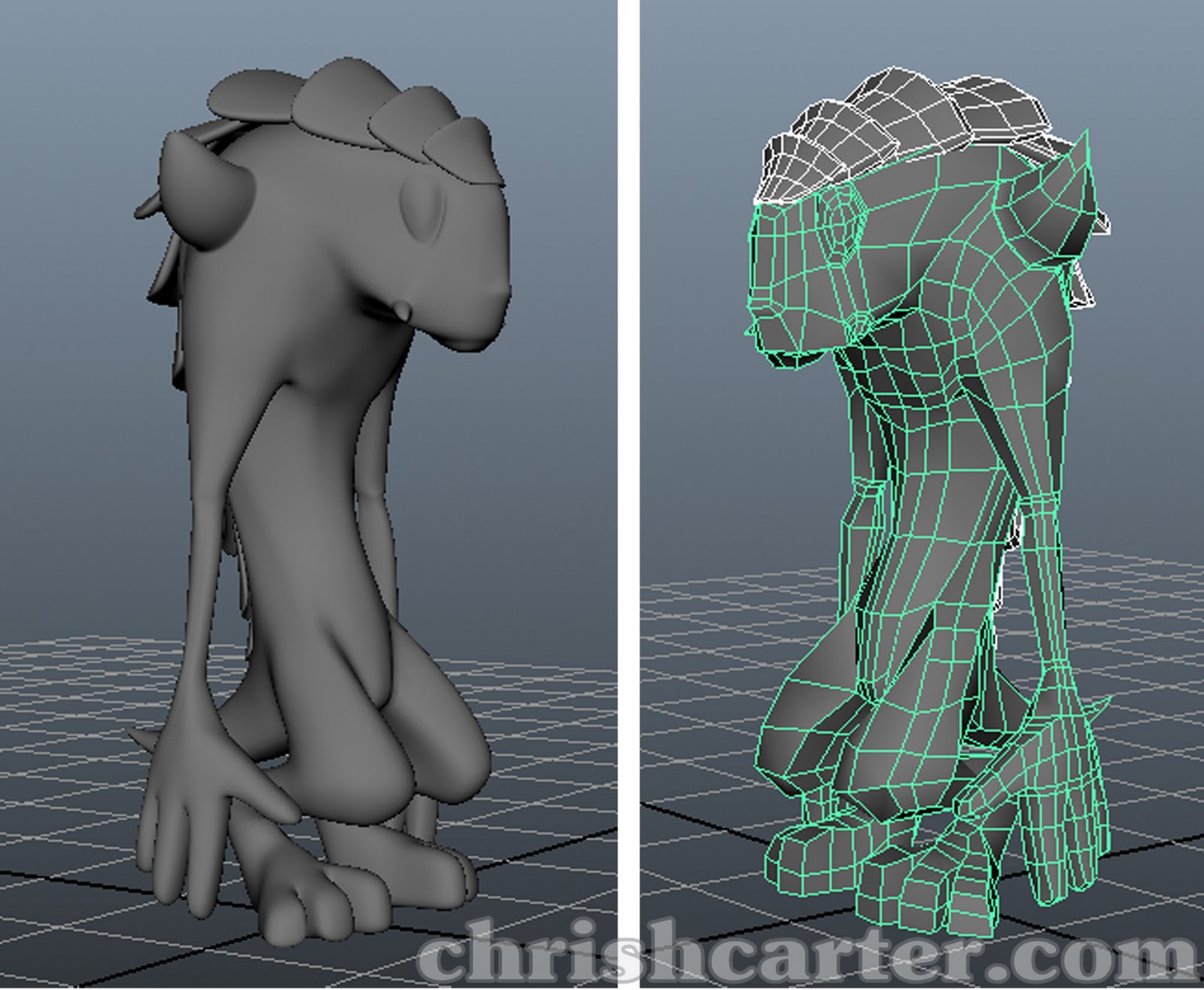
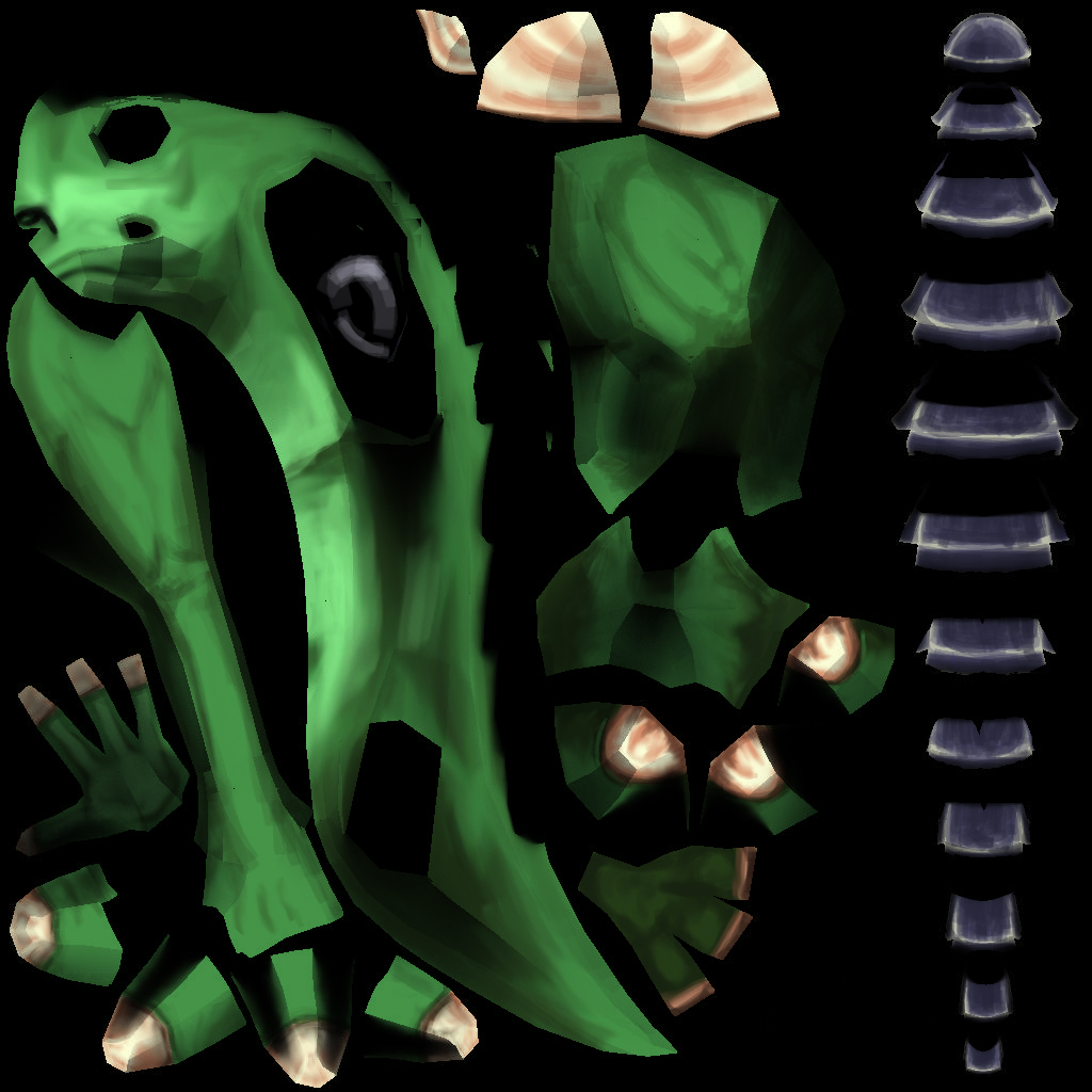
texture (1K)
textured character:
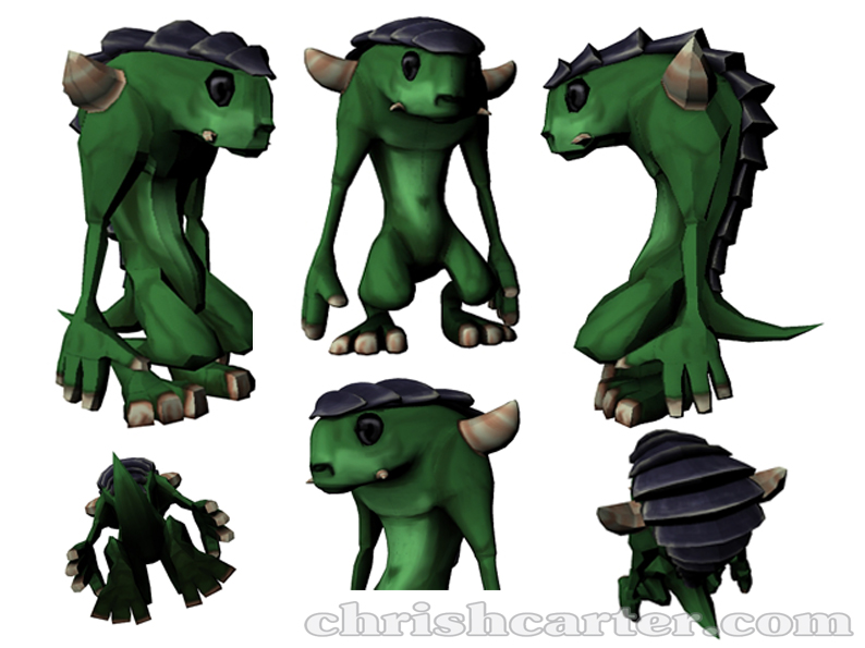
Critique would be massively appreciated, especially on the texturing, I really am a bit clueless in that area. Thanks
for more detailed information here is my blog
Basically I was given some concept artwork (which I have been asked not to show) and told to make it cute, model, texture, rig and animate it (the walk cycle can be seen here).
quick orthographics:

model:

texture (1K)

textured character:

Critique would be massively appreciated, especially on the texturing, I really am a bit clueless in that area. Thanks
Replies
-It appears you modelled with smoothing in mind but didn't use the smoothed version for anything. Additionally this has presented some areas where polygon distribution could have been used more effectively -i.e. around the eyes, his legs, and the scales.
-the finished model has some smoothing groups issues or inconsistancies with how you are using hard and soft edges, so some of the models faceting is clearly visible.
- same issue translated to your ambient occlusion map where you can see the faceting, most notibly around the chest and arms.
-texturing looks a bit soft, could push the definition of muscles and other forms a bit harder. No color variation(add some reds and pinks or other contrasting color), blending with black from the AO is looking muddy. The scales lack material definition. Could use more lighting info.
-Overall could use hints at scales or spots,wrinkles on the skin, cracks in the horns.
-eyes are black and lack moisture or reflectivity i.e. life.
-color pallette leaves something to be desired- looks dull lacks appeal
my 2 cents quick paintover
Here is what I have so far:
I hope its an improvement
after making a high poly version in mudbox and painting diffuse and specular maps, this is what I have.
Unfortunately I am still having problems with the normal map transfer. Below is the low poly with the high poly normals mapped to it. Have I just made a bad high poly version or is there something I am not doing in the normal map transfer process? I have followed a few tutorials and usually end up with the same problems.