Home 3D Art Showcase & Critiques

Gcanlas WIP assets

Hello Everyone. Me and my senior project group of 4 are getting to work on some assets. This is a quick placeholder pass on one of the enemies. I'm thinking I'm going to back and model the tail as one piece. I'm also not sure how to handle the membrane piece in between the mandibles. Anyway, this is where it starts and any constructive feedback is very welcomed. That's why i'm here. ;)

cartrap.jpg

Replies

  • Gcanlas
    Options
    Offline / Send Message
    We call it the camo toad.

    camotoad.jpg
  • Gcanlas
    Options
    Offline / Send Message
    sitter.jpg

    another placeholder just so we can start blocking things out.
  • LeoNp
    Options
    Offline / Send Message
    LeoNp polycounter lvl 13
    To blobby still, add some posture, weight, boney protrusions, etc.
    Make final concepts to new art direction
  • Gcanlas
  • Gcanlas
    Options
    Offline / Send Message
    BGstudy.jpg

    i know this might be pointless posting my background study without posting any sort of targets. But its basically an abstractish far off destroyed alien jungle world background to parallax on our sidescroller. This is more of a study of the "El Sheddai" treatment. This should at least give me a jump off point for the next passes. Our color pallete hasn't been decided on either. So where's my team at?


    PS. is anyone else thinking....miami vice?.....just me?
  • Agodines104
    Options
    Offline / Send Message
    wow, that's looking great! The negative space is very chaotic, but in a way that does communicate destruction. I like how some of the trees seem suspended among the buildings.
  • Melonman
    Options
    Offline / Send Message
    Very Niiiiice. Loving the style on this. Looking forward to seeing more.
  • Gcanlas
    Options
    Offline / Send Message
    Gave the Sitter a quick color pass in photoshop. We are trying to go with a sort of painterly style so I sorta went in and filled in the shadows myself with an opposite color and some brush strokes. I would imagine kind of what an ambient occlusion map would give you.

    Sitter_concept_color.jpg
  • Agodines104
    Options
    Offline / Send Message
    Hey, not too bad! I do see the sketchy lines you've got going on, and I think it would look pretty good if we could get that to work on the actual textures. I would also consider drawing some sort of linework on the big empty front portion of his body, just to indicate some sort of anatomy. This is looking better, but it would stand out nicely if we can get something going on there. Perhaps even adding some kind of glowing orb or maybe even a huge disgusting mouth in that big blank area, just to throw out a few examples that we could try.
  • Germophobic
    Options
    Offline / Send Message
    Damn, looking good man! This definitely looks like the target style we're aiming for.
  • Gcanlas
    Options
    Offline / Send Message
    Tried something a little different with this pass. Let me know what you think.

    camotoad_concept-1.jpg

    A rough of some stairs.
    stairs.jpg

    p.s I never felt like running over a wireless card until this weekend. >:(
  • kfsps83
    Options
    Offline / Send Message
    the photoshop passes look good. I agree with Adam in that there should be something more to the sitter - not necessarily geometry, maybe, but at least some wrinkle lines across the belly, perhaps. Between the styles for the sitter and the camotoad, I like the sitter better.

    The stairs are pretty cool too.
  • Gcanlas
    Options
    Offline / Send Message
    another half hour pass at the background.
    BG_03.jpg


    we're going to using a lot of speed tree i'm assuming but wanted to add some odd pieces to make it seem a little less earthy. I need to think about these more because they feel incredibly generic to me still. I can see a huge difference when I don't sketch things out first.

    deco_organic.jpg

    spiky.jpg
    stumpy.jpg
    squishy.jpg
    shrooms.jpg

    I can probably make these a lot more efficient, especially since they won't be animated. low poly is still something i struggle with a bit. :/
  • Gcanlas
    Options
    Offline / Send Message
    Wanted to start on a style sheet but my brain died, then was resurrected as a pattern making zombie. I'm just going to choose one and move on now.... but which one....

    patternstudy.jpg
  • Gcanlas
    Options
    Offline / Send Message
    We're running out of time and so I put together a rough and tumble cheat sheet style guide so we can keep moving along.

    style-guide.jpg
  • Gcanlas
    Options
    Offline / Send Message
    Textures for our tech bsps. The first is a larger panel. I tried to go with something techy/sci-fi but will sit back and be more subtle. The second is for smaller detail pieces.

    Panel_Tech_Large_preview.jpg

    Panel_Tech_Detail_preview.jpg
  • PolyHertz
    Options
    Offline / Send Message
    PolyHertz polycount lvl 666
    Like the 1st version of the background study, not so much the 2nd version which doesn't seem as clean.
  • Gcanlas
    Options
    Offline / Send Message
    Was Playing with crazybump. I know we're trying to go with a simpler look, but man i just love textures. :P

    Bump_previews.jpg
  • Gcanlas
    Options
    Offline / Send Message
    Simple Crates

    Crates_01_preview.jpg

    Some sort of Interior paneling.
    Panel_Tech_Interior.jpg
  • Gcanlas
    Options
    Offline / Send Message
    Thanks Polyhertz. I did end up going back to the first one. The second one got real messy.
  • Gcanlas
    Options
    Offline / Send Message
    Been mainly working on tile stuff this week. I have a floor one that splits into 9 and a wall one that splits into 6. That one i was experimenting with glowy bits and transparencies. It looks like poo in udk, I don't know how to handle those weird shadows and make it look like one big wall.

    tilesFLOORpreview.jpg

    tileWALLpreview.jpg

    tileUDKpreview.jpg
  • LeoNp
    Options
    Offline / Send Message
    LeoNp polycounter lvl 13
    sweet stuff. Will go over the light map seams in class tonight to get rid of the lighting artifacts. Can also drop these on some bsp surfaces in game.

    Move forward with some Normal maps from Crazybump & see how they turn out.

    Ideas:
    A little more color variation could be explored. Very slight, & mainly in the grunge masks.
  • Gcanlas
    Options
    Offline / Send Message
    exploring decals and color accents.

    tileDECALpreview.jpg

    crateDECALpreview.jpg
  • Gcanlas
    Options
    Offline / Send Message
    The sitter In UDK.
    sitter_ingame_preview.jpg

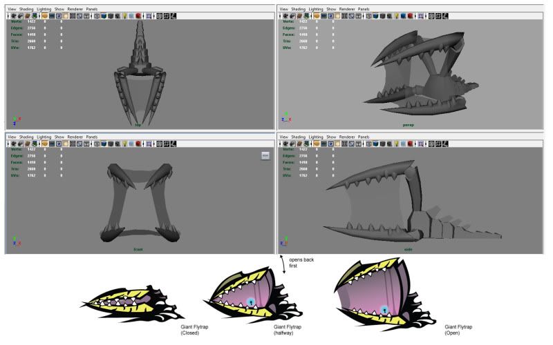
    Unfortunately I can't take too much time and have to jump around while I juggle between getting everything done and waiting for feedback from my teacher and teamates for each little part of the project. The clock is running down on us hard. I did try to get this one down to final in one night so we can base the other creatures off of it.
  • LeoNp
    Options
    Offline / Send Message
    LeoNp polycounter lvl 13
    Hey,
    Looks good, but still to blue. He really needs some kind of second tone, that can stull be a Bue variant, but needs to show the natural way creatures evolve a top coat color and underbelly color. Reference a couple of animals and show the reference on next post.

    Any luck on getting more of the spaceships, claws, etc organized?

    -P
  • Jessica Dinh
    Options
    Offline / Send Message
    Jessica Dinh polycounter lvl 10
    HAHA that thing is really, really cute! But I do agree with him needing more color, and also maybe stretch his tail a bit longer and thinner like you have it in the concept.
  • Gcanlas
    Options
    Offline / Send Message
    Thanks, Just saw your comment Jessica and I agree on the tail. I'll be sure to stretch it out when it comes to the final model and rigging.


    Here's the sitter with a different color scheme, and the reference that I used.
    sitter_02_preview.jpg

    Here is the window concept. This si more of an idea than antything close to final. I have it set up to where you can rotate it any way to change it up and I have a seperate plane with a little glowy holographic fence thing. I though I could maybe make a few different pieces for that inside part, some with broken parts, pipes, glass panes, etc...
    window_preview.jpg
  • Gcanlas
    Options
    Offline / Send Message
    I reworked the window.

    window_rework02.jpg

    completed my tileable techy wall materials, 6 different variants complete with normals and specs. And here are the completed vines that are just alpha'd planes.

    vinespreview.jpg
  • Gcanlas
    Options
    Offline / Send Message
    Seeing as how the materials I was creating were very disconected from the other assets. I wanted to try handpainting a tile. The one on the left is the painted one with a simple normal map. The one on the right is the same except the color map is just solid colors.

    newtilecomparison_01-1.jpg


    This one, I only changed the one on the right by removing the normal and spec from it so its a super basic, solid color texture.

    newtilecomparison_02.jpg

    To team: Please let me know what you think as soon as you can. I have one more thing to try and thats going to be trying to do a detailed vector color map. I think I'm going to tackle that tomorrow and we should be able to nail this down from there and I'll still have time to move on to the other tasks.
  • Gcanlas
    Options
    Offline / Send Message
    As promised, I have a new style to try out, with some subtle gradients. The second set has another texture multiplied through the material to break it up a bit. Another note, how is the red accent color?

    3style_concept01.jpg
    3style_concept02.jpg
  • Gcanlas
    Options
    Offline / Send Message
    Worked on the CamoToad today.

    CamoToad_preview.jpg
  • kfsps83
    Options
    Offline / Send Message
  • MrNinjutsu
    Options
    Offline / Send Message
    MrNinjutsu greentooth
    I think the Sitter pretty nice in UDK, although i'm not too sure on the environment assets you've done so far, they seem to be too flat (Which, i'm leaning towards C). I think it may be due to the foliage, maybe paint in some shadows or Ambient occlusion around the edges to make it pop more?
  • Gcanlas
    Options
    Offline / Send Message
    Thanks, We're trying to styalize it in a weird way, referencing games like el sheddai and insanely twisted shadow planet and the like. The game over all might turn out flattish but might fit in with the style. its fustrating for me to say the least.

    was playing with this again. but I'm still not happy with it.
    01.jpg

    messed with the window texture again. Its just a diffuse with a detailed spec map.
    03.jpg
    02.jpg
  • Gcanlas
    Options
    Offline / Send Message
    sec1.jpg

    this is part of the level concpet i came up with last quarter, But i don't know where i'm going now.


    starting to block in the style for the smaller hard surface objects.
    4.jpg

    I already have plans for the next pass, but will gladly take suggestions (as i desperately need some)

    here is a screen i stole from my team mate at one of the previous passes at the level design. To give you a better idea of whats happening in my jumbled thread.

    1121pic3.jpg
  • Gcanlas
    Options
    Offline / Send Message
    i figured out all the weird artifacts and redid the hanging plants.

    hangingplantspreview.jpg
  • Gcanlas
    Options
    Offline / Send Message
    the rest of the plants. Turns out decals aren't as complicated as i thought. But, billboards are. so i skipped that part. I'm wondering how hard it would be to apply wind.
    plantspreview.jpg
Sign In or Register to comment.