The BRAWL² Tournament Challenge has been announced!
It starts May 12, and ends Oct 17. Let's see what you got!
https://polycount.com/discussion/237047/the-brawl²-tournament
It starts May 12, and ends Oct 17. Let's see what you got!
https://polycount.com/discussion/237047/the-brawl²-tournament
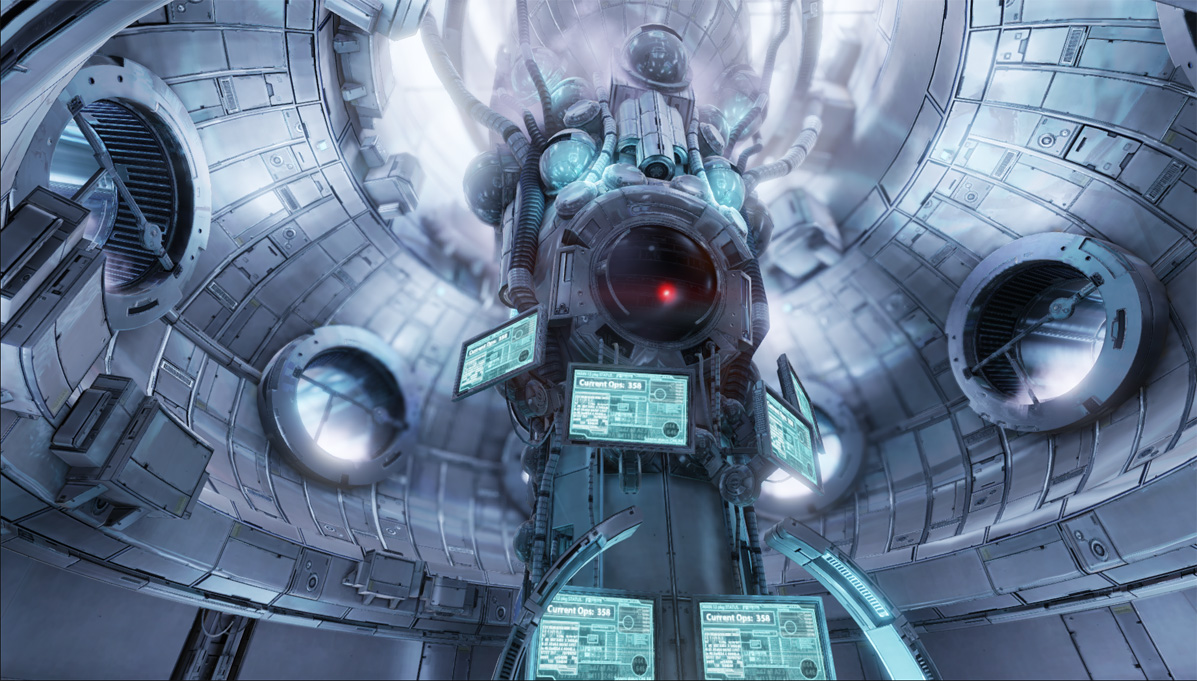
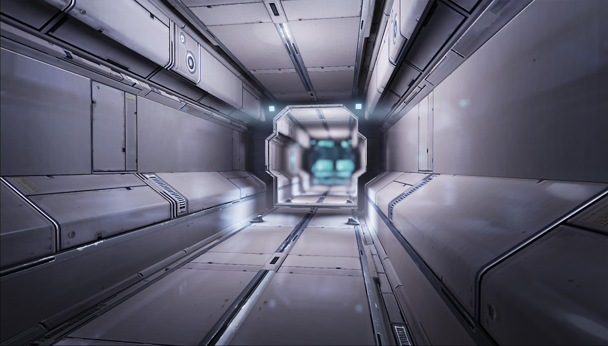
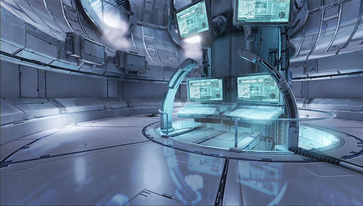
Datacore UDK environment
A small environment i made lately. Uses very few textures, a bit of an exercise in using modular textures. 90% of the scene (including the corridor, walls, most of the main stalk, doors, lamps) uses one 1024*512 texture. Totalt scene polycount is 69k triangles  Played around some with particles and light functions, and made those work together, and had some fun animating the screens aswell. :] Using UDK, of course :]
[ame=" http://www.youtube.com/watch?v=KQkDnK6T0w0"]DataCore UDK - YouTube[/ame]
[ame="
 http://www.youtube.com/watch?v=KQkDnK6T0w0"]DataCore UDK - YouTube[/ame]


Replies
why did i have the feeling when i first started watching the video that it was your work? hehe hadnt seen the OP id, but your work is really stylistic. congrats. immediately recognizable.
id have one thing to ask: could you give us a glimpse on how you made that metal material? it looks wonderful, and its so hard to achieve that look, at least for me!
and again, congratulations
If possible, could you post a wire frame and texture sheet. Thank-you and well done dude.
Gorgeous work. Would like to see textures as well, fitting that into one 1024x512 is impressive.
Banner this! Just, wow.
also, yes, some breakdowns or at least just the texture would be really interesting to see.
Also I wish more stuff would happen during the video. Maybe some monitors "blinking" with interference, this red "eye" thing moving around looking at stuff, some color lights twinkle here and there. Not really a fan of panning numbers at 0.50 seconds in particular. Also some more red color accents would work nicely imo, like lighting up the control panel at the bottom with red. Cool light functions in those steam exhausting tubes, maybe a few fans in there could add some motion into the scene, though they would mostly cover those great light functions. Or maybe a fan at the top? so the lighting would become slightly dynamic as well.
Anyway those are just a bunch of ideas your way, great job as usual, pal.
Keep it up!
+1
+2
Seriously loving this scene, it has a great atmosphere and a visually arresting style. That you've managed to created this with one 1024x512 is a technical marvel. Great work.
d1ver: yeah, i wanted to avoid the flickering monitors cause its so cliche :] And the panner numbers is actually just a part of the monitor texture, heh.. just wanted to break it up a little so i threw that in there.
Ah, i said 90% of the environment used that texture, however, there are a few other textures
Nice little map, looking forward to texture flats as well.
BradleyWascher: yeah, its very subtle.. ^^ Not really used to particles, so didnt spend too much tweaking it, also didnt want them to take up too much focus.
Sandro: not really, just a few polys extra here and there, in general the meshes are very cheap.
Here is a short video of the shader on the screens at work. Eh, a bit laggy, didnt have the same framerate in the video and in the recording, whoops :] The shader is one texture, with a whole lot of masks, clamps and stuff going on :]
I think the reflection is a little too strong. In the hallway its fine, but on the main...er...thing...it seems like its a little too much.
Seems like you were pretty smart about UV layout and whatnot, if you were only using such a small single texture. I know its been asked already, but can we see that?
gsokol: i was actually using several textures if you read my earlier posts, but most if it was built using one texture. And yes, the reflections are a bit too strong maybe, I am cheating alot with the reflections, might have overdone it a bit...heh ^^
Well, here it is. Its not even that modular, I actually really didnt plan ahead that well, I just made two pieces with it, and then I figured I might aswell keep at it, if I intended from the start to make the whole scene out of one texture I would have made it differently, improving both visuals and performance, but hey... next time maybe
1. The reflections are a bit strong.
2. You could use some different images on the screens, would make it a bit more believeable
My only issue with it is, I'm not sure whether the wall panels are supposed to be metal or plastic, but other than that looks sweet
also:
Spajsat: yo! You old lurker!
Perfect_Rolemodel: not really much to see :] Where its lighter, there are some pointlights. Pretty much it. Its just a bunch of pointlights :]
Zpanzer: Hmm, yes, but i LIKE reflections ^___^ and also Im lazy and wanted to finish it, so I didnt make variations.. I should though. Hmm.
toxic_h20: its all in the material :] Using both cubemaps and a screencaptureactor in this scene.
e-freak: wierd DOF? Could you please explain what you mean? :] Its a bit poorly done though, would have needed to animate the DOF to get a good result I think.
Hmm..have a whole bunch of things i want to fix now.. might go back and revisit this and fix some of the more glaring issues... :]
and if you really want to go for strong DoF in some of the shots, it might be better to have a static camera and a travelling dof (like you said, animate it). any chance you release the environment for learning purpose? it's itching me to do some camera drives
tillable/modular textures/materials are so much better for workflow and performance and (shockingly) when used right for visuals as you have proven here !!!