Lombos - ArenaNet Creature
polycounter lvl 6
I've learned so much doing this test no matter what happens every second spent on it was worth it. This is the first time I've done normals and the first time I've done a spec map. I'm pretty happy with how it turned out. I definitely struggled through some parts and have a much better idea on how to approach things for the next model I make.
First ever complete games model....I have this satisfied feeling...I'm excited to send these out then go buy Gears3 and be lazy for a few days! :poly121:
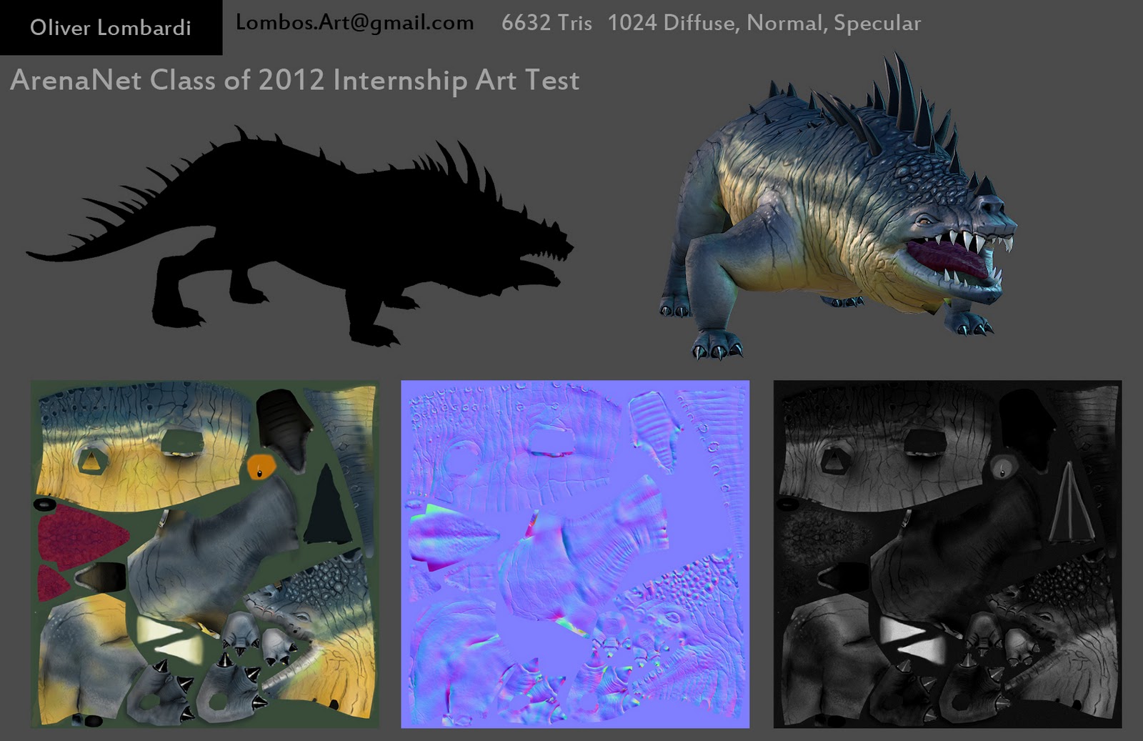
I'm very open to any critiques or comments. Will be sending these out tomorrow afternoon/evening and have time for last minute tweeks.
Thanks for checking it out!
- Lombos
First ever complete games model....I have this satisfied feeling...I'm excited to send these out then go buy Gears3 and be lazy for a few days! :poly121:
I'm very open to any critiques or comments. Will be sending these out tomorrow afternoon/evening and have time for last minute tweeks.
Thanks for checking it out!
- Lombos
Replies
I'd like to see a little more love in the legs, front and back, and maybe it's nothing, but the wrinkles or folds or whatever, along the body seem a bit too similar in depth. I think where it would bend more, like around the neck and legs, might have a little bit more dark or depth added.
From what I've been seeing from others doing this one, a popular crits is to angle up the pose a little bit, like have a more aggressive peak at the back/shoulder area. Most of the other peoples, including yours, looks more like he's squatting, you know? In the mose, he's more hunkered down in the front, almost an aggressive-defensive sort of stance.
Don't be afraid to have harsher transitions with the colors, they come out a little blur, try to sharpen the edge a little, not much. Like the concept has these fairly prominent stripes running across, and they vary a bit from the yellow, more as a beige, and just subtly stand out.
Good job getting it done, oh, I'd brighten or saturate the eye a little more too.
Looks nice, good topology, nice distribution to the spikes too.
How's about posting some of the WIP stuff? Always nice to see.
Ya I took another look today and totally agree about the 2nd image. So I re did it... Also, I think I lost some of the subtleties from the sculpt. That's something I'm working on pushing, less subtle more bold! I can definitely see I should push that even more as it seems you lose quite a bit when doing normals.
I think part of this too is the legs are staggered in the Concept. I wasn't sure if they would want to see it posed, but this is definitely something I will do in the near future as I will be using this as a portfolio piece. An aggressive pose, with a sand / dirty base..... and wearing a top hat.... ;o)
ah ya, can see that now. I had the stripes too straight and even...so while trying to break that up I blured too much in the process. Something I will definitely go back and change.
Sure thing! I'll do a post after this about the process and with some WIPs.
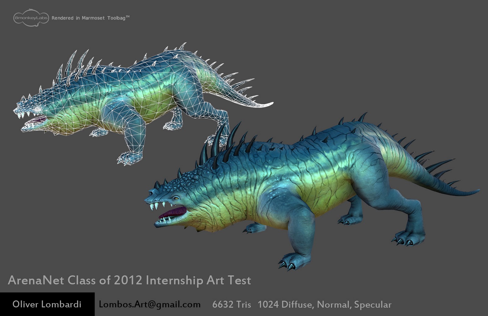
... New renders...
Really appreciate the Crit!
Thanks,
-Lombos
Long :
1. First, I created the base mesh for the body in Maya. I did a quick simple blocking out of the forms and brought it into Zbrush. Here I stayed in the 1st Sub-D and just adjusted things with the Move Topo brush and gave it better shape.
2. Next I made reference sheets. Even tho a solid concept was drawn out, I find it's nice to have something else to inspire or refer to.
Here's an example of one :
3. I used Poly cones for the spikes / teeth / claws. So I positioned and rotated them all how I liked.
4. Time to sculpt! My favorite part.
I have to attribute a lot of what I'm about to write to Mutte, check out his Zbrush thread ( Mutte ). I have a subscription to 3D Artist Magazine where he did a write up so I picked up a lot of his techniques.
I had already blocked out a silhouette I was happy with in step one, so from there I step up a few Sub-Ds mainly using Clay Buildup, Clay, and Smooth to start building out forms. Standard brush with Alpha 38 for some of the big creases / cutting into forms / separating forums etc etc..
From here I jumped up another Sub D started using the Dam Standard to block out the wrinkles. Also using the Inflate on the skin between the wrinkles to pop them out a bit. Lazy Mouse comes in handy here for the long wrinkles.
Displacement Brush. One of my new best friends. Amazing for when you get to that point where you need to start adding finer detail. Stepped up a Sub-D and everything was too smooth so I used the Displacement Brush with Alpha 25 on spray with a low intensity. It really breaks up the skin.
Last Sub-D hitting around 10 mil polys.. cleaning up wrinkles, adding fine details, more displacement brush with different Alphas! Just playing around with it, really fun. Did a cavity mask and went to the Deformation tab and did a really low inflate...like 0.3. Just pushes the wrinkles etc a little more.
That's the basics of what I did.
Finished Sculpt! :
5. Poly Paint time!!! I did a quick Poly Paint to block out colors, A lot of spray brush with alphas. Also, I am Red-green color blind. So I have people check colors for me incase my yellows are getting a bit green... I know the color wheel so it usually isn't a problem, but I find while poly painting the color I'm picking isn't exactly how it shows up on the model. Maybe do to the material I had selected.
6. Fun's over! Back into Maya... I imported a mid level mesh (spikes, teeth, and all) put it in its own layer and made it wire frame and not selectable. I used the mesh from Sub-D level 1 and started using that as a base for the Low Poly mesh.
7. UVs! Low poly being done I started up Headus and brought everything in and cut it up. By far the easiest way to do UVs that I've ever done. Cut up and messy, I brought it back to maya and overlapped the parts of the UVs that I could, then cleaned it all up. With the finished up UVd low poly mesh I knew I would use Xnormal for my mapping needs, so I triangulated the mesh and duplicated it. I used the Push Normals tool in maya on the duplicate to make a cage for Xnormal.
8. Xnormal! Went back into Zbrush and did quick n dirty GuV tiles. I mapped the Normals, AO, and Poly Paint with Xnormal. I did parts seperately.... The tongue on its own and the body own its own. I did not map the spikes/teeth/claws
9. Photoshop texture work. Painted in spikes/teeth/claws... and reworked the colors. Combined normal maps. Painted spec.
10. Marmoset ToolBag Renders!
Cliffs :
1. Maya base mesh
2. Reference images
3. Poly cones for Spikes n Stuff
4. SCULPTING TIME
5. Polypaint
6. Low Poly -Maya
7. Uvd - Headus
8. Xnormal
9. Photoshop texure clean up and maps.
10. ToolBag Render.
That's about it. Feel free to ask questions or comment!
Thanks
-Lombos
I've never used the displace brush, but it sounds pretty interesting, the next thing I make I want to try it on.
I have a question about why you did a GuV on the highpoly?
That sucks about the color-blind thing, I got a friend too, I tend to screw with him about it, yeah, I'm an asshole. I guess you'd being doing a lot of saturation checks? Good thing either way is color is pretty secondary.
Good job with the WIP really nice and long.
I thought of one more thing that might help,
Might derive from the concept, but hey, it's your own spin.