3D Artist looking for critiques
I am a 3D artist who graduated from the Art Institute of Pittsburgh in March of this year. I am currently employed as a digital printer working 40 hours/week and making $12/hr... which is okay, but I really want to push for a job in my field. I'm going to be completely revamping my portfolio, but I need some advice on where I should take it. What do I need to improve upon, what works, what doesn't, etc.
Here's a link to my online portfolio.
Here's a link to my online portfolio.
Replies
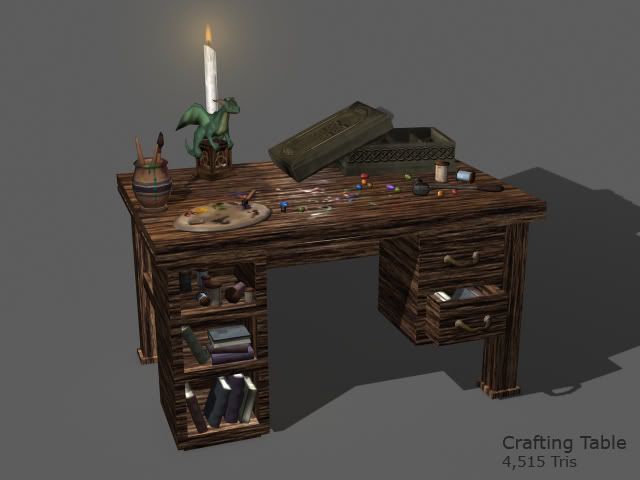
The texture on that table is.. not good. The items on the table look pretty decent but it looks like no care was taken in texturing the table itself at all, and it really detracts. it just looks like fibers from photoshop and just has way too much contrast for what ti is. Just look up some reference and put the same thought into that as you did some other objects.
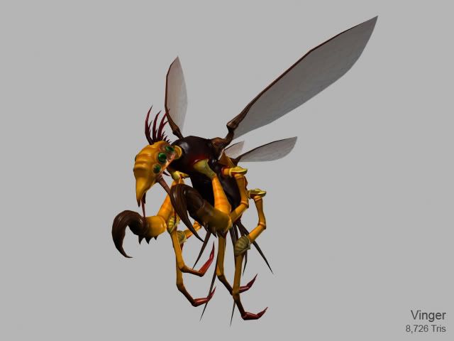
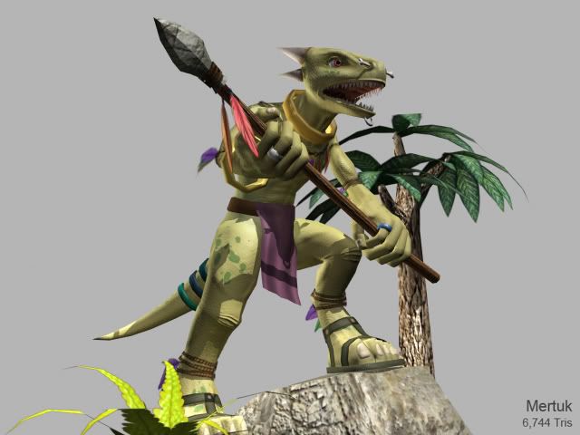
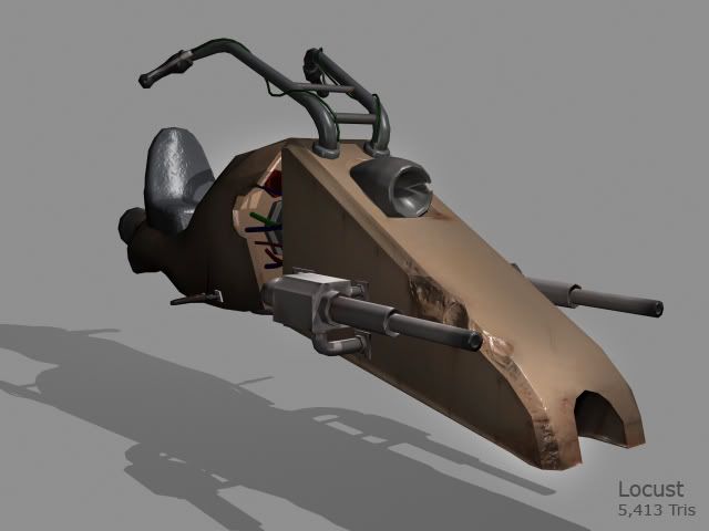
In general, I would say your textures are your weakest point. They seem a bit simple. I think that kind of works for some of your stuff, like your dino character - looking kind of cartoony and cute. But there are other things that could really use a lot more love material wise, like your locust vehicle. Really think about how your diffuse, specular, and normal maps are working together to create the material you desire - look up references of the types of materials you're trying to emulate.
Just my initial thoughts. Nice work and good luck
edit:
also, the way you're displaying your texture layouts is a bit disorienting. I'd much rather just see the entire square so I can get a better sense of how well you take advantage of your uv space.
I challenge you to push yourself further and come up with dynamic ways to present these great pieces.
I would say work on concepting and modeling separately. Being able to concept as well as model would make you a huge asset for any company, but you're models are going to continue to lack as long as your concepts do.
I would also say focus on either characters or props. They are both very different traits and both take a long time to figure out. Especially for someone who is just starting out, you need to have a more focused portfolio.
For your modeling, i would say really try doing someone elses concept The harder the concept the better of course. Your texturing is very lacking. A lot of your pieces look flat shaded, with no texturing on them what so ever (the speeder bike specifically). There are no levels of detail on it, everything is just big pieces and solid colors. Overlay some metal textures, and add some unique scratches and grunge to give the bike a story. You kind of did that to the front there with the indention which was nice. But you don't compliment that indention with texture detail. There is no paint chipping or anything.
The wood table looks like you literally just used 100% photo sourced textures, and no HP modeling. High poly model the table first, as a basic looking piece....so that the normals catch nicely on the surfaces and edges. Take in some wood textures (photosourced) and tweak them in photoshop to give it some unique edge wear. Never just lay in a picture of wood and leave it.
Also use reference and watch tutorials! I can tell you don't really do either of those things. Just keep going and dont give up! You are on the right track, just keep pushing yourself.
- I have a weak overall presentation.
- I have "Incredibly weak" texture work
- The way the textures are displayed is "disorienting"
- My portfolio pieces require better global illumination
- If possible, my portfolio should be themed
- Work from other peoples' concepts, not my own
- I should maintain a more "focused" portfolio and display either characters OR props
- I need to use references and watch more tutorial videos
Thanks again to everyone who has helped me out