Dreams (WIP)
polycounter lvl 7
So, I decided, against all my good natured advice to myself, to try and post up a level here and get some critique, my advice to myself I gave simply because I dont think my work is nearly good enough compared to some of the shiz I see on here. But I want to get better, and this level I want to be the best I can make it. Anyway, this is about 30% done in my opinion, I have alot to edit and go back to, and the models of a few things need editing.
Some of the more technical crap is on my blog at
http://imake3dthings.blogspot.com/
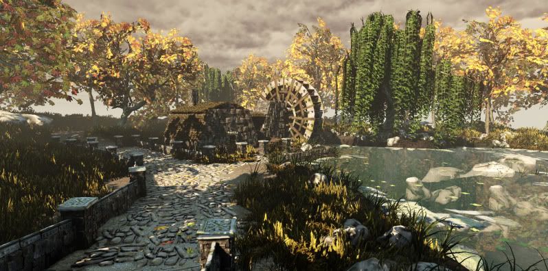
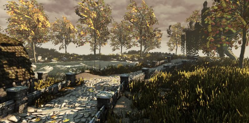
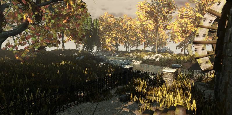
Here are the three major recent screens,
Please feel free to destroy me in critiques and comments, anything
thatll work on making me a better artist...I need to read up on learning
how to transfer normals better and do some better shader scripting
Also my water sucks...
Also, does anyone know to make a material gradually fade out if its masked,
I wasnt sure if that was possible, but the pond scum would look better
if that was possible.
Cheers
Anthony
www.abework.com
Some of the more technical crap is on my blog at
http://imake3dthings.blogspot.com/
Here are the three major recent screens,
Please feel free to destroy me in critiques and comments, anything
thatll work on making me a better artist...I need to read up on learning
how to transfer normals better and do some better shader scripting
Also my water sucks...
Also, does anyone know to make a material gradually fade out if its masked,
I wasnt sure if that was possible, but the pond scum would look better
if that was possible.
Cheers
Anthony
www.abework.com
Replies
http://www.hourences.com/ue3-water-outdoors/ <-A good UDK water tutorial. Its a bit complex but you can simplify it to your needs.
The shadowing on the grass is pretty harsh, grass is fairly translucent and lets a lot of light pass through itself. It does a lot of sub-surface scattering which you'll have to fake to a good degree. If you can adjust the self illumination of the grass that can help wash out the shadows. You often want this does as a gradient so the lower parts of the grass aren't glowing quite as much as the top. The scale of the grass seems pretty big too, which is throwing things off a bit.
You might want to cover less ground in grass and do some more material blending on the ground. That's a pretty big part of environment art and something potential employees would be looking for.
The thickness of the stone walls seems really thin.
It seems like like its fall in the scene as everything seems to be turning, except that one ultra green tree. Speaking of that tree the material seems to repeat quite often. Is that the tiling in the material or did you build the material by copying pieces? You should make the material tile but you don' want it that obvious. If you created a unique material by ctrl-c ctrl-v then it needs to be broken up a bit more.
The spec on the ground seems to have the same level of shine to it. It can help greatly to define the rocks and the ground as separate objects if they have different specular qualities.
I think you should better define the white bricks running around the top of the fence. The brickwork between the fence posts tends to get lost in the shadows.
It seems like some of the pegs/boards on the wheel in the last shot are floating?
To help fill out the trees you could add a few cuts to your leaf planes and twist and distort them so they aren't so flat. It can also help free up processing power by cropping the dead space around the leaves as tightly as possible. The less transparent pixels you have floating around the scene the better the scene will run.
A good way to get noisy leaf planes is to take a plane, map a branch/leaf pattern to it
Subdivide it once or twice, then pull some verts around with soft selection on.
Then apply a noise modifier.
Then optimize it. If you're using 3dsmax use ProOptimize it will protect the material and keep it from tearing apart.
You can then adjust the parameters of the noise and pro Optimize to fill out a tree.
Overall I like your composition and the lighting is pretty good if you polish up a few things I think you'll have something really great for your portfolio!
Wow, that is alot of advice, thank you, as far as the grass, I don't know much about sub surface scattering, so I will have to research that one. I can try and mock it through the self illumination i guess, if you have any tutorials or articles on that one throw me a link. Its meant to be tall and thick, its like those large grain fields, where it stands out and its all golden and shit, this doesnt look to much like it because the issue your talking about with its shadowing, so its a little harder to make it appear for what im going for.
The tree thats ultra green, no matter where i looked willow's always seem green, maybe ill desaturate it a little and try and yellow tone in to fit in a little better, but I thought it added a nice breakup, especially when the dock goes in next to it with a couple of objects I wanted to stand out. How i did that tree, was used the same trunk as the other tree, but created one branch with a texture on it, and then move it everywhere on the tree, if you think it would look better, I can instance the material and shade it slightly different and use that as a second source material on the mesh, ya thats probably what I will do sicne I had that issue staring at it feeling it was too instanced. The mesh detail is on my blog.
The branch I agree, does not look full enough, and I need to figure out how to better make this look
Here is the mesh right now
So any words from there on to try and make it look better, let me know, I will try and apply what you said alread to make it more full.
As far as the specular, thats something I need to research and look better into as I mentioned shaders arent the best of my skills, while I can do pretty ok with them, I still need to learn some, to start getting that extra little bit of definition, so I will definitely look into starting with defining specular
Those pegs arent floating, I forgot I changed the lightmap on that guy and did build.
Also what should I be doing to better define the top bricks like you mentioned.
This is all done in UDK latest version too.
thanks danny, and ya its all in game, not to be part of any game or anything that I know of lol, just working on my portfolio and such.
The grass looks much better with the diffuse breakup to its not so intensely shadowed, and shows off the long grain idea of it a little better.
Also went through and created new water, so its more dynamic and looks more realistic (thanks for the hourences link)
Worked on some of the specular setups to make the rocks stand out (not that noticeable in screens yet)
Still some modeling re purposing to do, but I saw the ArenaNet art test so im gona switch gears for the week, cause im learning about that a little late but hey why not.