brawl street fighter level completed
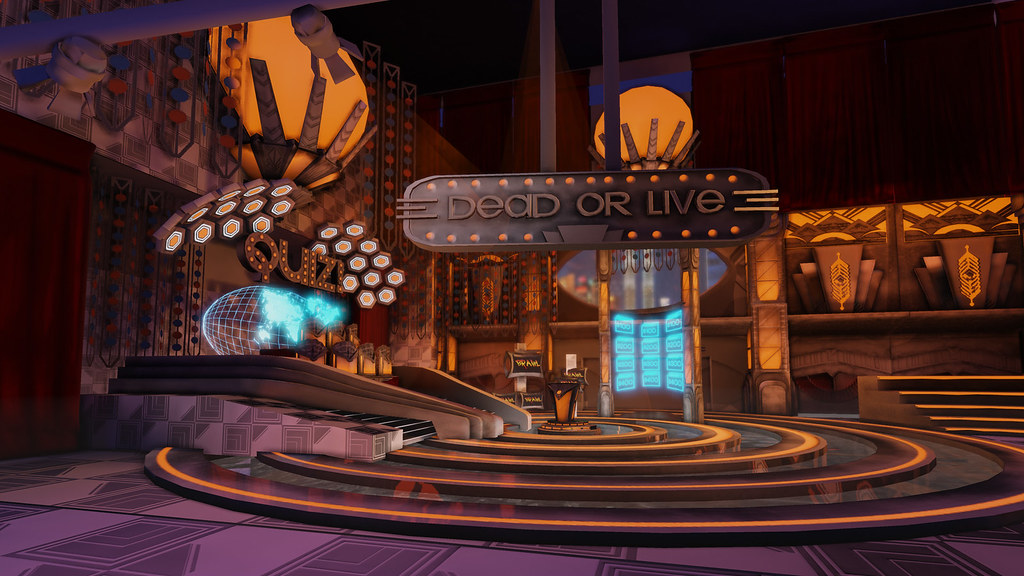
Well Wow i have not posted here in so long but am glad to say i was holding out to show a polished enviorment that i entered in to the brawl contest. I was not really able to polish it off the way i wanted to for the contest but i have been looking it over and self critiquing it. The first pics is the one i used for the contest while the second is the polished off one
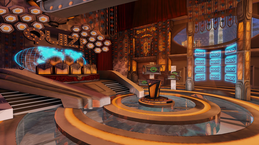
And now the finished version
I think it says a bit about what you can do with a level to push it even after you have finished texturing and modeling. Ironically the first levels texture usage was very in inefficient and and did not go with the guide lines of the contest. It to little to late but the new levels texture space if within the guide lines.(i went out my way to optimize it as much as possible)
Replies
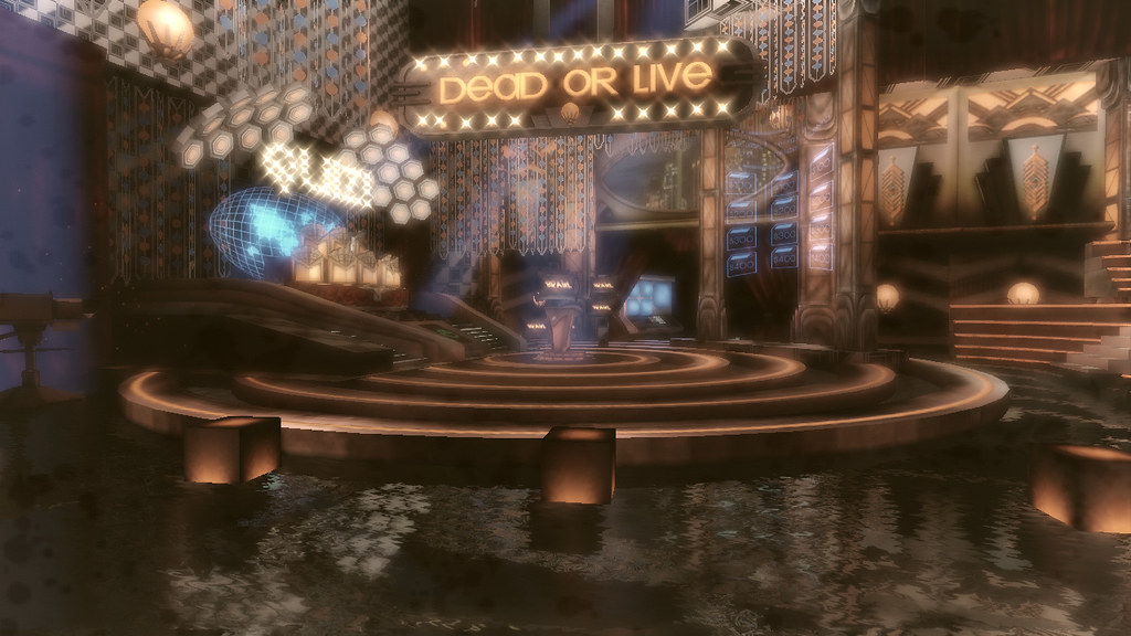
edit - also, the final version definitely looks worse. Very brown bloom brown nextgen gritty ew.
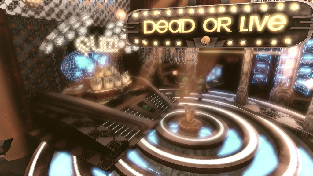
In the first one, it looks like a silly bright game show set that would have the cheeseball announcer with the slicked back hairdo. (you know the one) It makes sense, has a cheerful slightly vintage look, and it fits perfectly in that context.
The second one is a game show TV set floating in a sea of (nicely rendered) water? Why? (and how?!) It's so gloomy and dark it lost the bright silly vibes and now looks like there should be zombies or something coming out of the curtains.
So what's the story behind this thing? What are you trying to go for atmosphere-wise?
The older image was also much more interesting, remarkable and vibrant than the current one.
Why is there water on the floor? It looks really out of place.
The font for the signage doesn't really inspire me to fight.
Also in terms of lighting, theres just no atmosphere. Play with a very, very faint layer of fog, and at least some post processing. ATM, it looks overly bland.
Also as far as I can tell... There no shadowing? Why? Its really obvious here.