ArenaNet Internship Art Test- Mrandk
Hallo everyone! I'm gonna take my stab at the 2012 internship application test for character art.
For those of you interested in the internship you can find more about it here at http://www.arena.net/blog/arenanet-class-of-2012-internship-program-now-accepting-applications
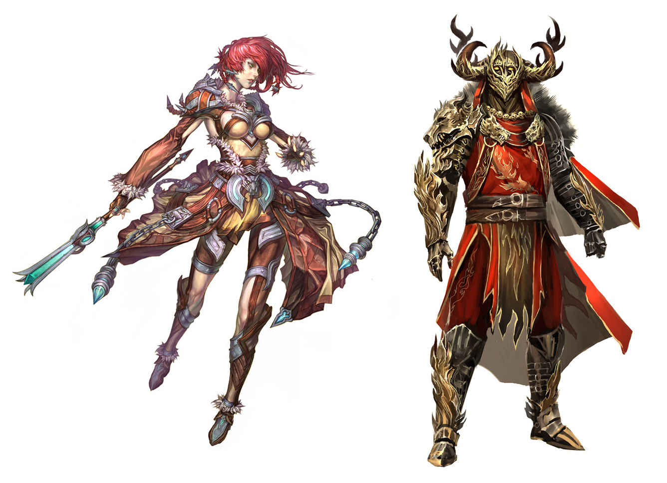
I've chosen to do the elementalist for my test. Here is the concept I am supposed to go off of.
I finished my base mesh tonight for the most part.
She's sitting at around 7.3k of the allowed 7.5k so I'm gonna probably "trim" some tri's from her hair (cause its all sorts of buggered up) in order to save room for the staff.
(Not sure if its required for her test but I still wanna do it).
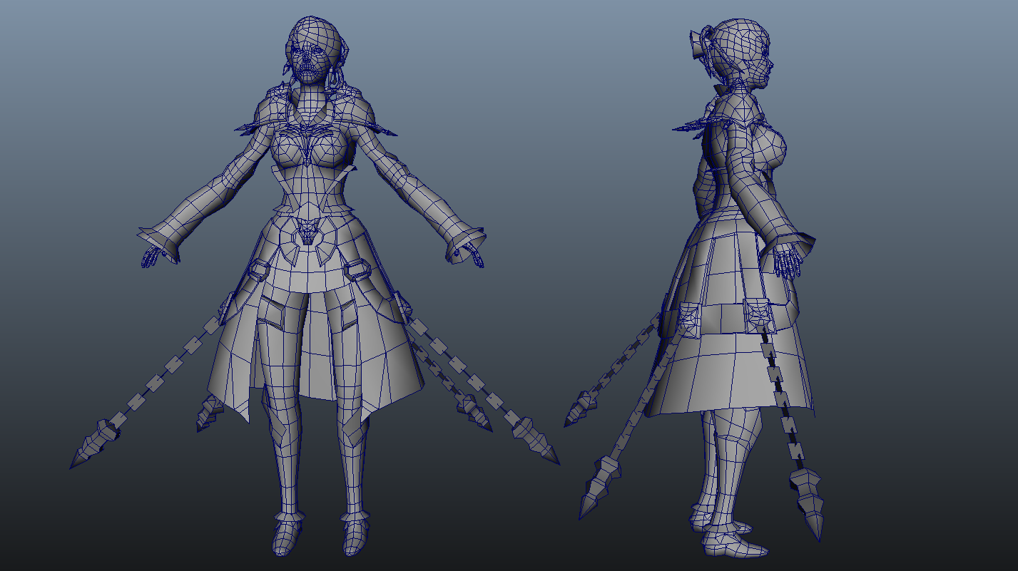
The hardest part about this gal was getting the sleeves and fur cards to line up properly for when I paint weights.
I'll start sculpting In about an hr and try to get an update before I go to sleep.
CRITIQUES ARE VERY MUCH WELCOME!
For those of you interested in the internship you can find more about it here at http://www.arena.net/blog/arenanet-class-of-2012-internship-program-now-accepting-applications
I've chosen to do the elementalist for my test. Here is the concept I am supposed to go off of.
I finished my base mesh tonight for the most part.
She's sitting at around 7.3k of the allowed 7.5k so I'm gonna probably "trim" some tri's from her hair (cause its all sorts of buggered up) in order to save room for the staff.
(Not sure if its required for her test but I still wanna do it).
The hardest part about this gal was getting the sleeves and fur cards to line up properly for when I paint weights.
I'll start sculpting In about an hr and try to get an update before I go to sleep.
CRITIQUES ARE VERY MUCH WELCOME!
Replies
Its looking good so far, the proportions are real nice. I'm looking forward to your updates
@Funky: Thanks for the support man!
Here is where I am right now: I have made some proportion tweaks mostly with the legs and their warpyness, feet, and size of the head.
(The chain and other "missing" parts have been deleted as they are merely duplicates that I will place after the bakes are complete.)
I am pretty much finishing off with the sculpt and am in process of uv'ing I'm gonna have to kick it into top gear because I still have to finish my reel for finals. I hope I get this done in time!
Critiques as always are welcome!
You've got proportions nailed pretty well, it's hard for me to find any flaws. I notice some differences in the face area, maybe a little too long? I remember, for a better read, that a woman's chin to jawbone is more acute, rather than round. But hey, I'm an environment artist, and I've glaring back and forth looking for imperfections. It's hard to find anything without sounding too nit-picky.
Good job Mandrk! You does a good woman.
Oh oh, now I see something, the breast and stomach area is smooth, maybe some texture noise? Painted or modelled, I don't think it would matter. It looks like a soft leather or else cloth, be nice to have some subtle wrinkles, considering it looks skin tight.
I turned in my test a few hours ago, I've been just awful at posting updates, kinda went into a work-frenzy to get this done in time. I'm not as happy with the final result as I would have liked to have been. Demo reel took up more time than i thought, at this point I am happy to have finished it on time. Tired to get the pose of the original concept for my presentation but due to a lack of time to properly rig it i couldn't get it as dynamic as the original. Anyways heres the shots:
These renders I don't find doing her justice, I know you were pressed for time, but maybe you could still get it to that little bit further completion. She's lacking some nice dynamic and mood setting shadows. Nothing fancy either, maybe a quick 3 point setup will make it look nice.
And what happened to her weapon? It'd be nice to see those bluish-greenish-turqoisy parts glow a bit, I think they have a subtle glow in the concept, but those would definitely push a nice dynamic balance.
Anyways, I hear birds, so it means I should sleep, good job man!
I really appreciate your input
Half it down in fotoshoppe and it'll get that nice fakes AA, no annoying stair steps.
Turns out my email submission kept failing due to the size of the compressed file and was never actually turned in. Which surprised me since the folder was only 6mb.
When it failed it sent the message to my spam so I never found out till I got paranoid and checked the spam box, Way to go internets XD
but it's hopefully in now, havent gotten a failure email from the inbox yet and i can get some sleep finally, I appreciate the feedback you guys have given me.
Butthair goodluck on your environment submission. I loved how you did the environment test, it has a ton of character to it!
[EDIT: I dunno whats up with my image hosting, the actual image is much crisper. Heres a link to it : http://4.bp.blogspot.com/-UcXjc1mrbeo/TnuHsi7U1HI/AAAAAAAAANY/I8aj9amU2fU/s1600/Presentation_Shot.png ]
I got a failure warning too after I first submitted mine, but this time Yahoo actually had the decency to put it in my inbox~
That means alot yeman, you killed us all with your entry. If you don't mind i'd still like to hear your critiques so I can learn from them.
I dunno what caused me to look at the spam box for the failure notices, if i didn't I probably wouldn't have ever known I had not turned it in.
It's just the shape of the skirt makes here look somehow less attractive from the side view while the front view looks great. I understand it's how the skirt occludes a big part of the legs. I think one way to fix it is to use those metal plates around the side of the skirt to your advantage. Use it as weights to drag that part of the skirt down thus creates an angle to the skirt and pops the hip. Also exaggerate the curvature from neck down to the hip and abdomen, and add a little form variance around the back part of her knee and upper shin should help enhance her silhouette from the side.
Just my two cents. Hope it makes sense.
Try something like this (excuse shittyness, only have MSpaint here):
yeman, is this what you were talking about?
Snader Thats some pretty baller ms paint editing, i agree with you on the direction of the shot. when i get back to presenting my changes i will be sure to keep what you have said in mind.
I also am doing another texture pass to try and get her tones more close to the concept and to soften up the face since it was a bit blotchy the first time around.
more changes to come in the next few days as I have just gotten back to re-texturing her dress and legs.
Critiques as always are welcome!