Home 3D Art Showcase & Critiques

Bronze Angel Statue

polycounter lvl 7
Offline / Send Message
Macattackk polycounter lvl 7
Hey, Im making a bronze angle statue for my friend's game.

Here is where im at as far as the zbrush sculpt and game model.

Still got a few more parts to finish on the sculpt and then gotta make the stand for it.

CURRENT PROGRESS:

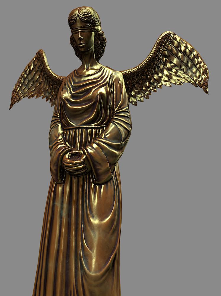
angel_closeup-1.jpg

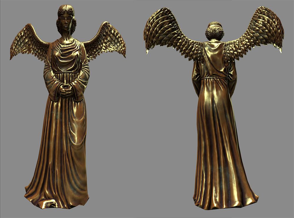
angel_frontback-2.jpg

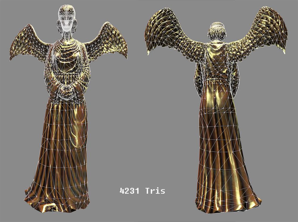
angel_wireframe-3.jpg

Replies

  • Shoy333
    Really love the texturing work on this I attempted to do a copper piece a while back and was really not sucessful at pulling it off could I see your texture flats and maybe a quick breakdown of how you textured it? Awesome job!
  • Macattackk
    Offline / Send Message
    Macattackk polycounter lvl 7
    ha, im not at the texturing point yet. that is just a shot of it in zbrush with a bronze matcap. i plan on making it look as close to that as possible though. its not even uved yet.
  • Shoy333
    Ah lol I was loving that bronze :P
  • Two Listen
    Offline / Send Message
    Two Listen polycount sponsor
    I don't think the folds on the entire torso and arms even resemble cloth right now.

    b447e1ae94c30b0d896ad04be2bb.jpg

    Sometimes less is more.
  • Jon Jow
    Inspiring texture work, that bronze looks incredible ! Keep up the good work.
  • Macattackk
    Offline / Send Message
    Macattackk polycounter lvl 7
    made a bunch of updates to the sculpt. next is detailing the existing feathers and putting feathers on the back and varying the cloth a bit more. also the feet.

    Two Listen: yea youre right. im going for a lot of folds on purpose for a more stylized look. I reworked some of the cloth, hope this looks better. the stomach area is the part that needs the most work probably.

    front2.jpg

    front1.jpg

    side1.jpg

    back1.jpg
  • Sukotto
    Offline / Send Message
    Sukotto polycounter lvl 8
    I think in this case less is more. You have way to many folds going on the torso and arms, its a little straining on the eyes. And also vary the size of folds, not every single fold is the same size. And above all use reference. Cloth is one of the hardest things to get right. Also, don't sculpt cloth with symmetry on, its noticeable immediately.

    And about your wings, I would take another look at them, they read more as leaves than feathers. And not all the feathers on a birds wing are the same size, birdwing_lg.jpg

    Hope that helps
  • jordan.kocon
    Offline / Send Message
    jordan.kocon polycounter lvl 13
    I just wanted to repeat what Sukotto said, turn off the symmetry. Its the first thing I noticed. I really like it so far though, just use some more reference for the wrinkles.
  • chrisradsby
    Offline / Send Message
    chrisradsby polycounter lvl 15
    It feels like the wrinkles/folds are all the same size, maybe you should use the pinch-tool at some of the tighter spots? Turn off the bronze material as well and use a regular clay one. Save the bronze material for the texturing :) Make sure you nail the sculpt first.

    Good work so far :)
  • Macattackk
    Offline / Send Message
    Macattackk polycounter lvl 7
    yea, i wasnt looking at reference enough. i was just going with my own stylized look but everyone here is right too many wrinkles, and i was going to eventually resize them but i need to start from scratch. and i was using symmetry in order to save texture space but in a cloth piece like this, it needs to not be on in order to make it look correct.

    i want the wings to definitely be the leaf style i have right now. i am eventually going to detail them to make them look more like feathers but i dont want them too look like bird wings.

    chirsradsby: thanks, yea im gonna redo a lot of the cloth and make more varied parts. the bronze matcap is just being used to display. im using a zsketch and pewter material when sculpting
  • Macattackk
    Offline / Send Message
    Macattackk polycounter lvl 7
    alright its time to take the cloth way more seriously. the stuff previous to this im just calling a warm-up, though i will use some elements of it. here is a quick sketch i did of some of the parts to lay the ground work. ill rework them now then draw out the rest and work out the other parts after. i should have done this from the start. always go reference, then concept, then execute.

    keep in mind this is a very loose concept just to make sure i understand the flow im going for.

    IMG_2140.jpg
  • Sukotto
    Offline / Send Message
    Sukotto polycounter lvl 8
    You should also do some research of cloth principles as well, you may be able to make something look like cloth, but knowing why it looks that way always helps:

    Anchor points, all the different types(yes there are different types) weight and whatnot all help make cloth look right
  • Macattackk
    Offline / Send Message
    Macattackk polycounter lvl 7
    yea youre right sukotto. ill look that stuff up again.

    alright heres my progress on the upper torso. still more refining to do but gonna start on the arms now.

    angel3.jpg

    angel2.jpg

    angel1.jpg
  • butt_sahib
    Offline / Send Message
    butt_sahib polycounter lvl 11
    looking infinitely better!!! sweet :D
  • Macattackk
    Offline / Send Message
    Macattackk polycounter lvl 7
    thanks butt_sahib.

    arms are pretty far, still gonna go back and make more variations in things later.

    angel.jpg
  • Scampbell
    Offline / Send Message
    Scampbell polycounter lvl 7
    its looking allot better. you should get some hard ref and go off that because i feel cloth wouldn't really bunch up around the shoulder like that the weight of the cloth from the arm would pull that much tighter and would almost make it flat. The arms them self's are looking good though. keep it up
  • Azkur
    Offline / Send Message
    Azkur polycounter lvl 8
    its looking really good i just think you should touch the face a bit cause in this moment at least for me it looks more male than female maybe use some ref to get the overall facial structure looking more like a woman. Keep the good work!
  • Macattackk
    Offline / Send Message
    Macattackk polycounter lvl 7
    scampbell: thanks yea i will definitely smooth those out. they dont look right to me either. heres the reference i was using to get the bunched up shoulders:

    GardenAngelStatue7036503.jpg

    Azkur: thanks, your right. i think her cheak bones are too large right now
  • Azkur
    Offline / Send Message
    Azkur polycounter lvl 8
    no problem as my personal advice i would say make her jaw line go more in a triangle to the chin and soften it a bit cause the strong jaw line in my opinion its one of the the problems also making her cheeks rounder might help i hope this helps you
  • mjackson126
    I think you would benefit going down a few subd levels and really woriking in those primary forms.
  • Macattackk
    Offline / Send Message
    Macattackk polycounter lvl 7
    alright i updated her face more. working on the legs drapery and also added a blindfold which was part of the original concept. still more refining to do on all the new parts but its coming along. gonna keep the more stylized look for the bottom of the dress inorder to make it look more ethereal.

    front-1.jpg


    face_front.jpg
  • Macattackk
    Offline / Send Message
    Macattackk polycounter lvl 7
    update on the back side

    im having trouble deciding how exactly to sculpt the bottom part of her hair. if anyone has insight into that, it would be good to know.

    angel-1.jpg
  • Macattackk
    Offline / Send Message
    Macattackk polycounter lvl 7
    heres the front so far. I decided not to go with the dress blowing in the wind since it is not blowing in the rest of it and the hair is stationary as well. I tried it but in ended up not looking so great. I have some more polishing to do to get rid of the wobbly areas but im going to finish the back first.

    angel_front.jpg

    angel_back.jpg
  • SnaFuBAR
    The wings REALLY need to be fixed... there's no sense of anatomy behind them, and the feathers are just wrong. The back of them looks like loose skin, too. I hope you don't take it offensively but those are very glaring problems that are bringing the whole piece down.

    The wings and the cartoony bowl cut hair just need a redo.

    Please fix these, I think this could turn out nicely.
  • Robbyh
    I find it to crisp. but thats my view only. u should try for a more clay style - carving.
  • Macattackk
    Offline / Send Message
    Macattackk polycounter lvl 7
    @SnaFuBAR thanks yea now that you say it those parts do look wrong.

    @Robbyh do you have an example of what you mean by more clay style

    well i smoothed out the wings and am in the process of figuring out the best way to make the feathers. ill use bird wings as reference. also changed the hair, still sculpting that out.

    angel_front-1.jpg
  • nicafornica
    Offline / Send Message
    nicafornica polycounter lvl 7
    the hair looks much better and the folds are coming out rather nice. Fix up the arms folds (should follow the arm not be a pointy slope) make rounder. If you are going for an angelic face i would fatten up the cheeks a bit. You made improvements keep up the good work fella.
  • SnaFuBAR
    are you using zbrush? i saw a good tutorial before for creating feathers in zbrush, and if i recall correctly, it was on an eagle head. it followed the head shape, etc.
  • Macattackk
    Offline / Send Message
    Macattackk polycounter lvl 7
    nicafornica: thanks for the tips, i will check out the areas you talked about

    SnaFuBAR" yes its zbrush. i did check out the birds of prey tutorial but the thing is he is doing more of a stencil thing. his feathers are all generally the same size and shape. mine need to be different lengths and what not since they are wings.

    heres where im at so far. i finished the hands and hair. the blindfold is finished except for the folds that will come from her nose. just gotta find good reference for that

    i am still having trouble deciding the best way to do the feathers. im generally thinking i will use masks and inflat in the deformation and sculpt each feather from there. i tried mesh extraction but it cant handle the little slits that feathers have where the fibers separate.

    the trouble im having is deciding how im going to correctly match the feathers of the front and the back. im going to have to use alpha at the ends of the wings where the feathers wont be. the problem will be matching up the front and back feather shapes so the alphas match each other. i am unsure the best way to do this.

    1-1.jpg

    2-1.jpg
  • alloa
  • Macattackk
    Offline / Send Message
    Macattackk polycounter lvl 7
    thanks alloa, yea im going to go for that sort of thing im just having trouble figuring out how to get the feather shapes on the ends of the wings like he has.

    here is an update with everything pretty much done except for the wings and the feet. im going to be matching my old game mesh with this new sculpt now.

    here are extra screenshots of it incase anyone has any critiques for any parts.

    front-2.jpg

    back-1.jpg
  • Macattackk
    Offline / Send Message
    Macattackk polycounter lvl 7
    so ive pretty much finished the sculpt except for some minor details on feathers and cloth where the tearing happens for the wings.

    ive also finished the base mesh and am about ready to UV. any critiques before I start UVing?

    sculpt.jpg

    base.jpg

    head.jpg
  • LRoy
    Offline / Send Message
    LRoy polycounter lvl 14
    That seems very high poly for something thats not going to be animated. You could get away with much less. Maybe even try giving decimation master a shot? It should work fine for this.
  • Macattackk
    Offline / Send Message
    Macattackk polycounter lvl 7
    i may decide to do that. the guy making the game wants it under 5000 faces and its at 4155 faces so i think im good on that. the way i have it describes the folds of the sculpt pretty well without going above the limit. With decimation master i doubt it would leave it with good topology. decimation master always chops things up in weird ways.
  • Macattackk
    Offline / Send Message
    Macattackk polycounter lvl 7
    alright well it turns out he does want it lower, so i easily knocked it down to 3146 faces.

    topo.jpg

    base-1.jpg
  • Tadao215
    Offline / Send Message
    Tadao215 polycounter lvl 16
    you could probably get rid of a lot of those edge loops around the mouth if you wanted to take it down even lower.
  • BeatKitano
    Offline / Send Message
    BeatKitano polycounter lvl 16
    Think silhouette, you can probably get it 30% (at minimum) lower without noticing any change in quality.
  • Macattackk
    Offline / Send Message
    Macattackk polycounter lvl 7
    yea i think you guys are right. here it is at 2534 faces.

    topo-1.jpg

    base-2.jpg
  • Macattackk
    Offline / Send Message
    Macattackk polycounter lvl 7
    heres the bake, i dont have marmoset for this computer to show it off well but here it is in maya. still some settings i gotta tweak to make sure the bake turns out correct, this was just my first attempt.

    it currently has normals, one AO pass and a solid diffuse color.

    angelmodel.jpg

    angelwire.jpg
  • chrisradsby
    Offline / Send Message
    chrisradsby polycounter lvl 15
    Could optimize the shit out of this to be frank. It's a statue after all. You should probably aim to get it down to 1000 tris. It could probably be done as long as you keep most of the silhouette. Other than that, good work man.
  • Macattackk
    Offline / Send Message
    Macattackk polycounter lvl 7
    thanks for the suggestion and compliment chris. ive reduced it down to 4311 tris. i think that anything beyond that will start to sacrifice the silhouette.

    i have quickly banged out a base texture for the statue that is based on the bronze zbrush matcap. I will now look at more references and try to add other grime and tarnishing that is needed. I have posted my diffuse texture as well if people want to see my layout. there are some areas that need to be fixed as far as the grime on the statue, like her moustache. ill deal with that when Im further along.

    angelfrontback.jpg

    angel_close.jpg

    angel_heart_diffuse.jpg
  • Steve Schulze
    Offline / Send Message
    Steve Schulze polycounter lvl 18
    What kind of environment is this statue in? At the moment it's very clean and polished. If it's out in the weather it'd likely be much darker and have taken on a patina of green copper oxide.
  • Macattackk
    Offline / Send Message
    Macattackk polycounter lvl 7
    well its in a school courtyard, its supposed to be semi-old i guess. i have darkened it like you said since thats the way the bronze ref images usually look and have added patina to it. the final tri count is 4231. im calling it pretty much finished unless someone has something to critique. i still have to make the stand for it as well which shouldnt take too long.

    angel_closeup-1.jpg

    angel_frontback-2.jpg

    angel_wireframe-3.jpg
  • Macattackk
    Offline / Send Message
    Macattackk polycounter lvl 7
    1024x1024 maps

    diffuse:
    angel_heart_diffuse-1.jpg

    specular:
    angel_heart_specular.jpg
    normals:
    angel_heart_normals.jpg
  • Macattackk
    Offline / Send Message
    Macattackk polycounter lvl 7
    alright here is the finished stand sculpt. i might add more cracks in the stone part. the bronze thing she is standing on is supposed to be a cloud.

    stand.jpg
Sign In or Register to comment.