A couple aircraft WIPs
Hi everyone.  I think this may be my first post of content on this forum.
I'm getting back into poly modeling and game stuff after a long hiatus. I was hoping that I could get some C&C on my texturing work so far with this one aircraft?
I'm not very good at painting and I'm only slightly better at textures. At the moment except for the paint chips it looks a bit empty and bland to me? I'm planning on putting some warnings on, but I was wondering if maybe I should put more?
But yea, otherwise I'm also posting another WIP that I'm working on. Hope you folks enjoy.
So I'm texturing this aircraft, based on this concept
http://www.moddb.com/games/skykick/images/sft-238#imagebox :
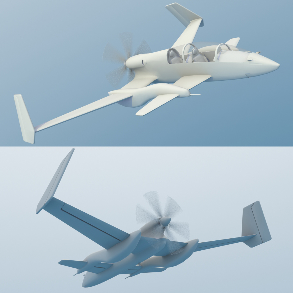
And here's the texture WIP so far;
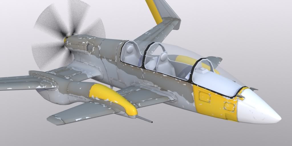
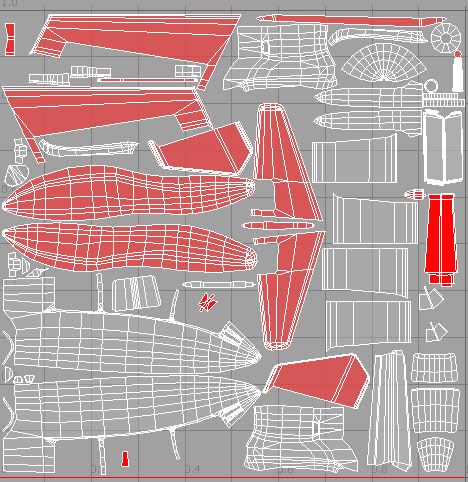
The UVs:
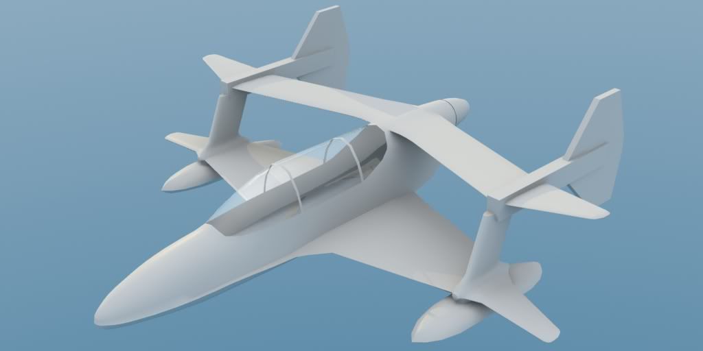
...and I'm currently modeling this when I'm not texturing that;
http://www.moddb.com/games/skykick/images/sft-240#imagebox
Cheers, and thank you!
I'm getting back into poly modeling and game stuff after a long hiatus. I was hoping that I could get some C&C on my texturing work so far with this one aircraft?
I'm not very good at painting and I'm only slightly better at textures. At the moment except for the paint chips it looks a bit empty and bland to me? I'm planning on putting some warnings on, but I was wondering if maybe I should put more?
But yea, otherwise I'm also posting another WIP that I'm working on. Hope you folks enjoy.
So I'm texturing this aircraft, based on this concept
http://www.moddb.com/games/skykick/images/sft-238#imagebox :

And here's the texture WIP so far;

The UVs:

...and I'm currently modeling this when I'm not texturing that;
http://www.moddb.com/games/skykick/images/sft-240#imagebox

Cheers, and thank you!
Replies
Here's a shot of my spec map and an updated render;
I just can't seem to get it to "pop".
There is no micro detail in the texture at all
disregarding the big damage on this texture:
the rest is not just one color. there is a lot going on. usually you want the diffuse texture to have some of that information but really make the spec texture do most of it.
I think you're scratches are far too procedural, and their scale is too large. I see you're logic, but remember they are "edge scratches", obviously edges of an object that get scratched, but on a plane, you generally don't see them this often, things aren't scraping up it regularly enough to create this large a scratching. I'd make them much smaller, and start considering other grunge, such as streak marks and localised rust. Think less is more, and put a lot of detail in your spec.
Did a quick google search, not the best pic, but this is more what you'd be looking at: http://www.flickr.com/photos/strajinzoran/2840880660/
http://3.bp.blogspot.com/-LhOh178SS3g/TblHcsihuxI/AAAAAAAAMrM/Um6oQV2KIrc/s1600/gru-oldplane-1a391.jpg
Obviously depends on the style you're going for.
Good luck.
-Bake ambient occlusion!
-Do a normals2cavity with nDo (works superb for panel lines)
-do a base layer with base noise/grime/ Real soft and subtle, cover everything with it. Breaks the solid colors I use some of the eat3D brushes for that.
-Do panel color variations. If panels are made of the same material, make some slightly darker, some lighter, based on panel-lines again. subtle again though
-do light chipping based on the panel lines. Yours is really heavy, I'd make em smaller an finer and also less of them.
-In more occluded areas, aint some extra grime/oil accumulation. Use a brownish dirt brush for it. Subtle again.
-Paint "leakage" streaks. these could represent oil, or just rainwater mixed with dirt that always comes out of the same panel lines and holes. Paint this with a soft, small subtle brush, and always streak from front to back in the direction of travel for the plane!
-Plaster it full with placards! Aircraft textures are SOOO ratefull for this stuff. I have a library of that stuff; "No Step" "Hot Exhaust" "Tie Down" "Jack Pad" that sorta stuff. I think I'm mostly using this image (i gave it transparency): http://www.aircraftspruce.com/catalog/graphics/09-44216b.jpg
You can see all that in action here:
http://www.laurenscorijn.com/portfolio/gz81
Also, I think you use Blender, but don't render game-art dude. Get something like a nice shader, or use Marmoset or something. For 3DS Max there are a few nice shaders, you could use that if it's just for texturing, don't need to know how to model in it anyway.
I already had baked AO, it's not really showing through. I don't know what normals2cavity is
BTW that scene is epic, Xoliul. I am made of jelly. O_O
I use modo, which I couldn't find a good game-render shader for. Do you have any other workarounds I might be able to use?
and here's the texture area in question, I want to get it right in this section before I go on to touch up the rest of the aircraft.
So make that darker and keep your spec bright and it should look even better.
Well done!
And Xoliul what eat3d brushes are you referring too? Thanks
Why am I getting this weird smoothing error on the canopy? And how do I make the canopy transparent? It doesn't seem to respond to me adjusting the transparency slider.
Edit: Oh and that shading you're getting, not sure, could be an inverted face/something wrong with the triangulation/non welded vertices, I'm not a guru with that, but I'd check all those anyway.
What I would still improve:
-your base grunge/dirt has some sort of very subtle diagonal streaking (top right to bottom left) going on. I'd remove that and just make subtle cloudy, noisey base dirt.
-I can't really see your panel variations all that much
-More placards!!! Also keep the consistent in colors, don't use red, white yellow, black, etc.. Pick 2 colors max for them.
-To be honest, your bolts might be a bit too closely spaced, I'd use way less bolts around the panels. Might be a lot of work to redo.
-Before you use your texture, do an "Unsharp Mask" (it's in filter> Sharpen) on your collapsed/saved texture. helps make everything pop.
-I'm not sure about the white nose on the plane? it's kinda boring. I think it's because it's next to the yellow, also a light color. The white could work if it bordered with black or something like here: http://www.wallpaperslibrary.com/Wallpapers/Aircrafts/f-14-tomcat-wallpaper-2.jpg)
Also, your current paint scheme and finish has a bit of a WW2 feeling going on, not sure if you want that ?