Sketchbook: Greg Mirles
Hi Guys!
My name is Greg and I'd like to show off some of my art. I hope you enjoy it and maybe can give me some good feedback?
Thanks so much!
________________________________________________________________
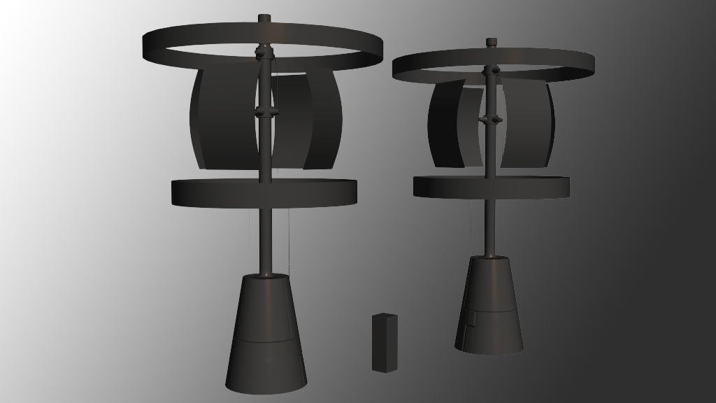
3D Model: The Holo-Adversign
This model here is a piece I'm making for a level.
It is an advertising sign that projects holograms that rotate around to report news or advertisements to the people of a far away (in space and time) city.
It was built in 3DS max, and this is currently the high poly, and I'm working on finishing up the antennae on the top and then I will do the low poly and texture it.
The concept was done by a friend of mine, who is also a new user to polycount. His name is ArcadeHero. I really appreciate the concept he did, and feel like it really works with the rest of the level.
I, of course will post more of the things for it as I finish them off.
Thanks so much!
-Greg
P.S: the little lines that are hanging down are wires that have come loose, I should probably bulk them up a little bit.


Replies
Remember to exaggerate bevels in your high poly models, for the sake of reading well on the normal map. Also, consider where you are putting your detail, with UV placement and texel density in mind. I'm assuming the box in the middle is the size of the player? If so, I would focus on making the base of the tower more interesting and focus your detail down there. If no one is going to see the small cylindrical shapes you have towards the top, then they will probably not get a lot of UV space, and you'll have to adjust the detail you put into them accordingly.
Also, get out of the basic 3ds max gradient background habit as soon as possible. Seeing a default gradient ramp in the render just shouts beginner. Presentation is more important than most people think, and it only takes a few minutes at the most to composite your work in photoshop. If it's just a viewport grab, even a blank background is better, or use a scene effect to add a slight vignette to it.
Looking forward to see your progress man.
I'll try and work on the base more and update with that as well as fix my bevels.
I'll do up something for the presentation of the render. Do you have any tips for compositing the image in photoshop?
I'm gonna try and post another update tomorrow!
thanks again
I know a lot of people like to add a very faint outer glow to the models in photoshop, to help them pop from the background. But it's up to you to come up with a presentation style that works for you.
I really liked making this, and I'm working on baking it all down for the low now!
Started a new environment, you can check out how it's going over in my thread in pimping and previews.
Comments and critique always welcome!
Here is another piece for that environment.
Another part of the Heart of Ganymede series I've been working on. Hope you guys like it!