New Tutorial: Level Design Memoirs. Part 01 Overgrown

This is the first tutorial of the series titled Level Design Memoirs. The series will show how I approach level design in my environments, and the thought process behind creating the individual assets. The first installment is titled Overgrown which focuses on creating the illusion of overgrown plants and how it affects the surrounding architecture. It also focuses on techniques that Ive gathered throughout the years in regards to creating appealing distribution of these assets throughout the scene.
Download Here
Preview:

For the future:
There is plenty to come for future installments of this 'Level Design Memoirs' series. The reason the series is titled 'Memoirs' is because they are a collection of knowledge that I have gathered from firsthand experience and personal observation. Therefore I will try to avoid using content that is not produced by me.
Here is a sneak peak of a future installment:

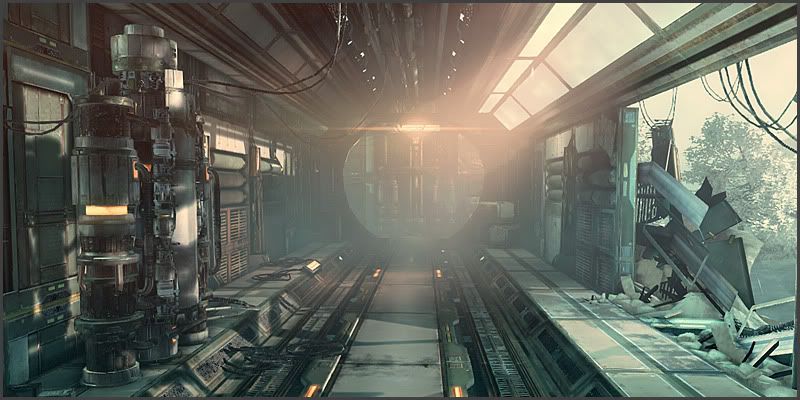
I will use my latest environment titled 'Arctic Facility' to demonstrate my approach on modular building and lighting. (Click on image or here to view video)
Edit: updated links
Best Regards,
Julio Juarez
Replies
I agree, I really enjoy seeing people post helpful resources here
Thanks for sharing the
You're welcome, I do plan to keep adding more. My intention is to keep it an open tutorial, similar to a blog, where I can add sections to it as I gather more experience. In a couple of years, I'll consider gathering these documents and improving them to create a larger resource such as a book.
Btw, I noticed that your levels are nicely color-graded - vibrant colors, just right amount of black levels, contrast e.t.c. I've been struggling with this lately. Could you write a word or two about your approach?
I know it's common in film to strive for flat-ish, low contrast image during shooting stage, so that contrast/colors can be pushed any direction during post-production to achieve specific look. Do you light your scenes with color grading in mind or is it an afterthought? How do you ensure it works properly on both bright and dark parts of your level, it stays consistent across multiple displays with different gammas e.t.c.
Thanks.
Definitely, the practice is very simple, and you can obtain lots of variety from the same model.
Those three trees are the same model, just rotated, scaled, and some color shifting done with UDK's material editor.
Hi Sandro, thanks for the compliments.
To attend you're questions regarding the lighting.
Because its a video game setting, first thing I do is ensure the shadows will look correct under any lighting condition. This involves lots of tweaking of the uv set used for light maps, as well as the resolution for those light maps. In these tests, I just add one single light such as a dominant directional and put temp objects to cast some test shadows on the models.
After this stage, its when I start adding point lights / spot lights to light sources. Then experimenting with the following settings:
Indirect lighting scale: Determines the intensity of the bounced light. I generally set it to below .5 (default 1). This way the bounced light is not intense, it produces better light gradients.
Light Source Radius, this determines the area in which the lights emit from. Considering that the larger this is, the more of an 'area' light it becomes. The larger the number, the softer and more spread out the shadows/light will be. So focused lighting with sharp shadows would in reverse, have a low source radius.
The other settings such as color, intensity, etc. are similar to any other app.
The last stage involves balancing everything out, I do this before doing any grading/post work. The result from this is not very high contrast, like you mentioned it would be in films. Part of balancing the lighting might be introducing a sky light, considering the skylight can be used to determine the value of the darkest shadow in the environment. Generally the intensity for that light is very low.
If the contrast is the same in background elements compared to the foreground, than part of the lighting process is also adding a distance fog / translucent cards.
Here is a before and after shot, the one in the right has the post effects filters applied.
Hope it helps!
You're welcome!
Glad to be able to help!
You're welcome. I'm almost finished working on the Sci-fi environment. Soon afterwards, I'll focus on creating more tutorials from the experience I gained from it.
Here is a video of some of the latest additions (WIP).
[ame]
Thanks
[ame]
Pardon for the low frame rate, fraps was failing so I used camtasia for this one.
Thanks, I'll have to say the same about you're work as well