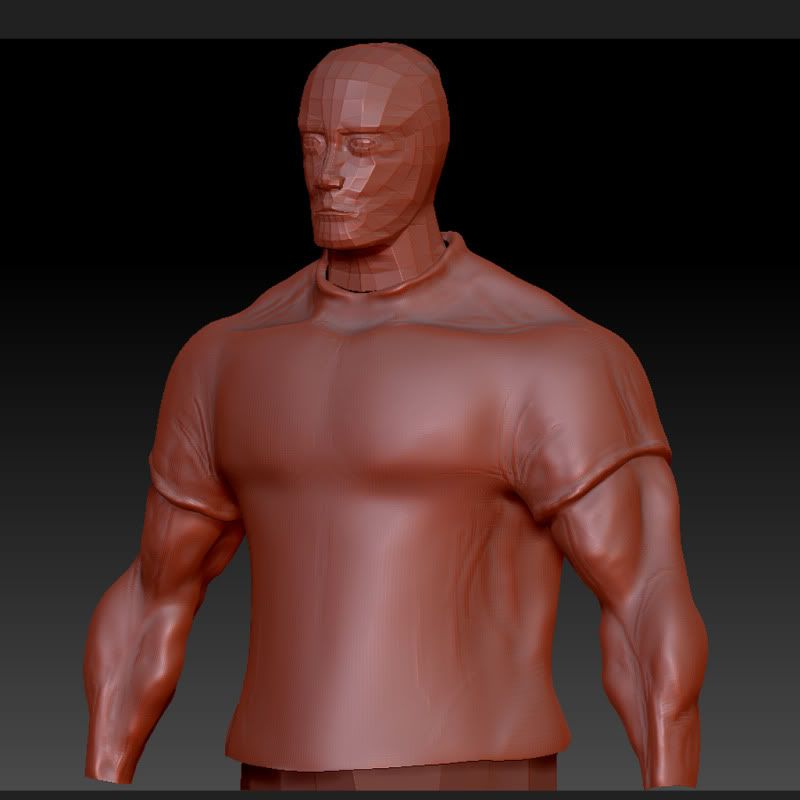
I think its cus i need to do bit more blending and work on them because there actually bigger on the concept :P But i will definately take care when comes to proportions
No, but really... your anatomy needs a lot of work. I'm no expert but you're not nailing basic forms. The muscles look super lumpy. And the proportions are off by a lot. He has no shoulders. google references and reeally study them. Good luck dood!
I find forcing yourself to stay on the lower subd levels to really get the proportions and big forms first helps a lot, that lumpiness usually comes out of trying to do to big corrections at a high subd level. Although iv seen people start at super high resolution with clay tubes brush and do amazing things, so i dunno
but yeah things are looking lumpy on your guy as of now, and some proportions look off, other people would know exactly where. keep at it!
The polish brushes work nicely to smooth forms out.
Like others have mentioned the main problem here is with the anatomy. I'm not sure if the character is supposed to look redonk but the proportions of the musculature is off. Here are the main anatomical problems I see off the bat:
The biceps look huuuuuuge in relation to everything else.
The deltoids are non-existent, especially if he's all BAF (Buff As F*ck)
There is a strange depression between the bicep and triceps, this is where the brachialis is located so it shouldn't dip in so much.
Theres a strange ridge (I'm assuming radius?) running up the forarm, with the palms facing forward this would be along the side of the forarm and not in the front.
Despite the anatomy I think the proportions are the main issue. He's looking a bit comical as he is now. You know what they say...chip away....chip away. :thumbup:
Usually when it comes to first timers in Zbrush they want to use brushes like the "standard" and brushes like "inflate" to do their sculpting. There is nothing wrong with those brushes but they you should build your stuff up. Start at a lower subD and turn your brushes down. An intensity of 50 is way to high which contributes to the lumpyness. I use intensities of 50 when I am just slamming in form... but when you start actually sculpting pull it down to something like 15 - 25 depending on the subD level.
I tend to do what trevor said where you jack up the Subdivisions and and start using the clay tubes and smooth.
I love the claytubes because you can lay things in like strips. Good for building up form and detail.
would also suggest getting out of that red clay... that matcap is hideous. It doesn't do a good job of showing off the model or form. Use the gray one if you don't go and download some.
Replies
Why you ask sir?
I thought they were looking very steds style but the refence/concept he has quite defined muscle lol
What would you advice be?
Thanks for pointing it out.
No, but really... your anatomy needs a lot of work. I'm no expert but you're not nailing basic forms. The muscles look super lumpy. And the proportions are off by a lot. He has no shoulders. google references and reeally study them. Good luck dood!
I have that book
but yeah things are looking lumpy on your guy as of now, and some proportions look off, other people would know exactly where. keep at it!
But i will start again, from lower level and build up more, mind you my base mesh was already quit beefy :P
I will go over my proportions a bit more, cheers for the advice
Like others have mentioned the main problem here is with the anatomy. I'm not sure if the character is supposed to look redonk but the proportions of the musculature is off. Here are the main anatomical problems I see off the bat:
Despite the anatomy I think the proportions are the main issue. He's looking a bit comical as he is now. You know what they say...chip away....chip away. :thumbup:
I shall revisit and read up my anatomy definately
The model the way I have worked it is with palms facing thigh like on the concept
Cheers everyone
I tend to do what trevor said where you jack up the Subdivisions and and start using the clay tubes and smooth.
I love the claytubes because you can lay things in like strips. Good for building up form and detail.