The BRAWL² Tournament Challenge has been announced!
It starts May 12, and ends Oct 17. Let's see what you got!
https://polycount.com/discussion/237047/the-brawl²-tournament
It starts May 12, and ends Oct 17. Let's see what you got!
https://polycount.com/discussion/237047/the-brawl²-tournament
Underground Sewers Control Environment (UDK)
Hello,
This is one of my old environments I created in the purpose of practicing modularity. Sadly the only modular asset in the scene is the wiring and the pipes. I considered this project as a failure because I failed to make the modular assets snap to the correct grid (need to turn off the grid and aligning it).
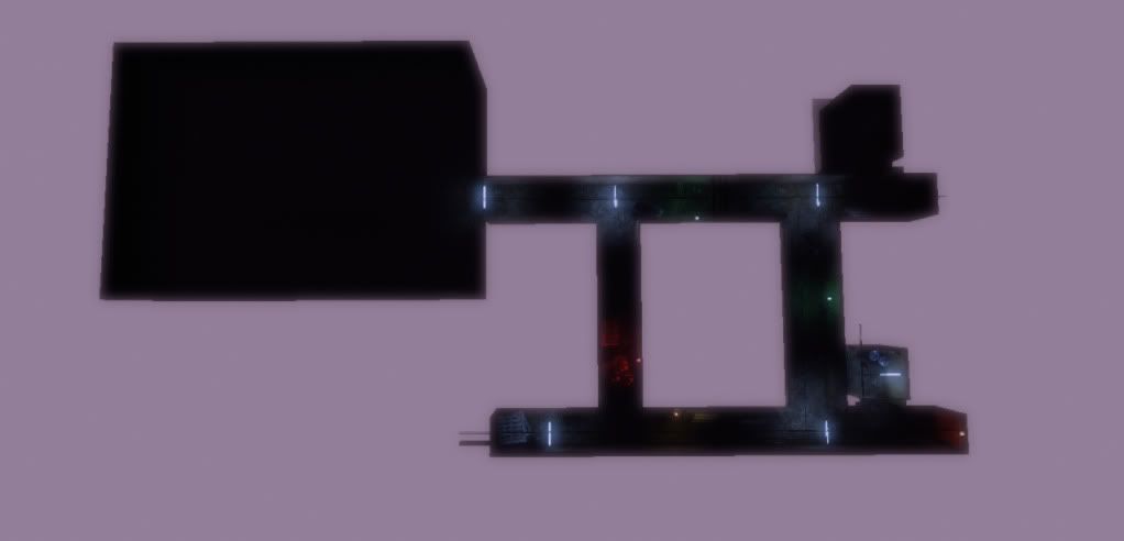
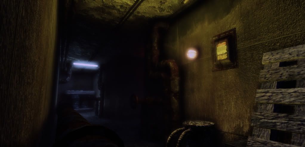
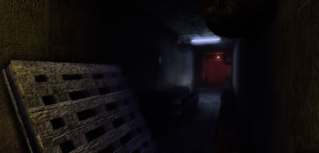
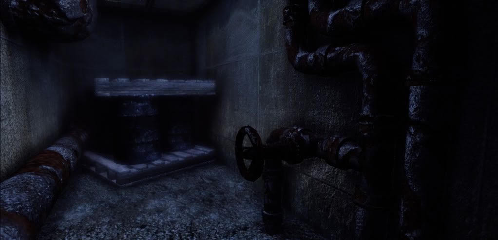
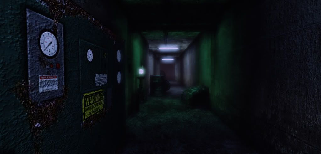
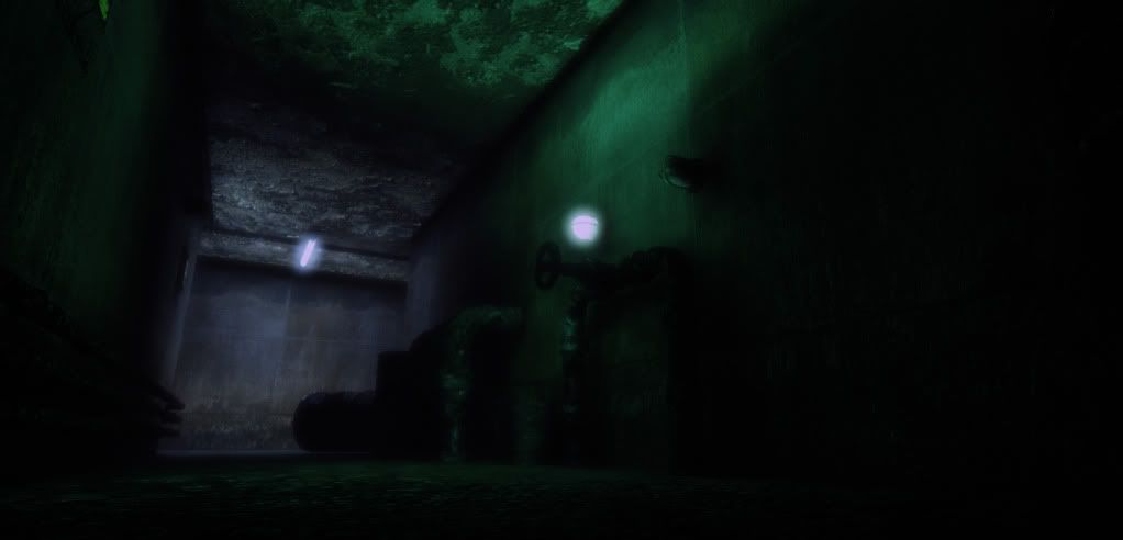
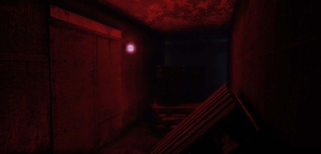
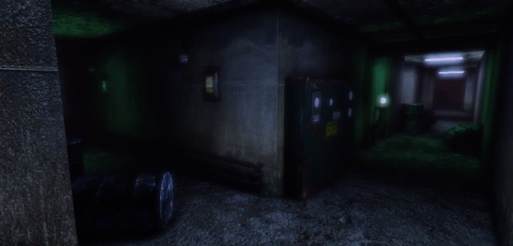
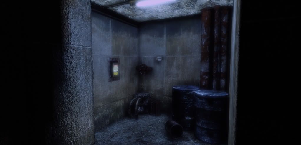
This is one of my old environments I created in the purpose of practicing modularity. Sadly the only modular asset in the scene is the wiring and the pipes. I considered this project as a failure because I failed to make the modular assets snap to the correct grid (need to turn off the grid and aligning it).


Replies
Keep it up
I would try to not rely so heavily on filter generated normal maps, or at least tone them down a bit. Keep it up man.
I really dig the contrast int the lighting though! Awesome practice for sure. Your first top down shot reminds me of all the hours I spent working in the G.E.C.K. engine
Yeah I got excited applying detail normal map at every assets :poly142:. After staring at some rough walls and concrete materials I just realized that the bumps are to small to notice when afar so toning down the detail normal map and adding cracks or variation to the walls might give the walls more looks.
Please correct me if I'm wrong.
Thanks.