SketchBook: Hofsta
Hey everyone! While I'm not new to polycount I've only just started posting recently. I figured it was time to toss up a digital sketchbook and get my head in the game.
Some of this stuff in here is downright bad, but I'm adding it in anyhow so I can learn from my mistakes. As always I welcome critiques and feedback so dont be afraid to let me know what's up.
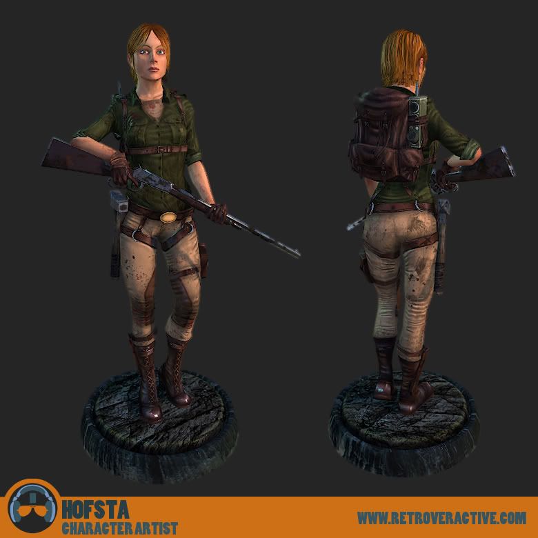
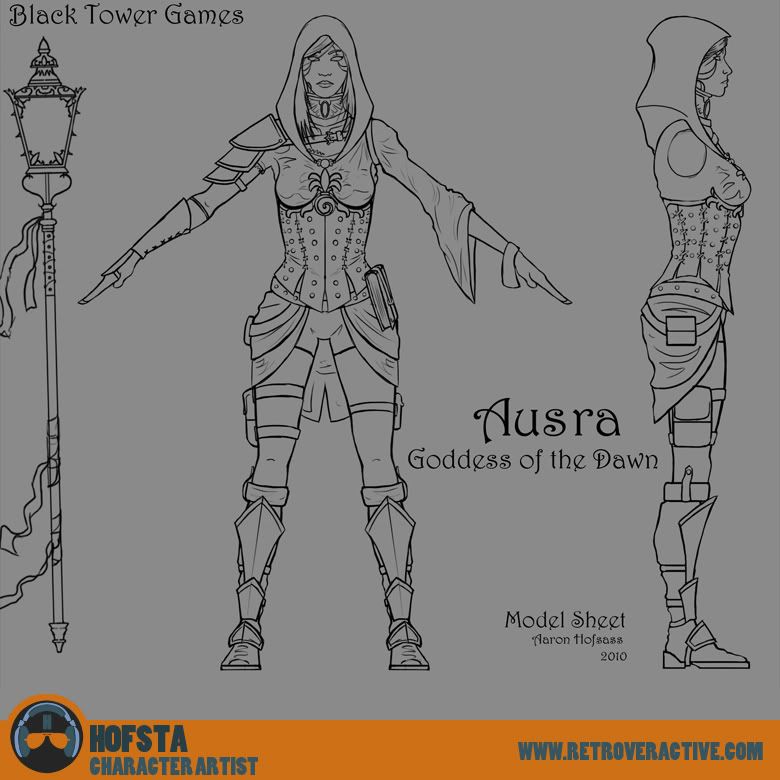
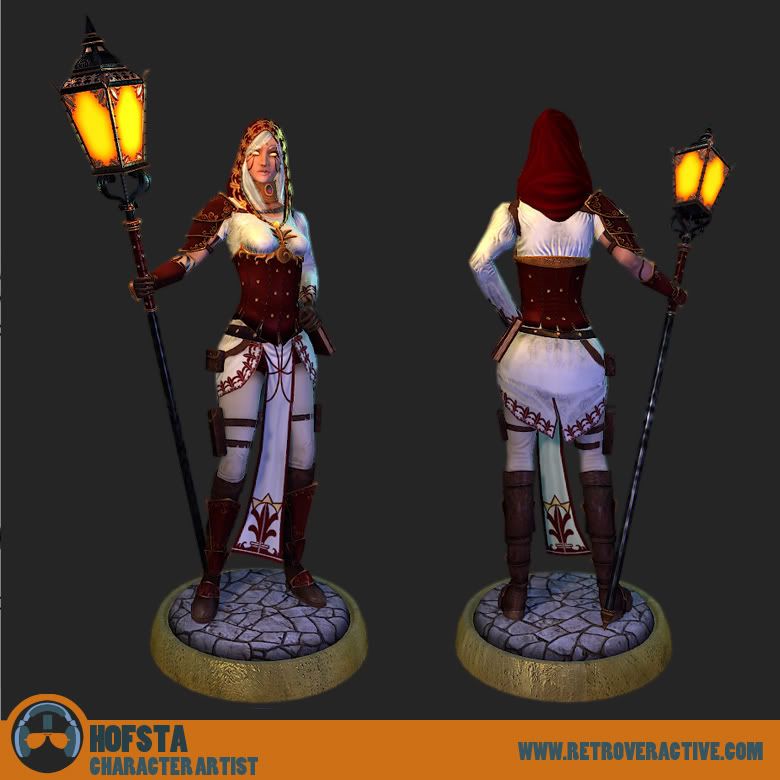
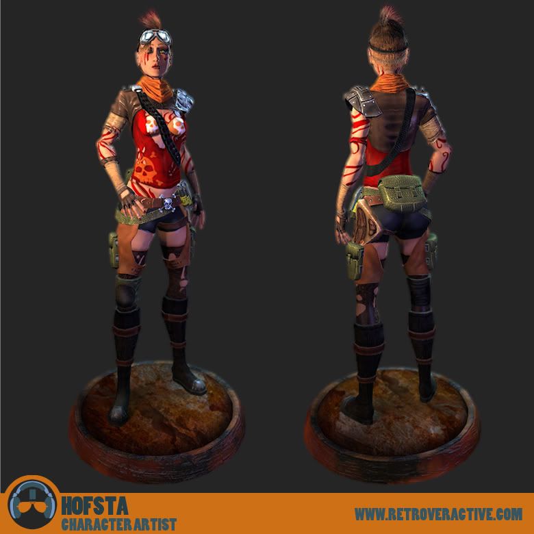
Here's some 3d stuff to kick things off.
Some of this stuff in here is downright bad, but I'm adding it in anyhow so I can learn from my mistakes. As always I welcome critiques and feedback so dont be afraid to let me know what's up.
Here's some 3d stuff to kick things off.


Replies
Loving the animal anatomy.
Superb work dude
Looking forward to seeing more.
You prolly wont see too much of me until Oct. rolls around, but as soon as I graduate i'll be working on some cool stuff again for sure!
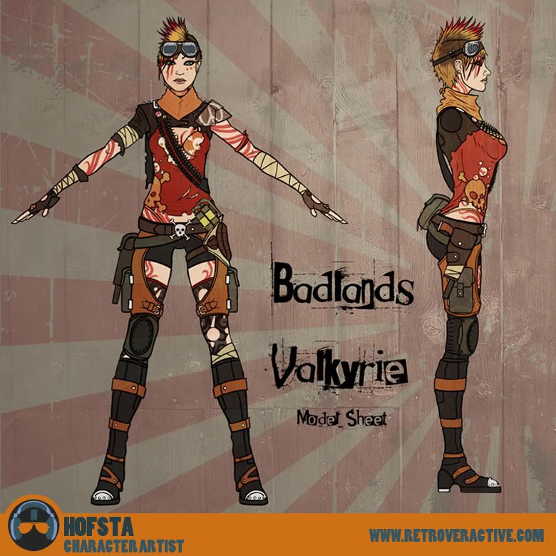
Here's something I did while stuck at work with only a Vector program to entertain me.
One I did forever ago and never got around to posting.
It'd be cool if you brought the techniques you're using in the paintings into your life drawing. In your life drawing you're throwing down a heavy outline and treating the shading almost as a different process while in the concept you're really working with tone.
Try merging the outline into the shading - treat line as if you bumped up the Brightness/Contrast up in photoshop and not as if you used the "Find Edges" filter. It'd really help
A quick diversion from my current projects.
And a revisit to an old thing. Not sure about the new direction though...
General crit; you seem to rely heavily on different blending modes without cleaning up the artifacts and tonal disturbances they can create in some areas. Take the norn character concept as an example. The strong blue glow (wherever it comes from) in her face flattens out the features. The light would still have a hard time reaching the crevices and such of the face and not sit on top.
The lower proportions of the body though are much more balanced.