Home 3D Art Showcase & Critiques

Marmoset Character Renders

Hey everyone! About to graduate college and I'm working on getting my meager portfolio together and put up on my site along with a demo reel. Been checking out Marmoset lately to render my characters.

MarmTest.jpgRaiderFem_Marm.jpgMarmTest-1.jpg


If anyone has any helpful tips about setups in Marmoset or just character presentation in general it would be much appreciated!:)

Replies

  • Der Hollander
    Options
    Offline / Send Message
    I'd tone down the DoF on the first two characters, the level you've got for the third one feels pretty good, I can see most all the details of the character with a midge of blur to settle it in 3D space better. That said, your bloom on the third character is way too strong. It's blowing out your details and taking a lot away from the piece.

    That's about all I got, your models look pretty solid overall, you just need to tighten up your presentation.
  • Hofsta
    Options
    Offline / Send Message
    Thanks for the DOF advice. I'm not sure why the bloom is so heavy in the third one, I think i might have had god rays checked and it jacked it up. Will definitely fix that though.
  • Hofsta
    Options
    Offline / Send Message
    So I followed your advice and this is what I got. I think they look much better now Thanks!

    MarmTest-3.jpgMarmTest-2.jpgMarmTest-4.jpg
  • Der Hollander
    Options
    Offline / Send Message
    Much more solid, good work!
  • MonkeyMHz
    Options
    Offline / Send Message
    Tiled ground or just a small base for them to be standing on would really help. Stuff like that can really make a piece shine.

    Otherwise its looking pretty good.
  • tharle
    Options
    Offline / Send Message
    tharle polycounter lvl 9
    Second the small base idea - think along the lines of Games Workshop miniatures imo.

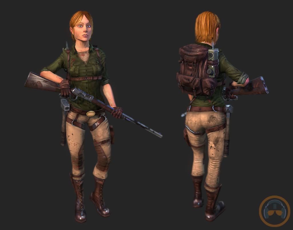
    also i think the lighting could be better - i dont know marmoset but is it just a default setup? looks quite flat imo. i'd have a search for 3 point lighting techniques from photography and see if you can't get some more interest in the lights and shadows.
  • ceebee
    Options
    Offline / Send Message
    ceebee polycounter lvl 14
    You got some nice characters here mate. I like the variation with the clothing but they're all females! You're like the opposite of me D:
  • Hofsta
    Options
    Offline / Send Message
    @ MonkeyMHz I would have love to do pedestals for each of these,. but with deadlines fast approaching I don't think I have the time. I could always use the default floor plane in marmoset but I'm not sure how flexible that is.

    @Tharle - Currently its a mix of default lighting with a custom 3 point light setup. I agree that there's a lack of contrast and shadow in these. I'll play around with some things and see what I can get.

    @ceebee - Dude its the bane of my existence. While I honestly prefer working on female characters all my school projects seem to involve a female character that I end up modeling. Before I knew it my whole portfolio was just chicks. After I graduate I plan to fix that though. In the mean time, what can ya do right?

    Anyhow thanks for the feedback guys, I plan on posting some kind of revisions based on your comments later today.
  • Hofsta
    Options
    Offline / Send Message
    Okay, so I whipped up a shitty little base real quick and messed around with the lighting to try and deepen the shadows. Let me know how I did and If this is an improvement!

    RaiderMarmNew.jpg
  • Der Hollander
    Options
    Offline / Send Message
    That's a good little base, it grounds the character nicely. Don't be afraid to get creative with them, either. Use textures that help compliment the world the character is from, and it'll really make them pop.
  • Barbarian
    Options
    Offline / Send Message
    Barbarian polycounter lvl 12
    Good work overall.

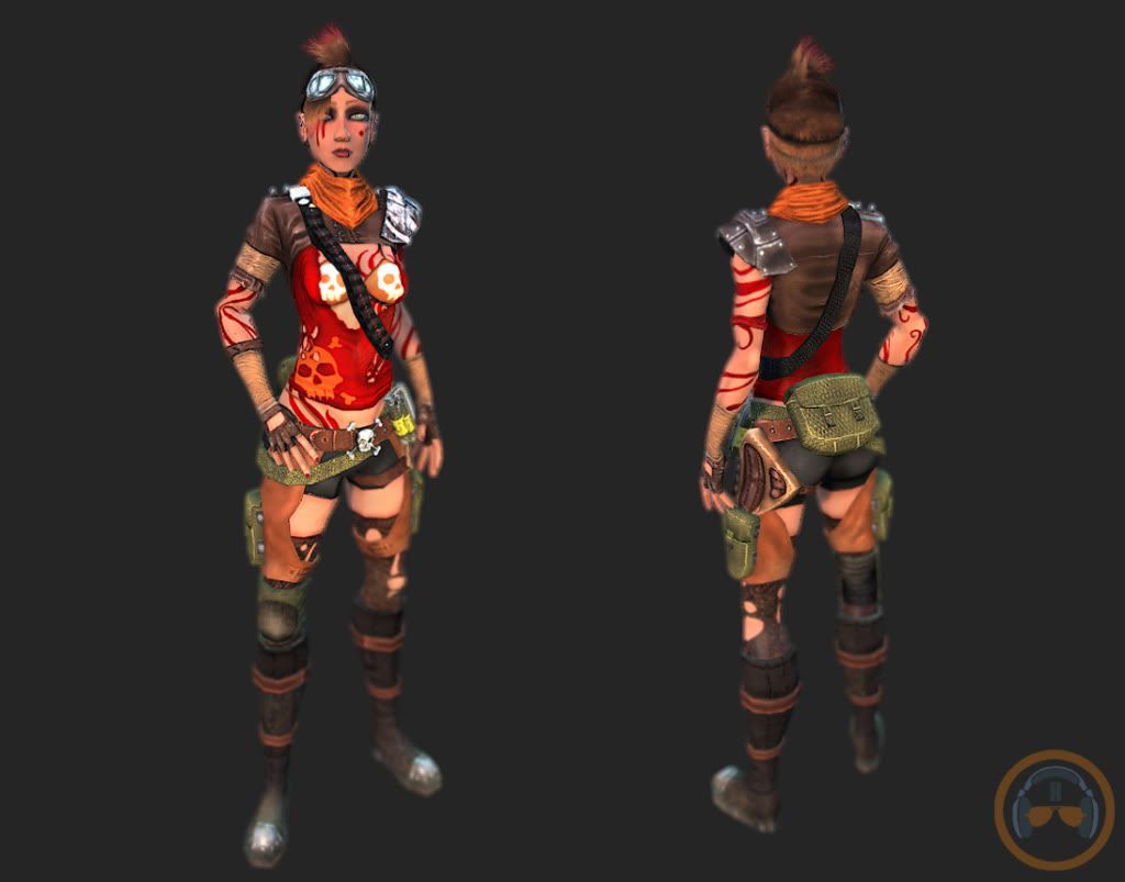
    Only thing I can offer: There is some faceting visible on the left thigh exposed skin of the character with the "red striped" body paint (not as visible in your more "zoomed out" last image with the pedestal) that my eye catches. How low poly is the character? Maybe adjust the camera angle a bit. The red stripes on the face tend to stick out too much to my eye (but that may just be me or your intent) and draw attention from other facial features.
  • tharle
    Options
    Offline / Send Message
    tharle polycounter lvl 9
    yeah thats looking much better
Sign In or Register to comment.