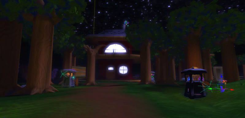
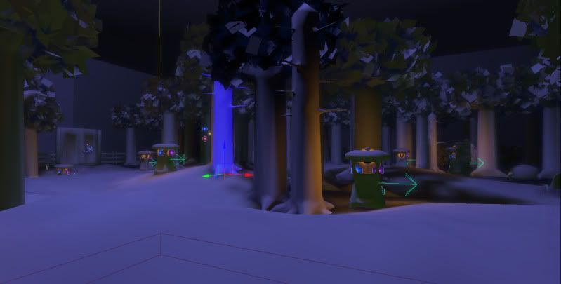
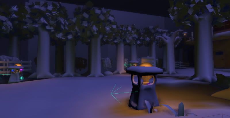
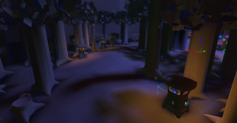
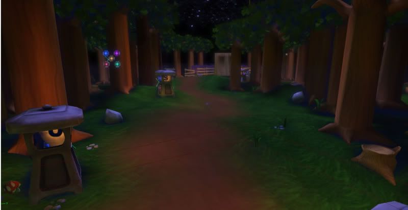
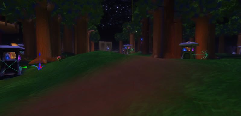
Hi PC, I've been lurking around here for awhile now but I've been too scared to post work. I think I'm ready now from some really good critiques, so here is a hand painted forest scene I've been working on. Let me know what you think.
it looks pretty cool whats the story behind the scene
Its very stylized so its hard to critque without knowing what your trying to achieve with it
and welcome to PC for your first post
yeah looks like a good start to a piece - do you have any reference images that you're working from? i think the floor needs a few more tufts of grass or flowers etc. - looks a little bland just with the blended texture.
the trees are obviously very straight but that sort of works with the hand painted texture, maybe the blend into the roots could start a little higher though rather than just fanning out around the bottom? they could maybe be a touch thinner for their height too but that depends on the style/reference you're going for/working from.
i love the lighting and mood you've got going on - reminds me of an early zelda game
Like Tharle mentioned, I would play around with the shape of the trees, mainly the trunk. I find them a little boring. You don't have to go crazy with it mind you..
Other than that, the lighting needs a bit of work. Its pretty flat right now - the scene could benefit from some more contrast.
^
definitely agree with the lighting part. Since is at night perhaps some moon rays or some blue or whitish light shining trough and giving the trees some rimlight.
Looks good Linz! I agree some moonrays would be nice.
Also, I think some of the trees are floating/uprooted a bit. Second and third pictures, the tree on the left side it seems like some of the roots are floating.
Replies
Its very stylized so its hard to critque without knowing what your trying to achieve with it
and welcome to PC for your first post
the trees are obviously very straight but that sort of works with the hand painted texture, maybe the blend into the roots could start a little higher though rather than just fanning out around the bottom? they could maybe be a touch thinner for their height too but that depends on the style/reference you're going for/working from.
i love the lighting and mood you've got going on - reminds me of an early zelda game
Other than that, the lighting needs a bit of work. Its pretty flat right now - the scene could benefit from some more contrast.
Good start though.
definitely agree with the lighting part. Since is at night perhaps some moon rays or some blue or whitish light shining trough and giving the trees some rimlight.
Also, I think some of the trees are floating/uprooted a bit. Second and third pictures, the tree on the left side it seems like some of the roots are floating.