The Blue Bomber
Hey Polycount folks! Don't worry I'm not dead. Yet, anyway.
Here's my newest portfolio piece entitled "The Blue Bomber". Enjoy. Critiques are mandatory. Also, my website has higher res pics if you wanna see them:
www.ryansanderson.com
As posted on my blog:
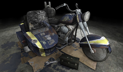
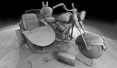
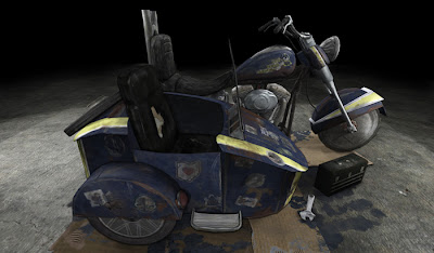
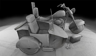
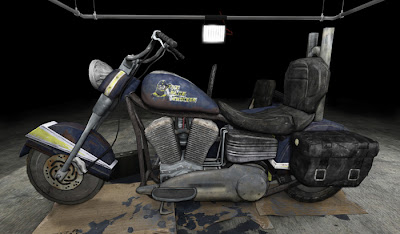
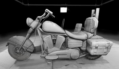
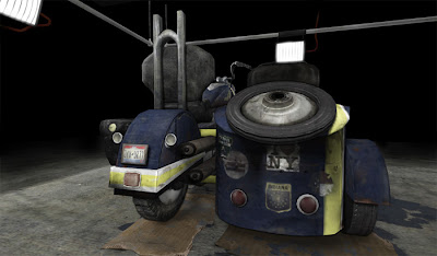
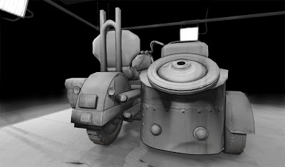
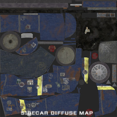
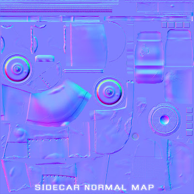
Texturing went a lot faster than I thought it would. When you have the groundwork laid out from the normal maps, it's surprising how fast you can work out all the other details. I tried to keep the colors mainly neutral, with some accent colors thrown in. Having certain parts of the bike painted blue, yellow, and white allows a conceptual reason for this to happen. You'll see little dabs of red here and there, but it doesn't overpower by any means. I also was trying not to put too much detail into the maps, which is a problem I've had in the past. This project taught me that sometimes less is more. There doesn't seem to be any part that overshadows another. You honestly don't want to know the total amount of layers I used in Photoshop for this project. I'm guessing at least a couple hundred.
The cardboard, toolbox, and wrench were thrown in last to help fill out the scene, and also to help with a little narration. I'm pretty proud of the lighting setup as well. It gives me some liberty to not worry about the background so much so that I can focus on showing off the bike. I didn't want to have a blank background for it to sit on, but I also didn't want to overcrowd the scene either.
You also might be able to tell that the normal mapping detail pops out more as opposed to before, with the overall lighting having better contrast. Messing with the shadows parameter in the postprocess editor helped to achieve this. However, you'll also notice that the shadows aren't as dark at the same time. With the amount of light that's hitting the bike, they were way too dark before. MUCH better now, I think.
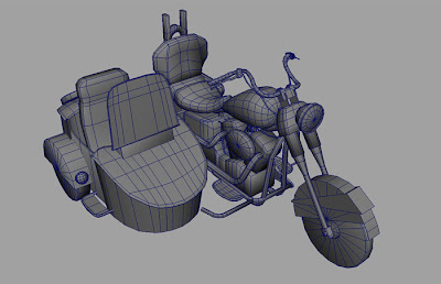
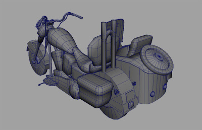
Some wireframe pics thrown in for good measure to show that I model nice and clean.
Overall, the polycount comes in at 10k. Considering that this would be onscreen constantly, almost as much as the main character, I think it's just about right. I must say that I'm impressed with the amount of polys I was able to cut out. It was HEAVY before.
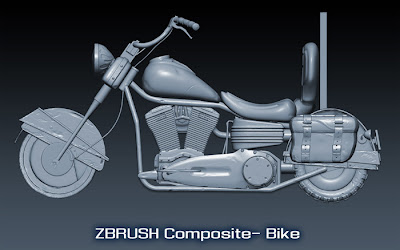
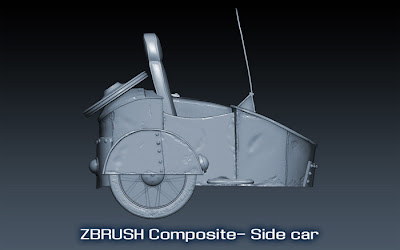
Since my computer is a total fail when it comes to rendering a lot of polys onscreen at once, I had to export each part out of Zbrush individually to composite all together in Photoshop. With a little shadow tweaking, it turned out pretty well.
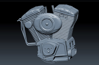
The engine turned out REALLY nice. Added in some sexy blue. Who doesn't like sexy blue?
Let me know what you guys think.
Here's my newest portfolio piece entitled "The Blue Bomber". Enjoy. Critiques are mandatory.
www.ryansanderson.com
As posted on my blog:


Texturing went a lot faster than I thought it would. When you have the groundwork laid out from the normal maps, it's surprising how fast you can work out all the other details. I tried to keep the colors mainly neutral, with some accent colors thrown in. Having certain parts of the bike painted blue, yellow, and white allows a conceptual reason for this to happen. You'll see little dabs of red here and there, but it doesn't overpower by any means. I also was trying not to put too much detail into the maps, which is a problem I've had in the past. This project taught me that sometimes less is more. There doesn't seem to be any part that overshadows another. You honestly don't want to know the total amount of layers I used in Photoshop for this project. I'm guessing at least a couple hundred.
The cardboard, toolbox, and wrench were thrown in last to help fill out the scene, and also to help with a little narration. I'm pretty proud of the lighting setup as well. It gives me some liberty to not worry about the background so much so that I can focus on showing off the bike. I didn't want to have a blank background for it to sit on, but I also didn't want to overcrowd the scene either.
You also might be able to tell that the normal mapping detail pops out more as opposed to before, with the overall lighting having better contrast. Messing with the shadows parameter in the postprocess editor helped to achieve this. However, you'll also notice that the shadows aren't as dark at the same time. With the amount of light that's hitting the bike, they were way too dark before. MUCH better now, I think.


Some wireframe pics thrown in for good measure to show that I model nice and clean.
Overall, the polycount comes in at 10k. Considering that this would be onscreen constantly, almost as much as the main character, I think it's just about right. I must say that I'm impressed with the amount of polys I was able to cut out. It was HEAVY before.


Since my computer is a total fail when it comes to rendering a lot of polys onscreen at once, I had to export each part out of Zbrush individually to composite all together in Photoshop. With a little shadow tweaking, it turned out pretty well.

The engine turned out REALLY nice. Added in some sexy blue. Who doesn't like sexy blue?
Let me know what you guys think.

Replies
As far as your low poly goes, you still have a TON of wasted triangles, most evidently in the sidecar. I've attached a paintover showing a more efficient use of triangles on the front of the sidecar. There are several places where it looks like you just got rid of your smoothing loops and called it good, where you can (and should) go through and get rid of any triangles that aren't supporting shape or silhouette. Once you've done that, give your tires more divisions to make them look more rounded, at the moment they look extremely faceted, and adding in a bevel to the sides will also help the normal map transition from the tread to the sides. I'd also put in geometry for the straps on your saddlebag. If done correctly, you can make your low poly more detailed to fit your high poly and it should still weigh in at 10-11k tris.
Your high poly model looks good, you just need to push yourself further to really make it a good piece. Work on your texturing and presentation most of all, really tighten it up. Do plenty of research, experiment, start over, tinker, and keep at it.