Going to be updating this environment soon, would like some crits plz
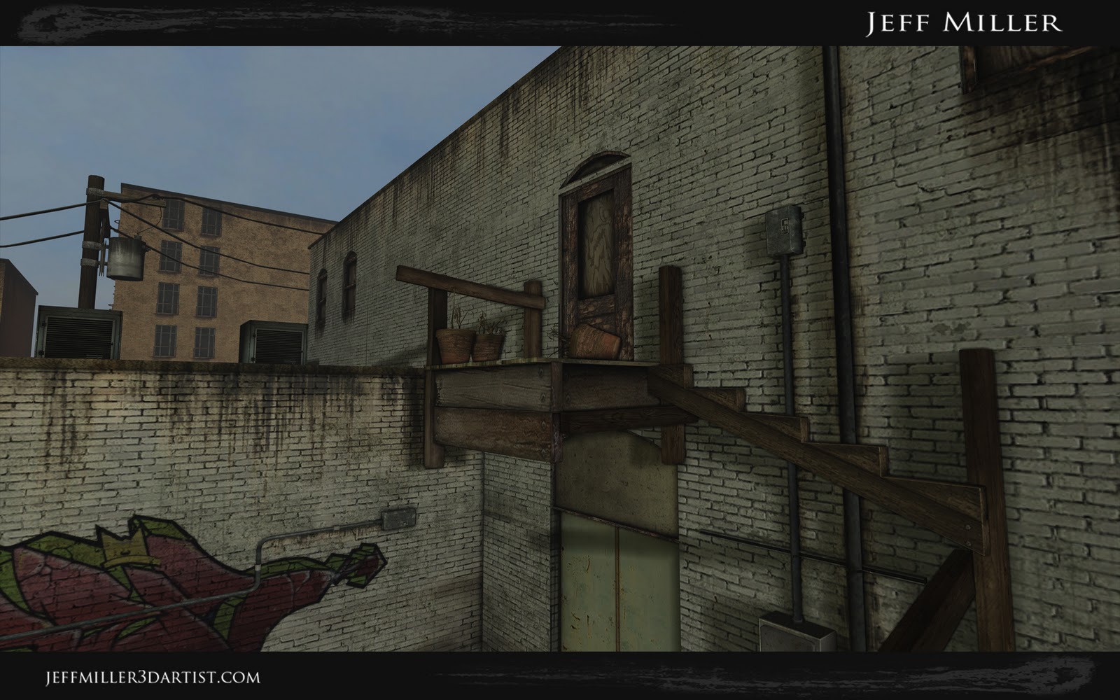
Looking for any changes or additions to the scene.
i already have plans to:
1. touch up the telephone pole
2. fix the floor heights on the background buildings ( space between windows)
3. major lighting fix ( any thoughts on lighting would be nice)
thanks!
http://www.jeffmiller3dartist.com
http://www.jeffmiller3dartist.blogspot.com
Replies
things are looking pretty flat. as in planar. not a whole lot of interesting architecture going on. the majority of this scene is flat brick wall.
building in the background needs work as well. windows seem very close to the roof-line, and generally lacks any sort of detail and looks like a last minute addition.
in general, scale between assets seems to be a problem. nails on the boards look to be huge. or are those bolts? flower pots seem large compared to brick size. i expect to see a door knob.
In addition to what Sectaurs said:
In general your scene just isn't visually interesting. You have a nice start, but you just don't really have any interesting shapes. You really need to break up all the flat lines everywhere.
The frame for the stair case that must have fallen or whatever doesn't really read well. Try adding a little bit more visual interest to this. Have maybe part of the frame for the other side there, but have it half busted and leaning, or have some of the stairs there, but have them snapped in the middle or something. It will make more sense and could be a nice focal point if you do a good job.
The thickness of the trim on the rooftops is too skinny...thicken that up and have it stick out a little more.
Change the color of bricks on the front facing building wall. I can't tell if its supposed to be the same building with an L curve or a different building...but try adding red brick there or something. Even if its the same building it could have been an addition...or was just painted differently to break up the monotony of the white bricks.
Electrical boxes on the walls look good. Add more of those to the blank areas on the wall to break up the flatness.
Try having some more stuff on top of the buildings in addition to whats on the roof on the left...maybe have some AC units or a water tower on the building in the distance, and a roof access (slanted roof with a door leading in the building) on the near one.
Are your bricks a tiled texture? just curious.
And obviously, as you had mentioned..you need some work on the lighting. Maybe having night lighting or at dusk would be cool.
I think you did a pretty nice job with your decals...with placing them behind the electrical boxes and whatnot. Shows that you are thinking about how wear would happen in real life.
I look forward to seeing your updates!
Im thinking about adding rain gutters for both walls. Also adding industrial skylights instead of the ac unit on the left building.
@ gsokol - this is rendered in UDK, this was done in 5 weeks for a midterm. Yes my brick texture is tiled, im thinking about changing the wall texture on the left to brick covered in plaster with chipping.
Im working currently on my final project for school, but i plan on getting this as well as 2 other projects done for my graduating portfolio. so ill get updates up here asap
thanks for the comments they helped alot!