The BRAWL² Tournament Challenge has been announced!
It starts May 12, and ends Oct 17. Let's see what you got!
https://polycount.com/discussion/237047/the-brawl²-tournament
It starts May 12, and ends Oct 17. Let's see what you got!
https://polycount.com/discussion/237047/the-brawl²-tournament
WIP / bruce from finding nemo(?)
Hi guys, let me introduce myself first.
My name is Josue Marquez, and I'm currently studying Digital Animation.
This year(second) they introduced a Maya course and right now we are suppose to animate a fish and make an underwater scene.
Anyways I wanted some thoughts/criticism on my shark and see if you can help me in anything.

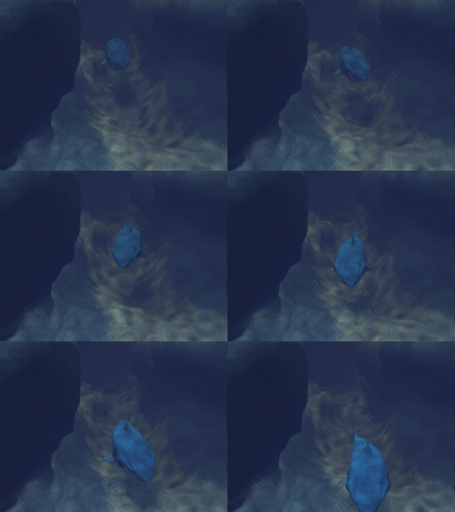
This is a preview of what I've achieved so far, the caustics is just a ocean(?) material attached to a target light.But I'm not convinced with the effect


And this is the model in question.
I know is missing a normal maps with scars but the one time our teacher tried to make normal maps,It didn't work lol.And I don't have the time to try it miself,I barely work 2 hours a week in it(my pc died ).
).
Any tips on how to make the underwater escene look cooler ? like how do you make a cheap volumetric ligth ?
Cheers !
My name is Josue Marquez, and I'm currently studying Digital Animation.
This year(second) they introduced a Maya course and right now we are suppose to animate a fish and make an underwater scene.
Anyways I wanted some thoughts/criticism on my shark and see if you can help me in anything.

This is a preview of what I've achieved so far, the caustics is just a ocean(?) material attached to a target light.But I'm not convinced with the effect


And this is the model in question.
I know is missing a normal maps with scars but the one time our teacher tried to make normal maps,It didn't work lol.And I don't have the time to try it miself,I barely work 2 hours a week in it(my pc died
Any tips on how to make the underwater escene look cooler ? like how do you make a cheap volumetric ligth ?
Cheers !
Replies
Other then that I would say it looks amazing.
See lines on the side of shark. It's unregular and color transition (from white to blue) is sharp not moody like in your diffuse.
http://www.friendburst.com/file/pic/photo/2011/02/bluecol-shark-jpg.jpg
I know that you're doing cartoon shark, but still please use reference to see how it skin looks like. And last think when you do cartoon style character you need to use many solid colors and only use diffrente saturations of it. See texture here:
http://fc07.deviantart.net/fs71/f/2011/199/2/2/ibergil_constructive_by_hellstern-d400s2a.jpg
@Sliterin : I know
I'm positive about redoing it,from the ground up(I didn't even make nostrils to him lol)but right now I'm in a rush because of the deadline.
Thanks for your input ! :poly136: