Shipyard Scene
polycounter lvl 12
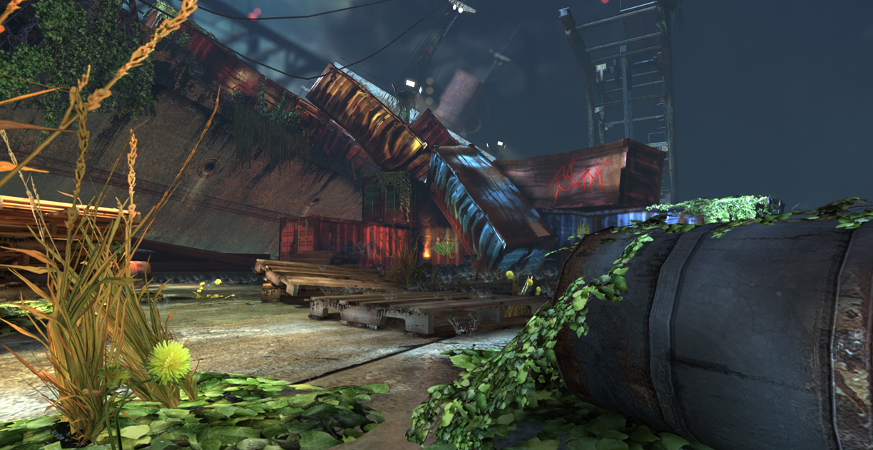
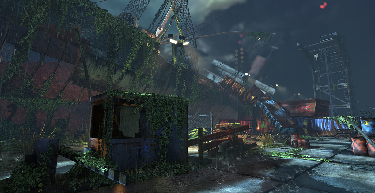
Hey PC, this is a scene that myself, Jeff Miller, and Matt Mangini created for a class. All assets, textures, and UDK work were done by us. We were working from a concept chosen by our teacher. We did this in one quarter and had a blast creating it. We are graduating soon, so we are starting to get our work out there. Comments and critiques are welcome. Enjoy!
-Team Triad
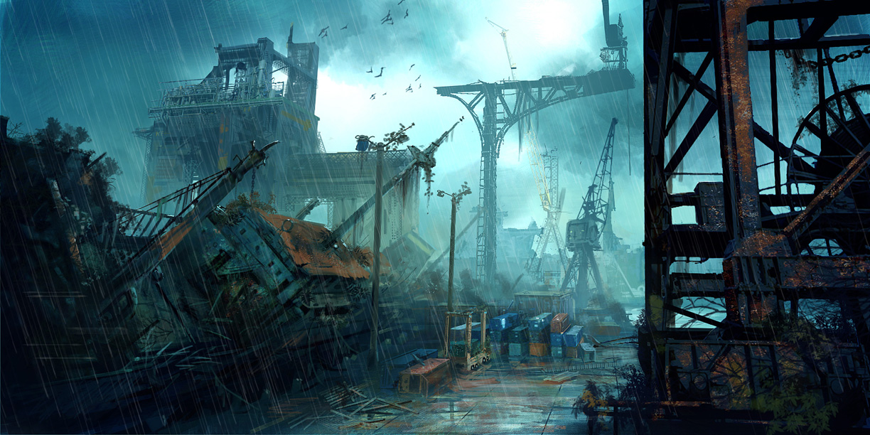
Concept:
Video:
[ame] http://www.youtube.com/watch?v=A5_MON6OPsM[/ame]
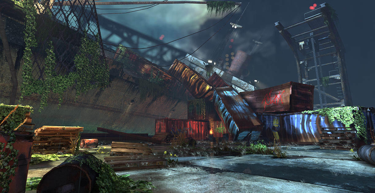
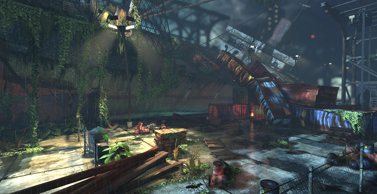
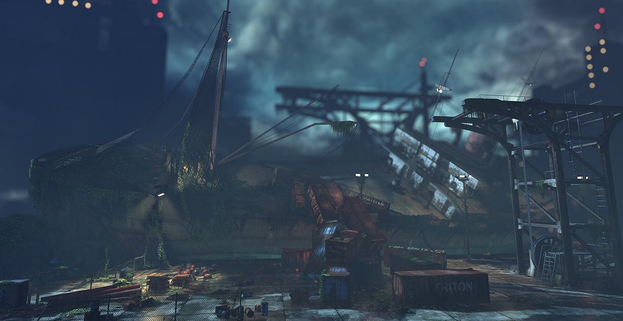
Renders:
Andrew Hackathorn - a.hackathorn@gmail.com
Jeff Miller - JeffMiller3dArtist@gmail.com
Matt Mangini - 3dmangini@gmail.com
-Team Triad
Concept:
Video:
[ame]
http://www.youtube.com/watch?v=A5_MON6OPsM[/ame]Renders:
Andrew Hackathorn - a.hackathorn@gmail.com
Jeff Miller - JeffMiller3dArtist@gmail.com
Matt Mangini - 3dmangini@gmail.com
Replies
The black levels in the concept are bold and for the most part progressive, whereas in the scene there is little to no blacks.
Some refs of Capsized ships...
http://www.containershipping.nl/casualties.html
Agree with the contrast. Turn the fog brightness down or go back into the post to fix it (this is on the renders. Your video seems pretty decent. Odd...).
@Bart - The ivy is all one texture and split up into three differnt shape( a hanging one, a longer and thinner one, and one that is all clumped together.) With that I made three different meshes and repeated them all over. Hope that helps.
EDIT: Ah its from Singularity. Google image search ftw!
Did do some photoshop on one of the screens. Hope you don't mind
@Mad - I hear ya. Thanks for the paintover. We'll rework the tonemapper and lighting for sure!
@Erich - Thanks man, it means a lot. We work so hard on this. Do you mean in the screenshots or the movie, the fact that it doesn't look like its raining? Thanks again for the feedback
@Walrus - I see what ya mean, some shots don't look very wet. That's a great idea about water running down. Maybe I'll take parts of the my material for the sign(the beginning of the video) and add to more materials.
The ivy/moss growing over the barrel in the bottom left looks a little weird. I guess the fact that I'm not sure if it's ivy or moss is a bad thing. Does ivy usually just grow randomly on the ground like that? I haven't seen that before but I could be wrong.
The ivy growing on the container on the right looks like there actually could be ivy growing there, but the lighting on it is blowing it out, and the shadow is really dark as well.
The containers all look sort of warped and bent unnaturally. I understand that it's supposed to be old and they fell off of the ship, but I don't know if they would bend that way. Seems like maybe just the corners or the area where it actually collided with something should be the damaged area.
Last thing that I noticed was that the wires hanging didn't have enough edge loops. Just throw a few more in there so it doesn't look so low poly.
Overall this is really good, just needs a bit more polish.
@Erich - I agree with you on certain screens. We'll play around with the shots some more.