Home 3D Art Showcase & Critiques

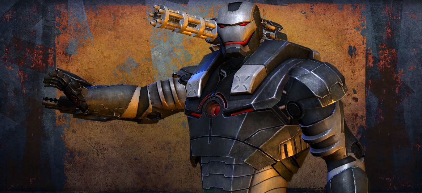
Iron Man War Machine

pixelato7
polycounter lvl 14
Offline / Send Message
pixelato7 polycounter lvl 14
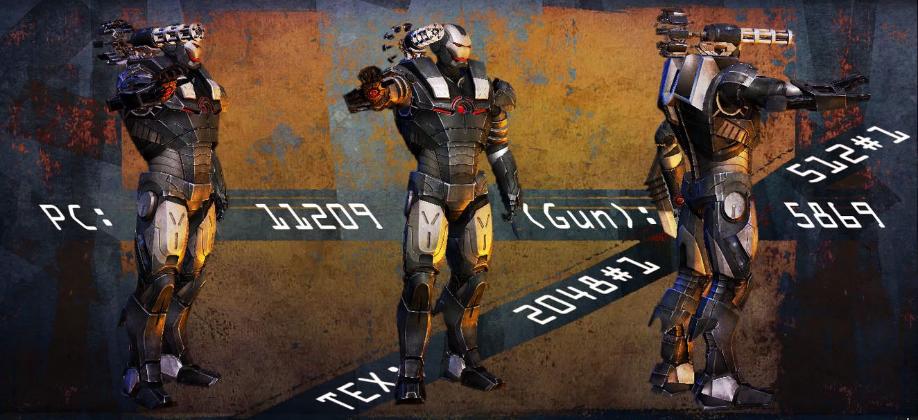
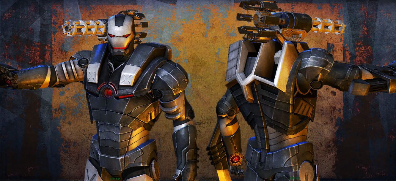
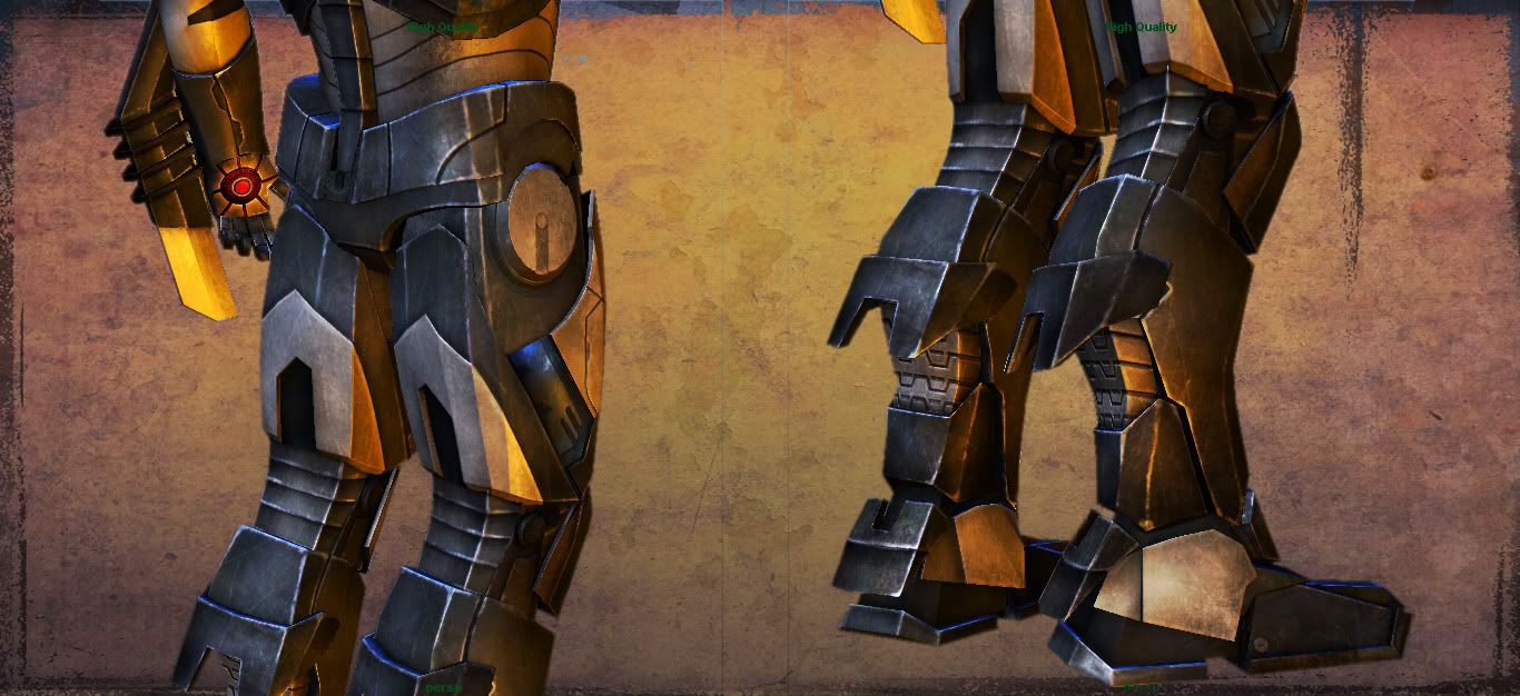
Hey guys finally done with the output of my long lost work, actually this is a a bit old work of mine, but wasn't able to complete the final output somehow, but finally took some time to finish and wrap this one. So here are the final results.:)

And this model is not based on the original movie or game's concept it's actually based on the concept done by "Phil Saunders" in very earlier stages even before the movie came out, and some modifications of my own:poly121: you can check out the concept here : http://www.comicartcommunity.com/gal...image_id=39279

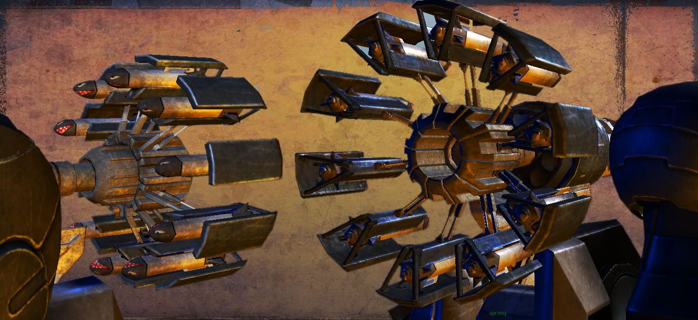
And the mounted Gun on the shoulder is fully transformable, I'll also post the animation soon.
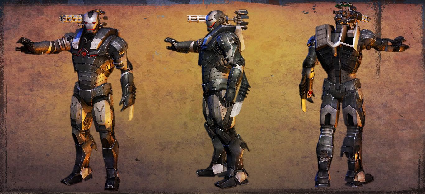
1-1.jpg

4-1.jpg

6.jpg

9.jpg

14-1.jpg

13-1.jpg

I hope you like'em :poly142:

Replies

  • pixelato7
    Options
    Offline / Send Message
    pixelato7 polycounter lvl 14
    and BTW I just found out that the given link for the concept is not working so here is the concept :

    warmachine1.jpg
  • MrHobo
    Options
    Offline / Send Message
    MrHobo polycounter lvl 13
    The model itself looks good, but the presentation needs to be rethought. The orange colored background and grunge effects are overkill and are detracting from your model and in all honesty make it difficult to read the textures properly.

    You could probably keep the grunge but either drop the orange out completely or replace it with a cooler color (saturated blue?) You might want to tone down the orange light you have on war machine as well. Same thing goes for the text in the background. I'd say either drop the opacity or loose it completely.

    Also wires would be great let us see how you put this bad boy together.
    Take care of the presentation and Im sure this puppy will start to sing like a $10 dollar hooker at Mardi Gras :)
  • pixelato7
    Options
    Offline / Send Message
    pixelato7 polycounter lvl 14
    MrHobo wrote: »
    The model itself looks good, but the presentation needs to be rethought. The orange colored background and grunge effects are overkill and are detracting from your model and in all honesty make it difficult to read the textures properly.

    Also wires would be great let us see how you put this bad boy together.
    Take care of the presentation and Im sure this puppy will start to sing like a $10 dollar hooker at Mardi Gras :)

    Thanks a lot for the insight of it man appreciate it, will work on the presentation according to your points soon, and here are some wires and WIP screens but without posing:

    WF_1.jpg

    And one with only occlusion and normals :

    NM_3.jpg
  • Tenchi
    Options
    Offline / Send Message
    Awesome work. Texture maps would be great to see too... ^^
  • pixelato7
    Options
    Offline / Send Message
    pixelato7 polycounter lvl 14
    Tenchi wrote: »
    Awesome work. Texture maps would be great to see too... ^^

    Will post them too :)
  • ez_jamin
    Options
    Offline / Send Message
    The model's nice however I'd say the textures are making him look a little concrete rather than metal.

    Seeing the texture maps would help point out the cause.
  • X-One
    Options
    Offline / Send Message
    X-One polycounter lvl 18
    I agree with most of the crits. The presentation does not help the piece at all. The metals seem very noisy too. In general, your metal materials just don't feel like metal. It could just be the noise, but I'd suggest playing with the spec/gloss maps as well as possible added a reflection mask/map to really help sell it.
  • pixelato7
    Options
    Offline / Send Message
    pixelato7 polycounter lvl 14
    Heh hobo here is the update on the presentation part killed the orange tone over all :
    1-New.jpg

    And here are the textures Diffuse and Specular:

    Textures.jpg
  • Coridium
    Options
    Offline / Send Message
    Coridium polycounter lvl 15
    Good to see your work so far! I think that the first thing that I noticed was some of the proportions/features on the head/mask. I think that the thinner design of the concept might work better for you, currently the chin is much wider in your version, in fact the whole head might be wider. I realize this is you own interpretation of the design but I think that it might look more sleek with a more streamlined head as its a very distinctive design that draws the eye of the viewer.
  • pixelato7
    Options
    Offline / Send Message
    pixelato7 polycounter lvl 14
    Yeah i get your point mine head is a bit bulkier and rounded compared to the concept , in my case i tried to put a smile on it's face inspired from The "JOKER", my all time favorite villain, and i guess that change is even not possible now otherwise i have to change my mapping and all the maps again :(
  • Digital_3d
    Options
    Offline / Send Message
    Digital_3d polycounter lvl 9
    Well done Shray,
    New renders are looking cool. I hope you will get best critics here which will improve your Bad boy. All the best bro.
  • Raider
    Options
    Offline / Send Message
    Raider polycounter lvl 9
    Nice modelling but the texture is letting it down, is there a reason every single edge possible on him is scratched? It would never happen like that.. also ditch the metallic background it's making the render looking hella grainy.
Sign In or Register to comment.