Home 3D Art Showcase & Critiques

Street Market / Ancient Rome

polycounter lvl 6
Offline / Send Message
randomind polycounter lvl 6
Good Morrow
I wanted to share some screen shots from a scene I am currently working on.
Considering the look and feel, I am working towards a suburban middle to lower class part of a city in ancient Rome which has just been attacked . A recently abandoned market alley where people fled in panic. Some Props got knocked over, shattered Jars and stuff. Everything was left behind and maybe some folks already started looting houses or setting fire.
I hope you get the picture...
Anyway, I would be very happy to get some feedback and suggestions on what I´ve got so far.
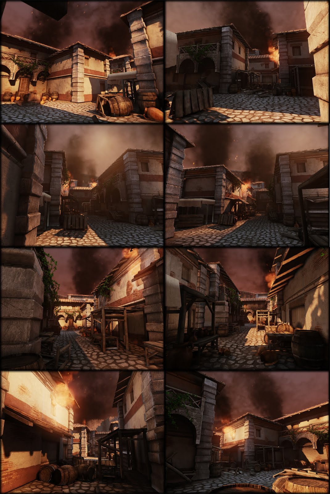
roman_treet_market.jpg

Replies

  • ev149
    There doesn't seem to be any pictures here...

    EDIT: Your ground seems very flat, a bump map could help it out. Your scene is also pretty barren, a few plants/leaves/patches of grass could help. Overall, it's looking good so far! :thumbup:
  • randomind
    Offline / Send Message
    randomind polycounter lvl 6
    got a little to hasty there :>
  • zenpat
    Offline / Send Message
    zenpat polycounter lvl 10
    hey randomind my friend ! as I said, for only 2 weeks of work, this is great ! waiting for the decals to come in ;]
  • m4dcow
    Offline / Send Message
    m4dcow interpolator
    Cool looking scene.

    The skydome conflicts with the harsh shadows for me, can't really tell what time it's supposed to be.

    I also think there would need to be more stuff scattered around to convey people fleeing. So fruit or produce scattered here and there, shattered wine jugs, torn or burnt cloth of some sort.

    Depending on how recently people fled you could have charred vendor stands.
  • randomind
    Offline / Send Message
    randomind polycounter lvl 6
    good point on the lighting issue.
    and yes atm it still looks rather empty. i will be working on smaler props in the coming days to get some more life in there.
    thanx for the advice.
  • randomind
    Offline / Send Message
    randomind polycounter lvl 6
    ev149 wrote: »
    There doesn't seem to be any pictures here...

    EDIT: Your ground seems very flat, a bump map could help it out. Your scene is also pretty barren, a few plants/leaves/patches of grass could help. Overall, it's looking good so far! :thumbup:

    I tried to get some more depth into the ground with parallax occlusion but apparently I´m doing something wrong ^^. I guess im gonna add some static paving blocks to get the job done. Definitely considering to add some foliage decals and sprouting weed.

    Thank you for the feedback ;)
  • Oiban
    Offline / Send Message
    Oiban polycounter lvl 6
    It looks great! i agree that the floor could use some more depth, the lighting issue, I didn't realize at first, not till i read the comment, now I do see it every time. But Other than that It's looking great, really like what you did with the bricks and the paint, and the balconys.

    keep it dude!
  • randomind
    Offline / Send Message
    randomind polycounter lvl 6
    so I dealt some damage to one of the market stalls, set some more fire, added shattered jars, crates, bags of wheat and uhmm yea.... fish...
    can´t do with out fish. Still need to work on the lighting issue, and I´m looking forward to add some detail and foliage to the ground.


    screen_grab_19_07.jpg
  • toxic_h2o
    Offline / Send Message
    toxic_h2o polycounter lvl 8
    wait wat :/ looking pretty good the fish are a great improvement haha.
  • Highelf
    Offline / Send Message
    Highelf polycounter lvl 11
    Love the scene, good job! The floor also bothers me though. The tiling is too obvious and it feels too flat (the individual rocks as well as the thing as a whole)

    An idea might be to add some geometry and actually curve the road itself, and also use vertex paint to mix 2 different tiling textures (similar materials but other tiling)
  • Rhoutermans
    Offline / Send Message
    Rhoutermans polycounter lvl 12
    nice work on the props! Try to break up the floor with vertex painting a bit tho (some bigger sand patches)? :) Keep going!
  • Nistrum
    Offline / Send Message
    Nistrum polycounter lvl 9
    why why the fish. very nice feel to the scene though
  • BeserK
    Offline / Send Message
    BeserK polycounter lvl 12
    Your props look a little "clunky", everything is just a little too thick, maybe add some fine detailed props or make your current ones more delicate. looking great otherwise, it reminded me of a Dr Who set straight away!
  • randomind
    Offline / Send Message
    randomind polycounter lvl 6
    Highelf wrote: »
    Love the scene, good job! The floor also bothers me though. The tiling is too obvious and it feels too flat (the individual rocks as well as the thing as a whole)

    An idea might be to add some geometry and actually curve the road itself, and also use vertex paint to mix 2 different tiling textures (similar materials but other tiling)


    Ok, I gave the ground some slight hight differences and tried to get some variation by vertex paining. I tried to add some actual geometry but I could not get it done in a decent looking way yet.

    A couple of decals were added and its looking a little fruitier due to some apples pears and carrots (yes, carrots are fruit form now on).
    I made some small weed patches but I´m not really happy with how that turned out.
    BeserK wrote: »
    Your props look a little "clunky", everything is just a little too thick, maybe add some fine detailed props or make your current ones more delicate. looking great otherwise, it reminded me of a Dr Who set straight away!

    I did not notice that, but your right. I find that a really interesting observation cause it does make quite an impression on the overall scene. I will try to contrast it in some way.

    I also cleaned up the one corner (big blue circle) to make some room for a unique prop. I think the scene could use some sort of eye catcher or point of interest cause right now there is all kind of chaos going on but noting to really hold on too. I´m thinking of a well or fountain, a water source for drinking and cleaning the busy streets (just thinking about the smell of fish).

    Let me know what you think of it

    oh and I have some ugly light map issues that need fixing

    Thanks for all the support so far, I really appreciate it and it helps a lot! =)

    roman_treet_market_20_07.jpg
  • G3L
    Offline / Send Message
    G3L polycounter lvl 9
    scene's looking good! how about some tapestry? torn up ones or something? or any type of fabric that's still hanging on pillar/columns/stands?
  • randomind
    Offline / Send Message
    randomind polycounter lvl 6
    thats it so far.. i hit the dead line, so i guess ther wont be any changes any time soon

    [ame]http://www.youtube.com/watch?v=WSqRJ4gRRps[/ame]
  • Ryan Smith
    Offline / Send Message
    Ryan Smith polycounter lvl 11
    Came out looking great. The fire was a little rough but something like that is always hard to get right.
  • ajr2764
    Offline / Send Message
    ajr2764 polycounter lvl 10
    awesome job really digging the atmosphere
Sign In or Register to comment.