The BRAWL² Tournament Challenge has been announced!
It starts May 12, and ends Oct 17. Let's see what you got!
https://polycount.com/discussion/237047/the-brawl²-tournament
It starts May 12, and ends Oct 17. Let's see what you got!
https://polycount.com/discussion/237047/the-brawl²-tournament
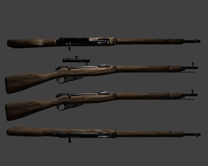
Piranah Plant and Mosin Nagant C&C Please! but be nice!
I basically want to improve my modelling skills and need some links to basic tutorials if people are willing to help me out I would greatly appreciate it.
I currently model with Blender 2.5
Piranha Plant Render 1

Piranha Plant Render 2

Mosin Nagant Render(Still need strap holes w/ strap)

All modeled in Blender.
I currently model with Blender 2.5
Piranha Plant Render 1

Piranha Plant Render 2

Mosin Nagant Render(Still need strap holes w/ strap)

All modeled in Blender.
Replies
If you want crits, post what you are trying to achieve, post larger shots, and wires.
So basically what you're saying is, I can't show non-game art here and what I was asking for is anything I should improve on my models since I'm trying to get better at 3D art.
Funny I thought this forum was for 3D artists and people wanting to improve and not just game artists?
these models are generic and have no story to tell.
like.. the nosin nagat, i believe, could be a lot more onteresting if it had a lot more scratches and rust and such
same goes with the plant.
"To offer 3D videogame artists the best News & Resource website possible. Every decision, every update and every move we make internally is with our communities best interests in mind."
The main focus is games, but it is also for people who are willing to take critiques politely and then not bash the person who just tried to help them out.
The plant:
Old, basic concept, almost looks like a bunch of primatives put together with mesh smooth on them. Texture just seems to be flat colours. Make it interesting, we've seen this plant a billion times, why not give it more personality, make it look more scary or something? grunge it up, give that texture sheet purpose to exist! You've got some dodgy shading too, which is why we need to see wires to see where its going wrong, also to see your topology to help you improve.
The gun:
Way too small image with no wires again, hard to give any critiques.
from what i can see though, the grain on the wooden areas is too large and the metal is way too shiny. Is this textured? The wood looks like one of the material downloads for Blender.
The lighting is very flat looking. Not many people light their models from behind. The shadows are very sharp and there's no AO. Is there a reason you gave 7 similar looking renders of this and no wireframes? This would look a lot better with spec maps, rim lighting and a lot more texture detail. Even though it's a clean style, you can still do more with the textures.
There is a difference between the geo density in various parts of the model. It takes a lot of edge loops to make the head, pipe and teeth that smooth, but other areas are blocky. This is the most obvious is the leaves, but also is visible in the stalk. There are bumpy areas around the corners of the mouth. You should show wireframes.
The gun looks like it's lit with a single spot light from the camera. The materials you used don't seem realistic. The grain of the wood really stands out and has deep black grooves. I don't know much about guns, but it seems that the grain is going in multiple different directions. Is this supposed to be 1 piece of wood? I looked this gun up on google and you missed a lot of little details.
I think that the gun could still use some work. The texture seems to dark to me. If you look at some references you will see that not only is the wood lighter, it has more of a spec/polished value as well. As of right now it looks like the gun has been left in the woods for a few years. Also, don't be afraid to add some subtle scratches and wear on the metal. Try to concentrate on the edges as that is where it would most likely rub up against stuff.