The BRAWL² Tournament Challenge has been announced!
It starts May 12, and ends Oct 17. Let's see what you got!
https://polycount.com/discussion/237047/the-brawl²-tournament
It starts May 12, and ends Oct 17. Let's see what you got!
https://polycount.com/discussion/237047/the-brawl²-tournament
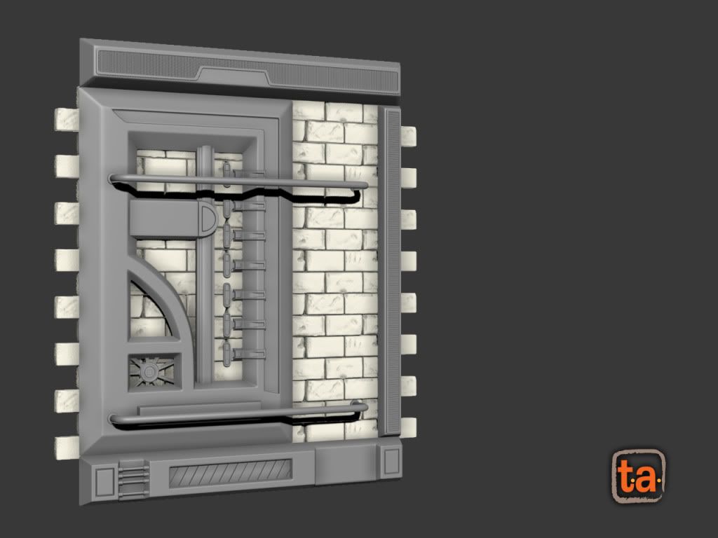
Modular Wall Piece
Start of a wall set I am modeling for an environment in UDK.
This is looking pretty plain, and was wondering if anyone had any ideas of how to spruce this thing up a bit, or if there are any parts that I should get rid of or replace? Thanks for your time everyone!
This is looking pretty plain, and was wondering if anyone had any ideas of how to spruce this thing up a bit, or if there are any parts that I should get rid of or replace? Thanks for your time everyone!

Replies
There's detail in some areas and less in others which is nice aesthetically (aside from shape flow). I'm sure when it gets painted it'll have a nice overall. Throw up some color samples, nothing fancy, just to see how it'll look.
For color, add some grime and rust. That'll give it some varied colors and a realistic feel. Otherwise figure out a nice color scheme.
Lastly, what is the look your going for? What kind of world is it? I can only guess, so try to reinforce it so right away I can tell where it would go. Reference. Reference.
To me, this prop looks like a door, but it isn't. I don't know what it is.