The BRAWL² Tournament Challenge has been announced!
It starts May 12, and ends Oct 17. Let's see what you got!
https://polycount.com/discussion/237047/the-brawl²-tournament
It starts May 12, and ends Oct 17. Let's see what you got!
https://polycount.com/discussion/237047/the-brawl²-tournament
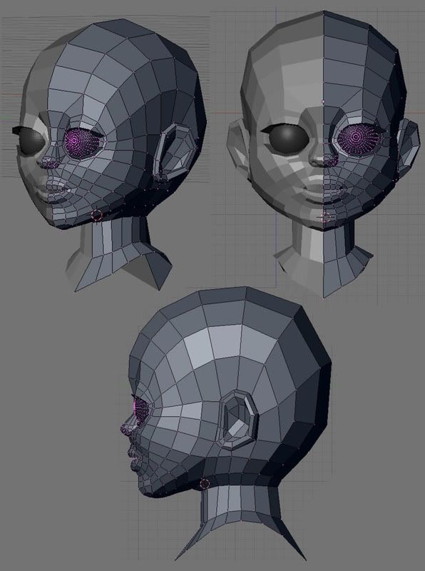
First humanoid head model
Hi there. I just modeled my first human head and I guess I made a lot of beginner mistakes. 
Could you guys give me some feedback?

Could you guys give me some feedback?

Replies
Also the neck should attach to the head in a much more gradual fashion. Again, even on a cartoon character there are many things that you should still try to base on actual anatomy. If you're new to humanoid heads then I recommend trying to make something more realistic first until you get the basics down.
My english isn't good enough
neck less straight
What do you think?
Thanks for the feedback haikai.
http://dl.dropbox.com/u/4898391/paintover_Crit.jpg
http://dl.dropbox.com/u/4898391/paintover_crit_girl_2.jpg
It's getting there, just make sure the proportions are not that of a child
I guess I have to work on the breasts, they look too much like she's got silicone implants.
Now critique please!
the only part which bothers me is the hand/finger transitions - the bobbles...no idea how can i describe that
edit: It's okay, I got it now. xD
I guess I should leave them for the highpoly, right?