Skullgirls: Filia
Edit: hmm is there any way I can edit the thread title? I edited the title of the first post but that doesn't seem to do anything. Anyway...
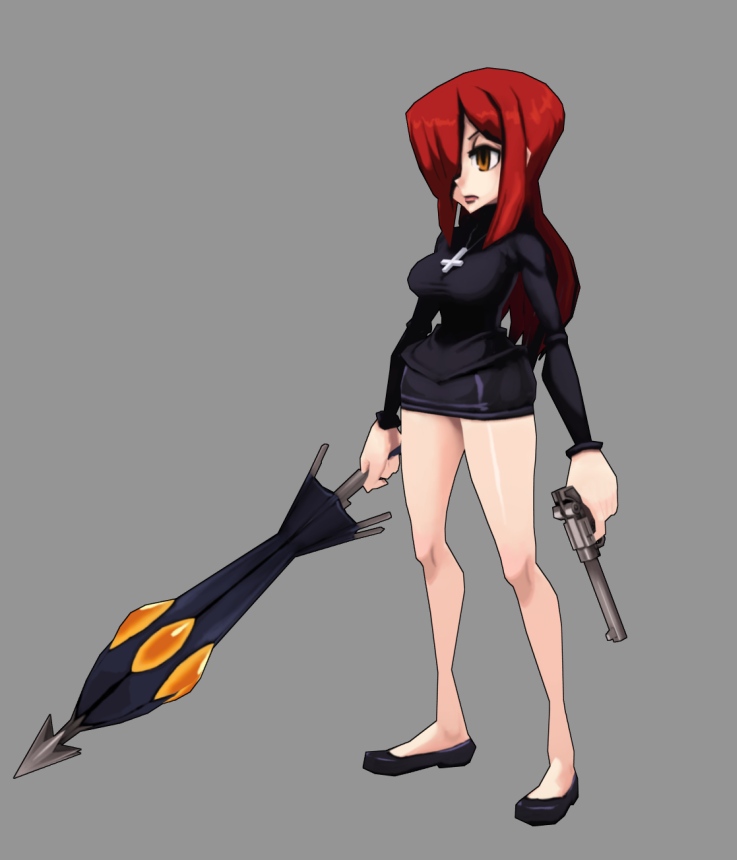
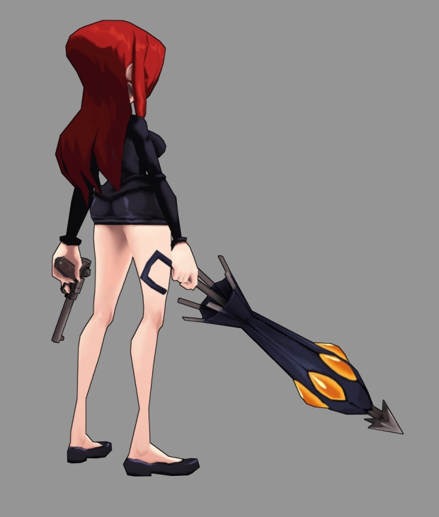
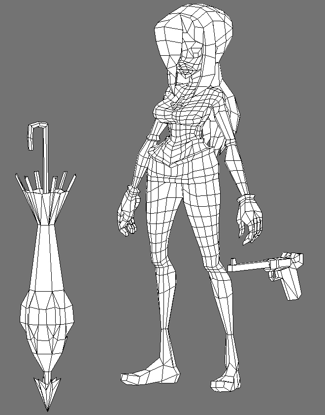
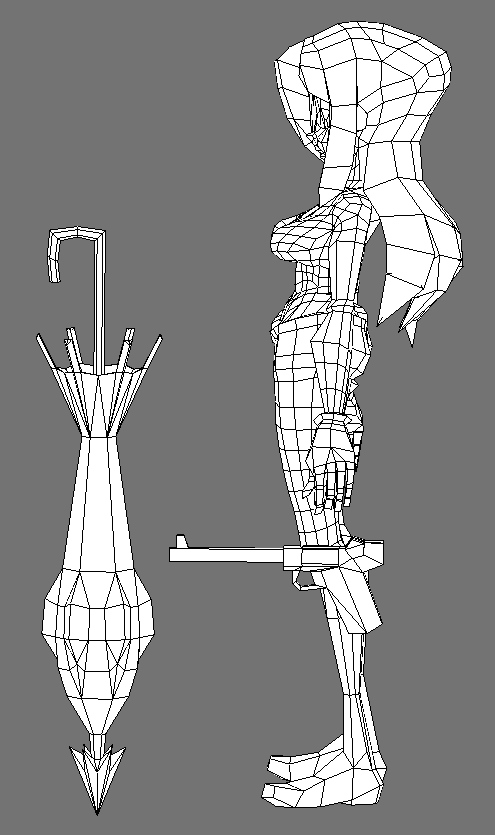
Here's another one, Parasoul this time. I tried to take into account a lot of the previous comments, such as not making the geometry in the feet too dense, avoiding skinny quads in deformation areas (while I did this in the arms, I forgot that the feet can rotate as well! So I have to add a few edge loops to her lower legs too) and using tris where appropriate. I think the geometry could be more evenly spaced, still. But oh well.
Again, crits of any kind are very welcome and appreciated!
Ref by Alex Ahad:

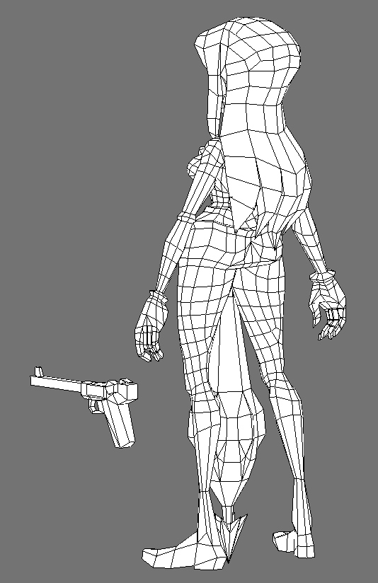
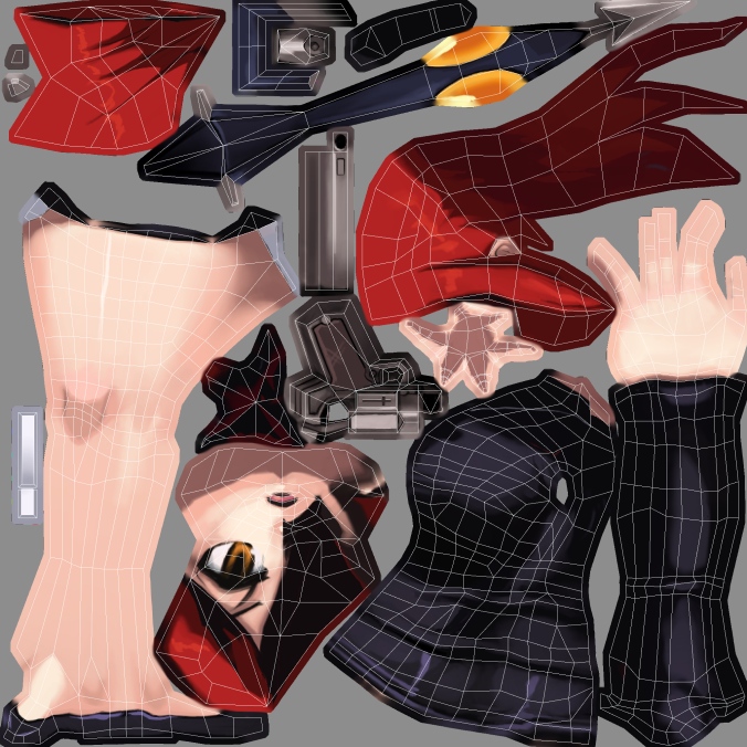
Original post:
For fun and education, I modeled a character from Skullgirls, a game I've been looking forward to for a long time: http://skullgirls.com/ You can find Filia in the characters section.
I'm still kind of a newb at proper polyflow and stuff, my pre-DWV entry was one big mess of triangles. :P I've really tried this time, and that's exactly why I need some good, harsh crits!
I still haven't been able to get rid of triangles 100% of the time, sometimes I just don't know how to remove them, or there's just too much stuff going on so that I get confused and just go ah screw it. Though I heard that some triangles are ok sometimes. The front part of the hair especially is still a triangle soup.
Any crits on any other aspect of the model are welcome, too!
Stats: 4320 tris, 1024x1024 diffuse texture, no lighting.
First image is the ref, drawn by Alex Ahad:

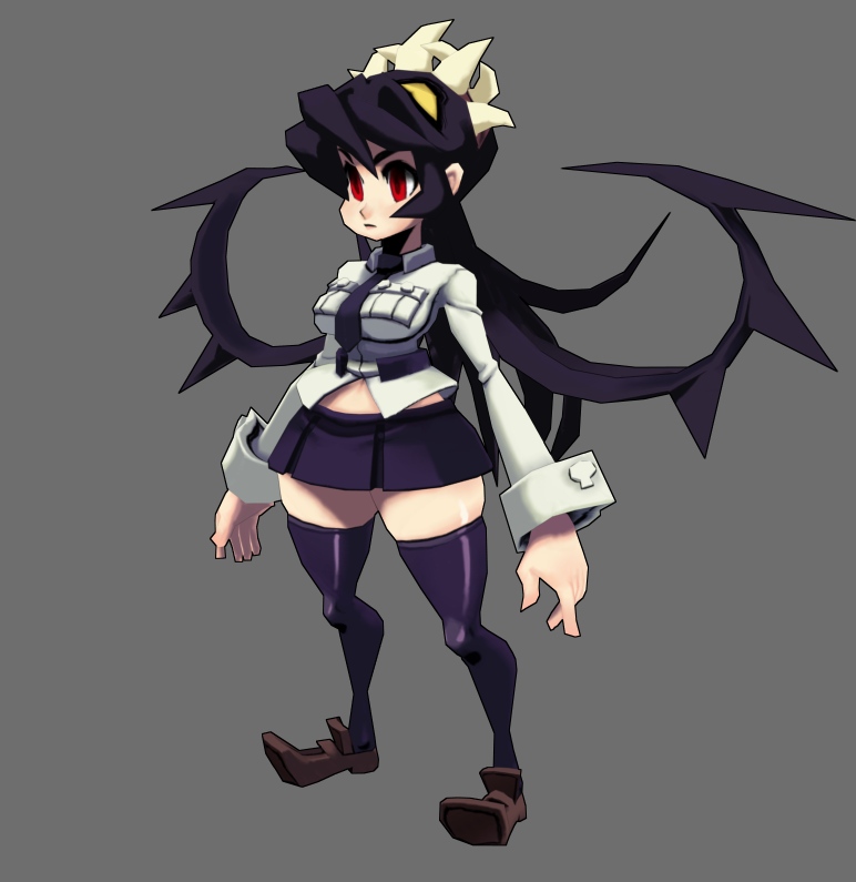
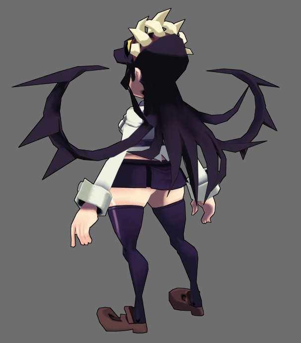
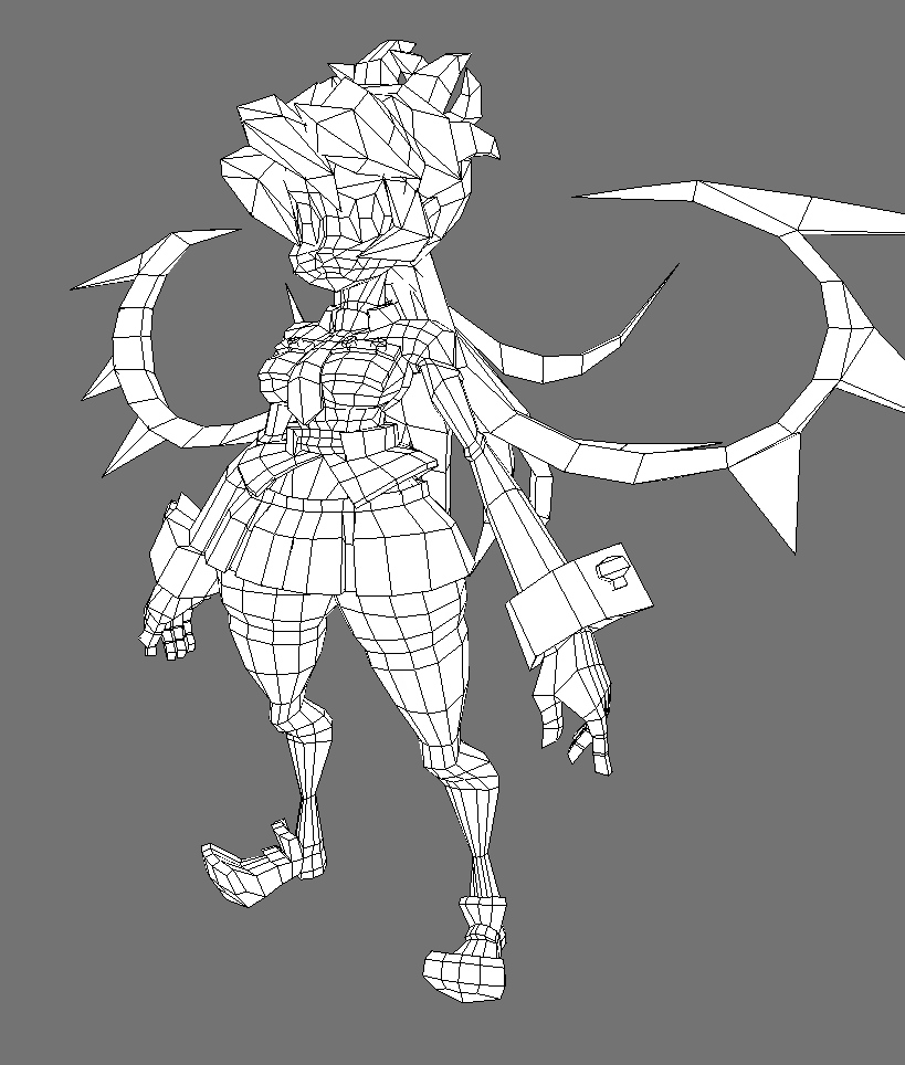
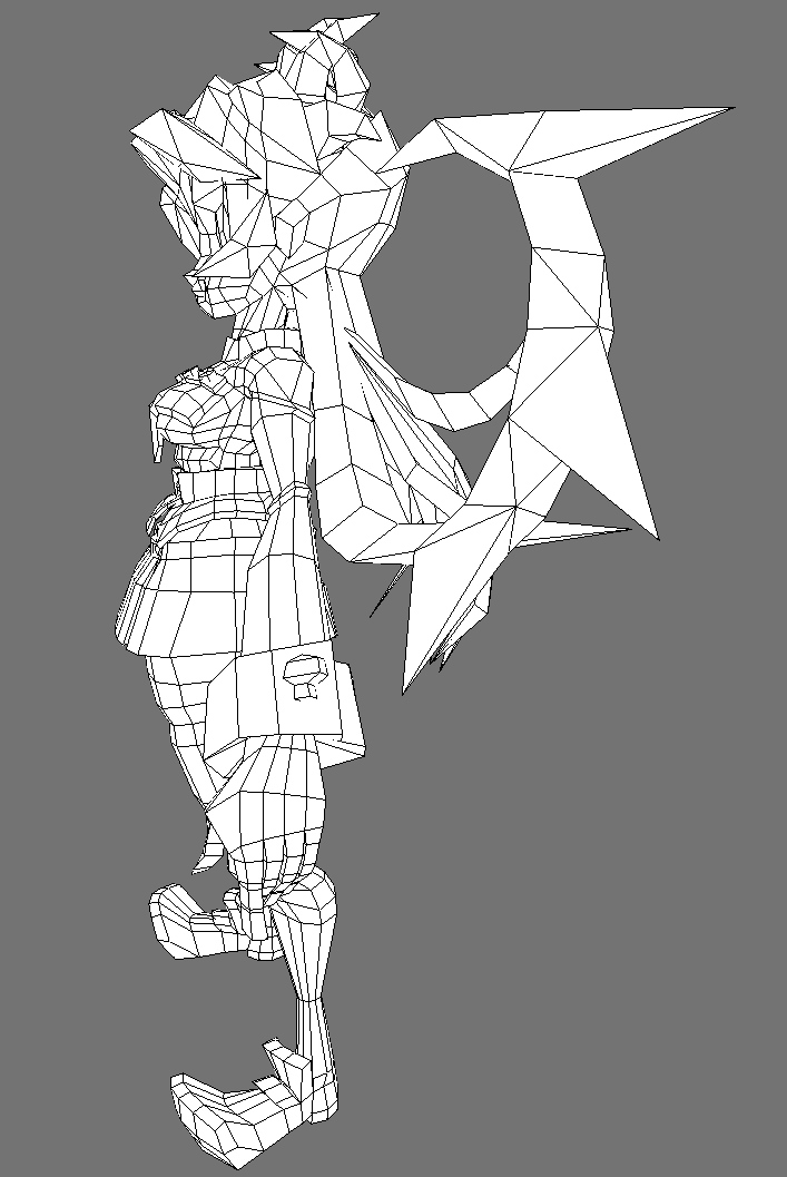
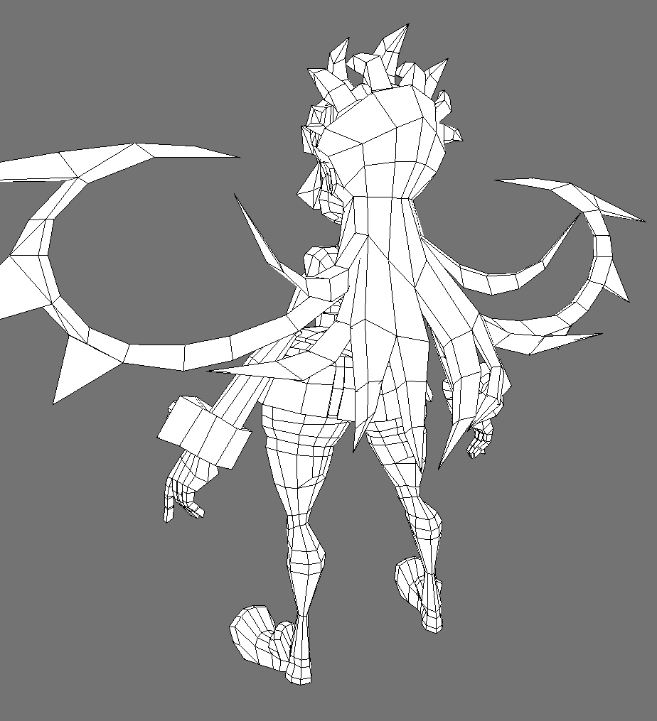
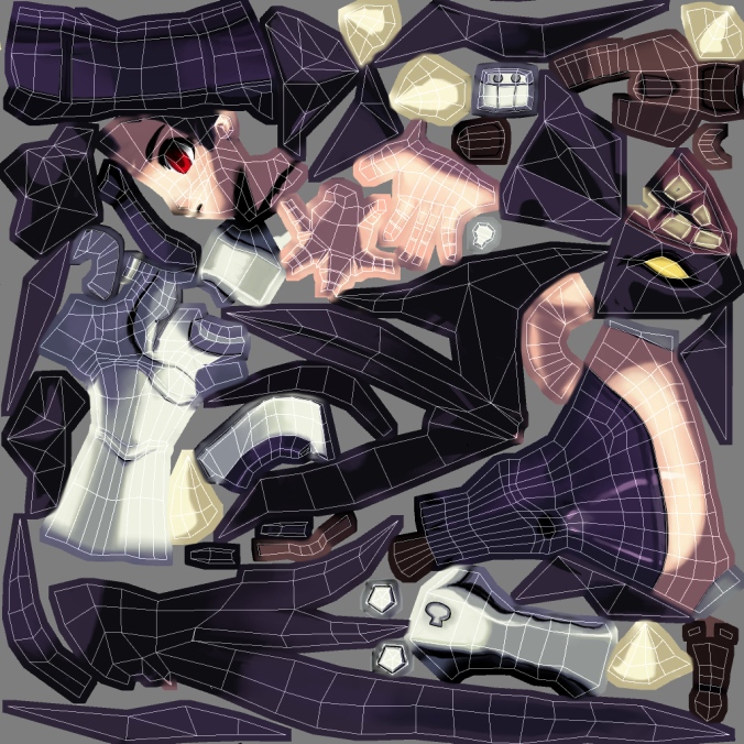
Here's another one, Parasoul this time.
Again, crits of any kind are very welcome and appreciated!
Ref by Alex Ahad:


Original post:
For fun and education, I modeled a character from Skullgirls, a game I've been looking forward to for a long time: http://skullgirls.com/ You can find Filia in the characters section.
I'm still kind of a newb at proper polyflow and stuff, my pre-DWV entry was one big mess of triangles. :P I've really tried this time, and that's exactly why I need some good, harsh crits!
I still haven't been able to get rid of triangles 100% of the time, sometimes I just don't know how to remove them, or there's just too much stuff going on so that I get confused and just go ah screw it. Though I heard that some triangles are ok sometimes. The front part of the hair especially is still a triangle soup.
Any crits on any other aspect of the model are welcome, too!
Stats: 4320 tris, 1024x1024 diffuse texture, no lighting.
First image is the ref, drawn by Alex Ahad:


Replies
And dont be afraid of triangles! In deformation areas, def keep nice quad-based geometry, but it all turns to tris once in-engine anyways. If you need to collapse two edge loops, use a triangle along a non deforming area. All of that extra geometry that isn't adding anything or helping the silhouette could easily be reduced this way.
Ah, that's good to hear. I always see people do the thing where they make one edge line do a u-turn as it were, like on the back of the upper legs there. That's not really necessary then?
Otherwise, thanks for the comments.
No real critics.
I really like it, show it to them.
But the reference has it too, so that was more of a design crit than critiquing you at all. The model looks great!
I think you may have hit on something though, I do get the feeling she ended up a little bit shorter than the ref, especially in the legs, amplifying the effect you're talking about.
Thanks for commenting!
kindof agree she's coming off a bit shorter/squashed than the concept in places, but its more of a visual illusion kinda thing (other wider parts throwing it off). Looks awsome regardless man, any plans to do some baws anmations?
Your topology actually isn't bad from what I can see although I do think you could optimize in several places and add more geometry in other areas to avoid long, skinny quads. Throw a rig on there yourself and see which areas have problems in bends. Areas that don't deform much and don't contribute much to the silhouette (top of hands/feet) can be reduced, and areas that might twist (forearm), or bend (knees/ankles) could use more divisions.
Really cool model!
And my opinion about overall is that looks awesome! :poly124:
I think this polycount is acceptable, considering that she has only diffuse map you can use some extra tris to give her the proper silhouete. And 4320 tris with only 1024x1024 difuse map looks right for me.
I might be wrong though...:\
haikai: Thanks for the pointers, I'll have a look at the deformations. Long, skinny quads are bad? Like in the arms?
fabio brasilien: Yeah I'm gonna do something about those parts, I've been stupid cuz I found out I can actually use just 3 quads instead of 6, don't even need any tris to make it more efficient. *derp*
Tenchi: It's actually just a setting in Blender's renderer ("edge" button on the render panel). It's pretty minimal, but it works!
Jigsaw: Maybe one day, I do love her character design. Got something else in the pipeline at the moment though...
Thanks for all the comments!
Well, it depends on how you plan on rigging the twisting of the hands. Hand twists start at the elbow and if you have long, skinny quads without enough crossing divisions then the polygons are not going to maintain the volume well when twisted.
If you've got the poly budget for it, and it looks like you should in this case, then striving for more evenly spaced geometry helps in other areas too such as more predictable UV performance and deformation. It's not a rule or anything, but maybe worth keeping in mind.
I don't think you can in the standard renderer implementation. But what might work I guess, is to do the thing where you take a copy of the model and push all vertices outward along the normals, at different distances depending on the thickness of the black line you want. Then invert the normals of the copy so that it is only visible near edges (the original model stays visible on top), and texture or color the copy solid black.
I haven't done this before so I don't know how well it would work. But there you go.
Thanks! As I wrote in my post, I did this for the arms, but forgot that foot twists start at the knee too (I think?) so I should add some divisions there I guess.
You should really show this to the team making the game, they'd get a huge kick out of it.