Roman City - First UDK Project
Now I'm done with my Uni course I decided it would be a good time to really get to grips with the UDK, I also wanted to make better use of some of the work I produced at Uni. I originally wanted to produce the Uni work I am experimenting with in UDK in the first place, but as it was a group project I was outvoted. This is a bit of an experiment to see how it could have gone if we had utilised UDK.
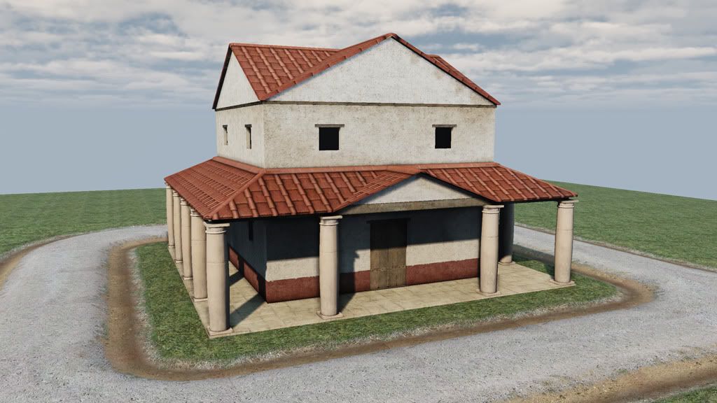
I've spent the last week or so getting my first set of assets in and getting to grips with the whole asset importing process, and some very basic level stuff. Here's a pic just to pretty the thread up, but it's not a lot to show just yet.
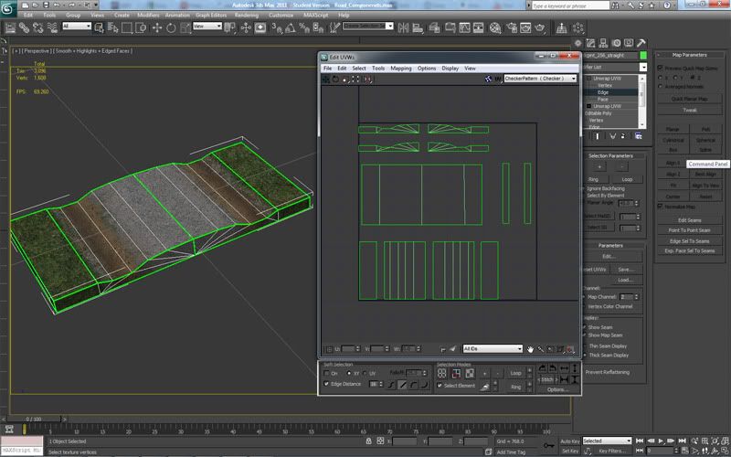
I have run in to a few problems already, and it would be great to get some advice as to solutions. A couple are probably down to lightmap/lightmass issues, but I've expended my limited knowledge and my searches turn up blanks. Firstly I am getting odd shading on the edges of my road modules. These go away if I delete the undersides of my mesh in max, but I'm not sure if that's a good practice, most similar Epic assets I looked at are all sealed meshes. They get worse if I reduce the lightmap scale, but I don't think padding is the issue as I have large spaces between islands on my lightmap UV.
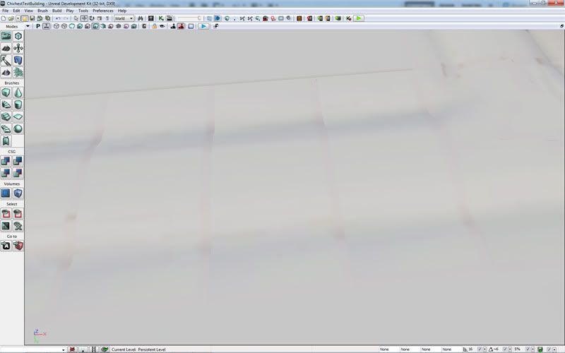
Secondly what's up with these odd blobs in my shadows? I've tried making a completely new lightmap, even an auto-generated one but they always end up there. Changing the lightmap scale does little to help here either. This was with a production quality compile too.
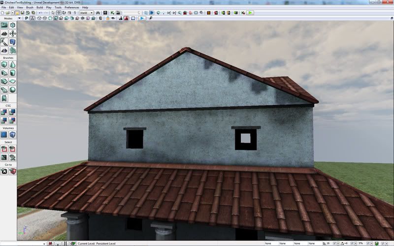
Similary to the first 2, with this problem, I'm sure there's something simple. The problem appears to be down to how I've UV'd my modules, the shading errors appear where the islands of my UV's are rotated and flipped differently on most assets. Does UDK not like you doing this? I guessed not, but then on other assets, such as the corner pieces of the portico it seems to be in-editor rotation causing the issue.
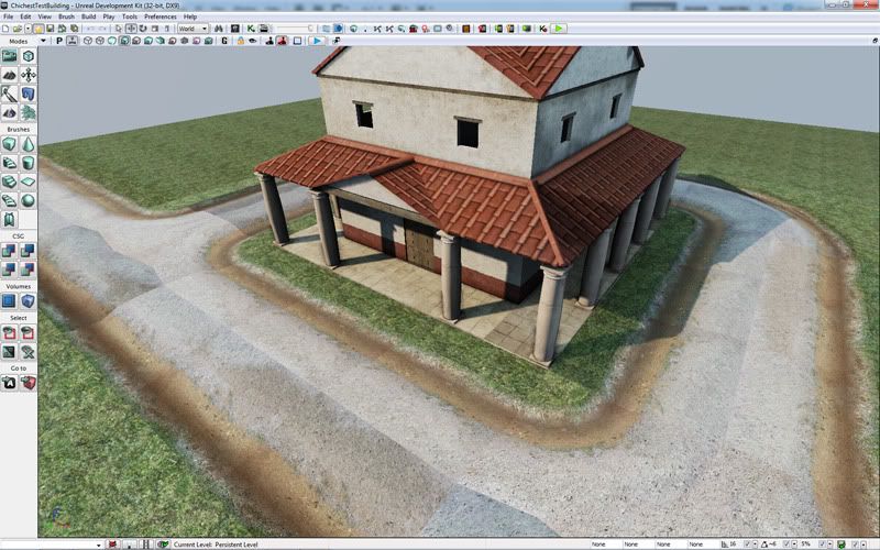
The first shot I showed has normal maps disabled on all the materials that show glaring errors, but I'd quite like to be able to use them :P
Any input or suggestions appreciated
I've spent the last week or so getting my first set of assets in and getting to grips with the whole asset importing process, and some very basic level stuff. Here's a pic just to pretty the thread up, but it's not a lot to show just yet.

I have run in to a few problems already, and it would be great to get some advice as to solutions. A couple are probably down to lightmap/lightmass issues, but I've expended my limited knowledge and my searches turn up blanks. Firstly I am getting odd shading on the edges of my road modules. These go away if I delete the undersides of my mesh in max, but I'm not sure if that's a good practice, most similar Epic assets I looked at are all sealed meshes. They get worse if I reduce the lightmap scale, but I don't think padding is the issue as I have large spaces between islands on my lightmap UV.


Secondly what's up with these odd blobs in my shadows? I've tried making a completely new lightmap, even an auto-generated one but they always end up there. Changing the lightmap scale does little to help here either. This was with a production quality compile too.

Similary to the first 2, with this problem, I'm sure there's something simple. The problem appears to be down to how I've UV'd my modules, the shading errors appear where the islands of my UV's are rotated and flipped differently on most assets. Does UDK not like you doing this? I guessed not, but then on other assets, such as the corner pieces of the portico it seems to be in-editor rotation causing the issue.

The first shot I showed has normal maps disabled on all the materials that show glaring errors, but I'd quite like to be able to use them :P
Any input or suggestions appreciated

Replies
Check this out:http://www.3dmotive.com/product-udk-lightmaps
As for your road prop in 3dsmax, the uv's have a lot of wasted space. Maximize the most "seen" space and mirror parts that look exactly like other parts.
@ Moosey_G: Thanks for the feedback. I'm used to smaller community's where creating 2 threads for the same project, even with different purposes would be frowned upon as "spamming." Will bear that in mind if I hit any further brick walls.
Th UV I was showing was my lightmap UV, hence the large amounts of wasted space (padding) I've since tightened that up a little anyway.
I was pointed to a couple of threads here which helped with my shadow seams on the modules. The biggest contributor was not having the edges of my UV islands line up with the pixels of the lightmap.
As for the normal shading problems, it was as much of a n00b mistake as I was expecting. I simply hadn't imported the normal maps as normal maps. The material creation tutorials I had referenced while workign on this didn't really cover the texture importing process so I never became aware normal maps had to be treated differently. Once they were set up correctly both my first and second errors disappeared though.
The next stage for this is to create my road layout, and start populating the city with it's various landmarks, then to fill the spaces with generic buildings.
This is a video about it, has a lot of good info
[ame]
Spent the time since my last post working on redoing my road modules to allow for greater flexibility than before, should also help with any pieces I might need to produce in the future. I've also done some work on the building pieces, created some new bits as well as made a 75% version to create some smaller structures with. Next I am going to create a few detail assets to flesh the space out with a bit.
Can I create meshes with multiple skins similar to source? For example my buildings use 2 versions of the same mesh at the moment, 1 with a red stripe on the bottom and 1 without on the top. Would be neat if there was a way I could make this one mesh with the two texture options. I haven't found anything on the UDN which would work like I wan't/would expect.
Going to do some large shrubs and trees next. As well as some prettier flowery things to add some colour to the space.
The textures seems to be very flat on other hand, to grainy/dirty on other hand. What I mean placement of the dirt is not really natural. Both of this issues can be caused by lighting, I can't say for 100% without just look at plain texture.
You should also put more details on roofs. They are just flat. Which looks odd. Add depth to them (geometry), and don't worry about poly count. You can reduce it later if needed.
I think you should also consider either using different textures for each level or use same texture but cleaner, and then add decals to break tiling.
Anyway, very nice start, want to see more!