[WIP] - Brutus Jr Gun
Hello everyone
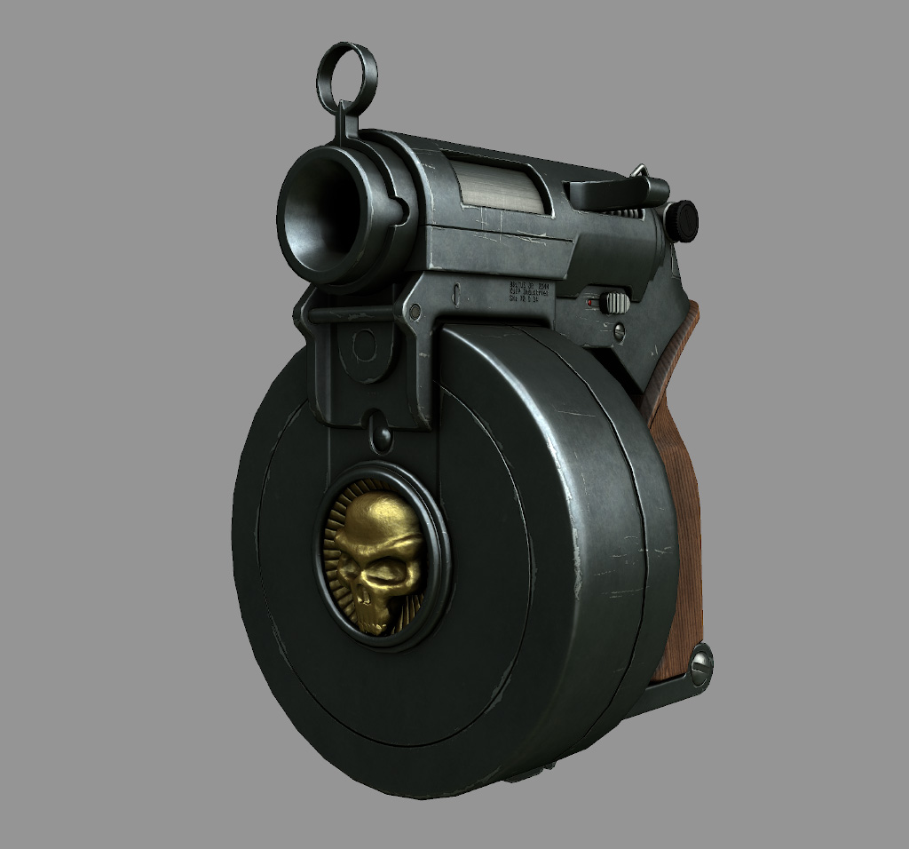
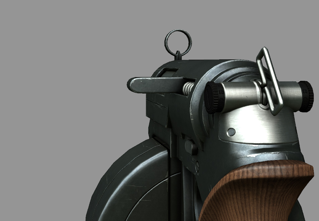
So I've worked on that gun for some time now and I think it's pretty close to be finished. I don't think I'll modify the model itself too much now, except for some slight changes. However, I'm sure I could push the textures a bit further with some good advice. I tried to define the materials (following Racer445's interesting article I found on NGHS) as best as possible, but after spending too much time on it, I probably miss a lot of things. So here it is.
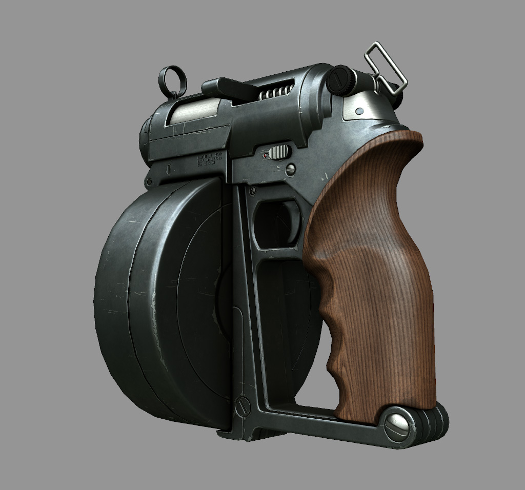
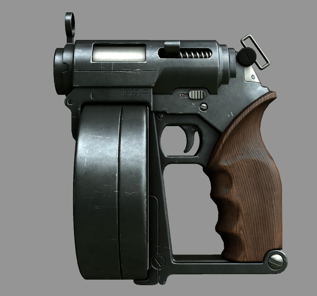
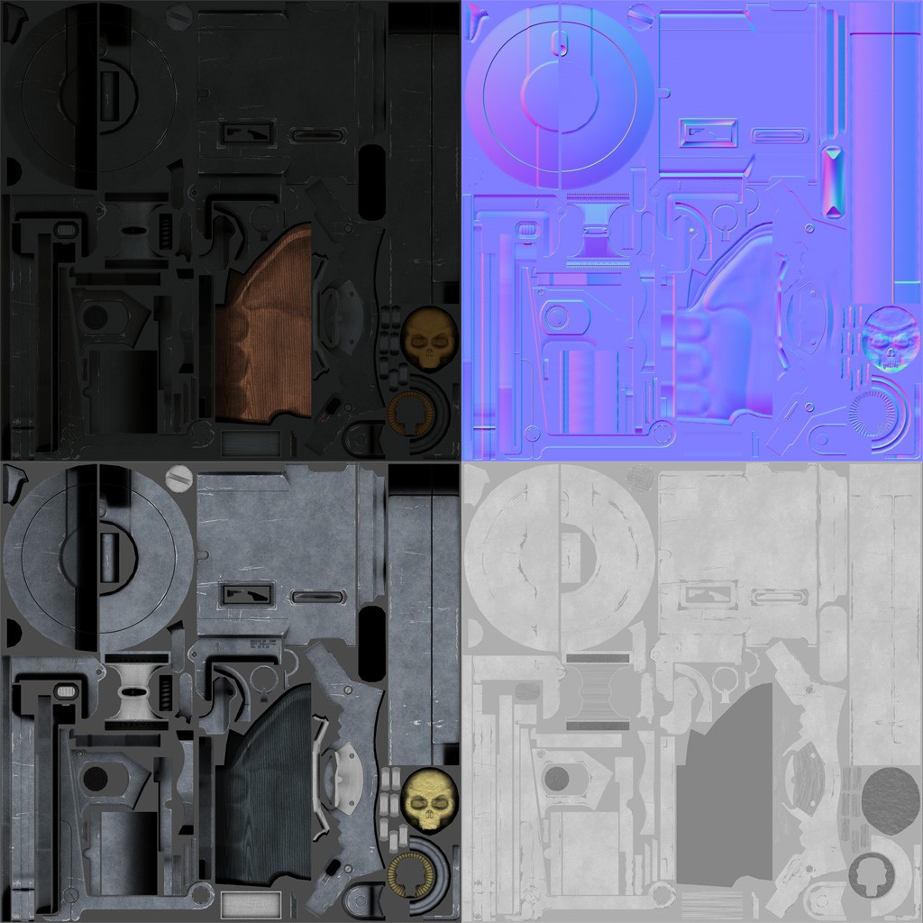
The mesh is about 5500 tris with 2048 maps. Rendered in Marmoset toolbag.
Texture maps (Bigger size here):
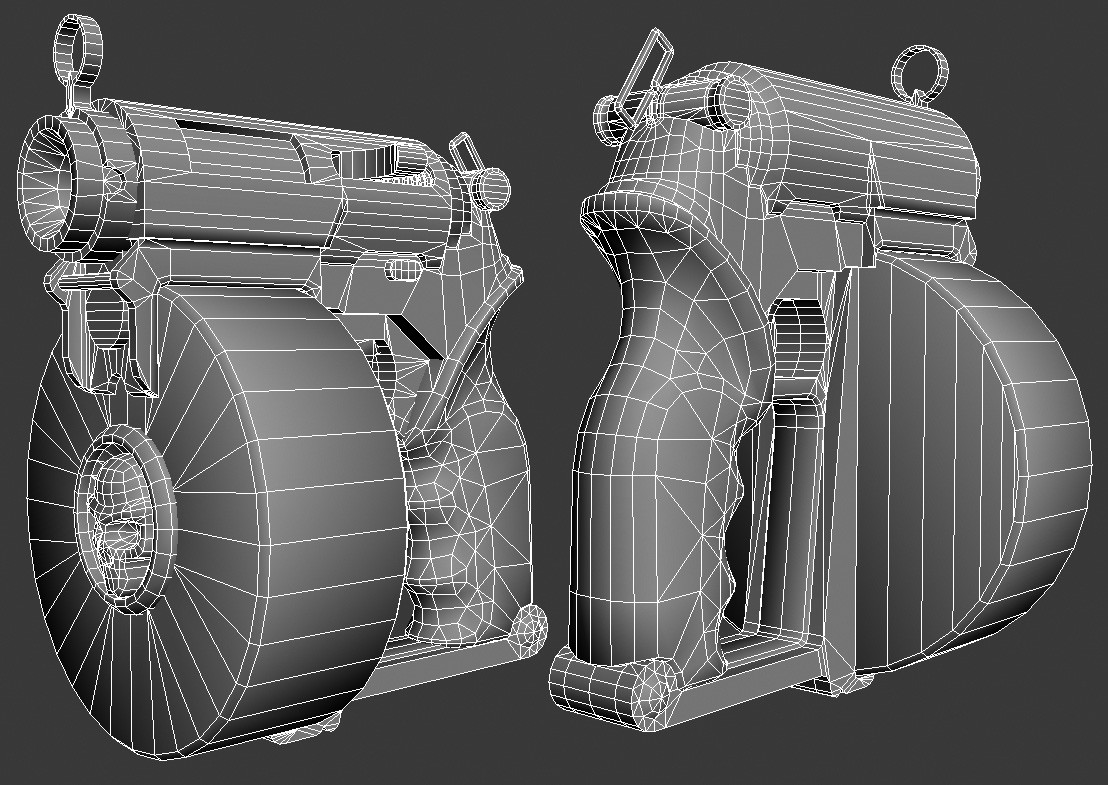
And finally some wires:
As I said before, I'd really like to improve it so don't hesitate to be harsh.
Thanks.
So I've worked on that gun for some time now and I think it's pretty close to be finished. I don't think I'll modify the model itself too much now, except for some slight changes. However, I'm sure I could push the textures a bit further with some good advice. I tried to define the materials (following Racer445's interesting article I found on NGHS) as best as possible, but after spending too much time on it, I probably miss a lot of things. So here it is.
The mesh is about 5500 tris with 2048 maps. Rendered in Marmoset toolbag.
Texture maps (Bigger size here):
And finally some wires:
As I said before, I'd really like to improve it so don't hesitate to be harsh.
Thanks.
Replies
is the the design from you?
was a paint metal?
the scratchs look like on paint
you can add more scratches and more dirt on it specially on the skull
for the wood maybe move the texture for find more interesting veins
It looks really good.
The wood is looking a bit monotone though. Try sprucing it up a bit and maybe add some wear and tear and cracks.
NO. NO. NO.
Wood should have a white specular
http://www.manufato.com/?p=902
cheers!
It's one of Guido Kuip's creations:
(I encourage you to visit his website, some nice things there)
Now for the comments:
low-seb: Actually, I wasn't really sure about what type of metal I should use for the main part. Painted metal seemed to be a good choice as it's quite easy to put convincing scratches on it.
kevlar jens: To be honest, I tried to add some dirt to the wood but it wasn't really good. And since the concept shows a clean wood, I figured I could keep it that way. Anyhow, if anyone has some good advice for making that wood more dirty, I 'll take it.
ZacD, EVIL, Oiban: As I mentionned, I watched and read Racer445's tutorials about materials and what I understood is this: For a dielectric material, in order to get white highlights, specular color should be the chromatic opposite of the diffuse color. Is that correct? Or should I completely desaturate the wood on my spec map?
Considering the wood grain on the specular, I'll attenuate it and post renders tommorow.
The only thing that is really lacking is some larger forms in the texture. Some nice big chunky specific damage, a large scrape here, a dent here, something purposely defined that tells a story. Right now you've just got a little bit of minor wear but none of it stands out, its just there for basic material defination. Put in a few cool areas of damage that give the gun character.
Some text(hand writen), decals/stickers, engravings(scratched in), or paint would also be good options, other than the typical scapes and dents, for adding character.
Perfect_Rolemodel: As ZacD said, it's my gloss map. In marmoset you have to put it in the alpha of the spec map, while UDK material editor has a slot for it.
EarthQuake: I thought about doing something like that but I wasn't sure it was a good thing to change the concept too much.
Anyway, here's what I came up with. I tried to find some sort of theme to it and not go too crazy with unrelated stuffs.
So it became some sort of futuristic roman legion gun. I'm not really sure about the color, text, and stickers so let me know what you think.
I also removed the grain from the wood spec and increased the polymer spec a bit. I'll try to add some larger variations to the texture later. For the moment I prefer to focus on deco and color scheme.
I know you didn't create the concept itself but I gotta say, that's a very cool gun and very amusing design, too.
I made you a quick "paintover" that could help you using you colors to their maximum
I think EQ is right about large scale details. However, I think the you need something that works with the form a little bit better. Those paint lines are cross contour in a way that is distracting.
Edit:
Also, for all the painted on stuff- you need to work on the spec and gloss separation so it looks like a different material. Right now the color looks like it was dyed on instead of being a separate material on the surface.
but seriously thats one ugly gun
like the gun before all the painting.
KoKos: Thank you for the paintover. However, I didn't want to use too much saturated colors like that, at least for the wood. But maybe I'm wrong.
AlecMoody, I see what you mean about the lines being distracting. It's pretty obvious it was improvised, and not planned from the beginning.
I also have difficulties adding large details. I tried overlaying parts of photos at some places but it feels unnatural.
Right now I could use some help. Some paintover or even references of what you think would be nice. It would really help me.
(The paint already has a slightly different spec and gloss value but obviously not enough, I'll work on that.)
I was just wondering why the SPQR since the Roman Empire has fallen over 500 years ago? Was just something that didn't really make sense to me.
About texturing I suggest you read this really great tutorial by Jeroen Maton:
http://www.cgsociety.org/index.php/CGSFeatures/CGSFeatureSpecial/the_top_ten_tips_of_texturing
Many times the difference between a good model and a great model are the small subtle details and he explains some things really well.
oh i get it! brutus.. spqr.. good one.
Overall the gun looks quiet well manufactured (even with it's strange proportions) and within that "concept" the skull area just looks quiet lacking.
First of the skull itself is weirdly shaped and has many flaws from an anatomical stand point wich doesn't really fit to the rest of the gun.
Second would be that with the added detail textures and theme the gun looks a lot better, however the center of the original gun design is clearly the skull part and right now the added detail texture is not supporting that part of the design. What it should in my opinion.
Other than that i would maybe take a bit more time to improve the overall look and feel of the texture, if you go for the used look go for it all the way. Just scratches are enough for you standart game look, it's nicer however to have things like a used wood grip with rubbed of bright parts (it's actually the softest material on your gun but seems to be the most intact) or parts where machine oil is gathering etc.