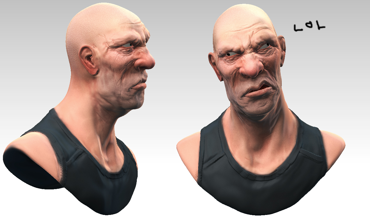
Brink bust WIP
Hey errybody! I am currently student at fullsail and have been lurking for a long time here. Finally grew a spine and figured it was about time I made a thread. I really, really loved the style of the characters in Brink so I figured I'd try my hand at one. Still needs a lot of love atm, the forehead, neck/shoulders, and ears are all jacked up and the obvious lack of eyes and teeth are even more disturbing. Was bored today so I slapped on some sloppy colors. Heres where I'm at right meow.

Hopefully will finish this up in a couple days, Critiques much appreciated!

Hopefully will finish this up in a couple days, Critiques much appreciated!
Replies
Also, spend a bit more time on his expression, the curling of his upper lip doesnt look right. the levator muscles pull on the whole upper part of the lip, so you have a more round shape IE:
@Bonebrew22 & shawnell3d : Thanks for the critiques! I messed around with the lips to make em more round and not all flat and fish lippy. Also I stormed the webs for a scowl with lips that were close to what i was looking for. I found one courtesy of the king of scowls himself the ol' Dick Cheney!
Also now with 30% more jaw!
(lemme know if there's anything else!)
Now to put some teef in that sloppy hole I call a mouth. There's so much more to do to this guy before I can call it done!
Nice skin tones too
Tim's work is was more stylized and over the top with expression. http://badpolygon.com
But you're on a really impressive path. Just keep at it.
@ Motenal you were right, the lips were twisted too much so it was giving a freaky inviso-punch look to him, i twisted them back the right way and pulled back some of the cringe
@ jeffro Thanks for the link man! it was really helpful, i pulled his jaw around to exaggerate it more and pushed around his cheeks
stuff i still gadda do:
neck detail
shirt shirt shirt
materials for eyes and teeth
texture polish
if you guys see anything else lemme know!