Exis F.E.A.R 3 Art Pimp [Art Dump]
Hi Everyone,
as you may know, F.E.A.R 3 just launched and it's getting some decent reviews! http://www.whatisfear.com
Exis had the pleasure of working with Day 1 studios on this great game. I can't say enough good things about day 1, they're a dream to work with. We were able to create a lot of really nice assets.
I want to send a special thanks to my team for their hard work.
Cheers to Alan, Alberto, Mashru, Steve, Joao, Robert, Craig, Mike, Jesse, Fabio, Stefano, Andrew, Greg, and all the rest. You guys are what makes Exis special, and it's my joy to work with you ever day.
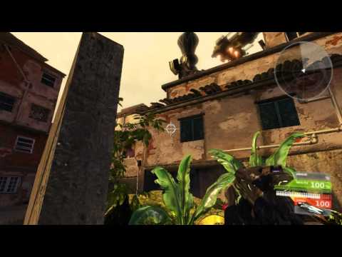
First, a video of a level I put together using FEAR 3 / Fracture assets. I did this level for fun to show off some of the models we did. There's some stock UDK models in there too, but it's 99% Exis materials.
[ame] http://www.youtube.com/watch?v=h9ZkCs4gWbA&feature=player_embedded[/ame]
We did over 220 assets for this game, so I really can't render and post them all, so I made some render of some of my favorite models:


as you may know, F.E.A.R 3 just launched and it's getting some decent reviews! http://www.whatisfear.com
Exis had the pleasure of working with Day 1 studios on this great game. I can't say enough good things about day 1, they're a dream to work with. We were able to create a lot of really nice assets.
I want to send a special thanks to my team for their hard work.
Cheers to Alan, Alberto, Mashru, Steve, Joao, Robert, Craig, Mike, Jesse, Fabio, Stefano, Andrew, Greg, and all the rest. You guys are what makes Exis special, and it's my joy to work with you ever day.
First, a video of a level I put together using FEAR 3 / Fracture assets. I did this level for fun to show off some of the models we did. There's some stock UDK models in there too, but it's 99% Exis materials.
[ame]
 http://www.youtube.com/watch?v=h9ZkCs4gWbA&feature=player_embedded[/ame]
We did over 220 assets for this game, so I really can't render and post them all, so I made some render of some of my favorite models:


Replies
oh yeah, mechs!
hahahah first thing we brazilians notice xD not that it takes any merit from the work. but its just that... its flipped xD
Superb work, especially the APC & Sniper rifle :P
The only gun that I don't like is this one, it looks like something on the level of Quake 3 texture and modelling wise.
Cap Hotkill, you talking about the design or the workmanship? I'd love a detailed analysis and/or crit if you're willing; it's the best way to enact improvement.
Bro, is that my modo renderscene? =P
Nice to see the highs for these, my favorite of the bunch.
Peter: Congrats on finishing up the gig!
I'd have to agree with Cap Hotkill, the gun feels out of place & maybe it's just me, but some of the characters feel a bit short, probably not a big deal in-game tho. Grats!
I know it is frowned upon to critique work in and Art dump for a released game but seeing as how PeterK/Exis would like to enact improvement.
I gotta agree with Cap Hotkill although most of the work is simply amazing, this gun and the one below don't seem to be hitting the same quality bar as the rest of them.
Critique wise i cant really say much about the design due to the fact i don't know what the actual concept looked like, but both the texturing and modeling on these two guns look rushed.
The thing that really stands out is the blockyness of the guns themselves as Cap Hotkill has said "it looks like something on the level of Quake 3 texture and modelling wise."
I know the Critique is very vague but its really hard to critique something that you cant see the reference for.
I don't know how they look in-game but compared to the rest of the stuff especially MM's and Johny's stuff the two mentioned guns could use some love.
Edit: Just like to say it again love! the stuff in this Art Dump
I'm glad to hear that you are always open for crits, maybe the design was made that way, but the normal mapping and texture works looks flat, like a model made for Quake 3 that only has 1 diffuse map, I feel that the metal colouring made by the heat is a bit overdone, and the specular/gloss are flat or all on the same level, the normal maps doesn't help neither because they seem to be a bit flat on the overall.
The level of use or wear is also not regular, when you add wear to a gun you must imagine were it can get rub on a flat surface,by the hands, or by a sharp object, there are zones that are hard to reach but are scratched and zones that are easy to reach that are in perfect condition.
EDIT: It would also be very helpful to see the concepts or references if its possible
Loving Johny's work as always, the guns are amazing and that character stands out as different than the usual buzz cut marine. MM, great weapons too, the character looks good, get the sense that he is young, in his late teens.
On the previous page my favorites are the mechs (of course) and the zombies, really well done. Was in awe at the amount of stuff you guys made in that video on youtube. Big ups!
But I would have to agree that spec and glossiness look kinda similar for all models. That tends to make all models look like they were made from same kind of materials. I would love to see spec and glossiness maps if possible.
Are they made from B&W diffuse maps ? (maybe here lies the problem)
But obviously this is great piece of art overall.
Thanks for posting all of this!!
Enough there to freshen up the folio
Cheers for sharing.
so good it angers me haha, love the cloth balance, your hard surface stuff is ace too
great job everyone