The BRAWL² Tournament Challenge has been announced!
It starts May 12, and ends Oct 17. Let's see what you got!
https://polycount.com/discussion/237047/the-brawl²-tournament
It starts May 12, and ends Oct 17. Let's see what you got!
https://polycount.com/discussion/237047/the-brawl²-tournament
Deus Ex Pistol
Hey all. figured id sort of discontinue my Portfolio WIP thread, as i guess its given me the proper guidance in what i need to focus on. so now id just like to get critique on my individual assets im currently working on. This one is the Zenith pistol from Deus Ex Human Revolution. found this concept a while back and only figured out it was from deus ex because i googled "Zenith Pistol" yesterday. anyway. here's the concept

original site here. http://www.xbox360achievements.org/news/news-5937-Deus-Ex--Human-Revolution---Mind-Blowing-Media-Explosion.html
some other cool concepts there.
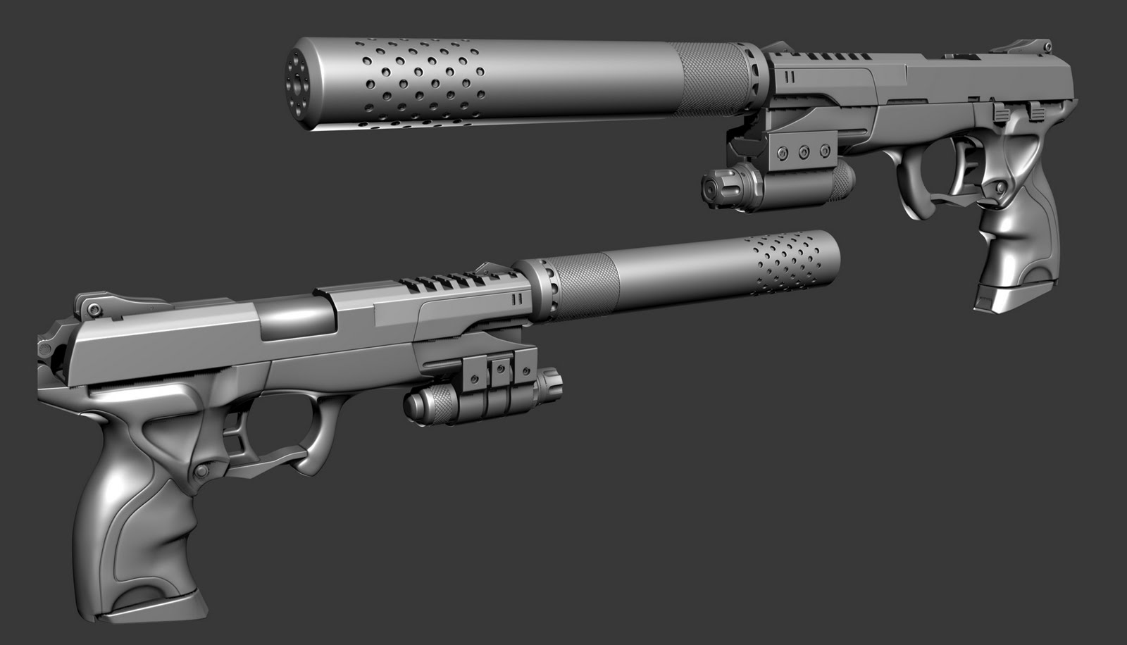
and here is my current progress on the gun.
High Poly:

and what im currently tackling. Low Poly with bakes.

i was finally able to get the silencer and laser projected today. it took a while, had to do a couple render passes and comp issues out but i finally got it.

im gonna be starting the texturing on this tomorrow. but id still like to see if any of you have any general comments or critiques.

original site here. http://www.xbox360achievements.org/news/news-5937-Deus-Ex--Human-Revolution---Mind-Blowing-Media-Explosion.html
some other cool concepts there.
and here is my current progress on the gun.
High Poly:

and what im currently tackling. Low Poly with bakes.

i was finally able to get the silencer and laser projected today. it took a while, had to do a couple render passes and comp issues out but i finally got it.

im gonna be starting the texturing on this tomorrow. but id still like to see if any of you have any general comments or critiques.

Replies
If I can make one critique, I'd say the slide and hammer looks slightly wider than on your concept art.
But good work again, I'm saving this concept art!
Very tight edges suggest a larger scale object, so for scale and readability sake, its good to soften up edges on something as small as a pistol, using softer edges with thicker bevels will also result in more interesting specular, and help your details read better from different angles, or from longer distances.
Very fine details/patterns such as the knurling on the silencer is another issue. When you have patterns this fine, you'll need to use an excessive amount of texture memory to get a sharp bake. Then, when you actually see it in FPV, the pattern just turns to noise. So a larger and more pronounced pattern is going to improve readability, and give you more flexibility with your texture resolution, as well as look better in mips or with reduced texture settings in a game.
The ridges on the hammer are another good example, this is a shape that should really pop out at you, because of how visible it is in FPV, but the detail is so fine, and the bevel is so weak, that you barely notice it is there at all.
In general, just try to remember to zoom out more and view the asset as a whole, instead of getting caught up doing fine details.
Other than that, great execution and nice bakes!
@next. yeah i had some initial issues with that in the beginning. when i was doing the high poly i tried for that shape but generally, it gave me way too many issues from the other parts of the concept.
@Boyso: that can easily be adjusted.
@EQ: i understand. in the past i usually adhere to this, but i think i got too caught up with this in trying to make the chassis and the slide look like they are one, so tightening up kinda helped that. ill keep it in mind to use soft edges next time. i adjusted the normals for the knurled grip. thanks. (missed the bit about the hammer.. i can change that too).
thanks again.
here's a bit of an update. got the texture slightly finished. for the most part i really dont know what else to put on this because i want it to be clean, and i feel that just adding detail for the sake of adding detail will take away from it. (i already feel like some of that is a bit too much, but we'll see what u all have to say). here's the updates.. i plan to have this entirely finished tomorrow.
You COULD add some manufacturing engravings on the right side of the slide. You have Zenith/10mm on one side, the other side could have a serial number or location of the plant, but it looks fine as is too. The front part of the barrel that's exposed when slide is locked looks weird where it transitions. It looks like a sharp edge where it should be smooth.
EDIT: Do you want some pictures of the finish wear on my P99? It's got some light holster and handling wear since I don't baby it much.
@garagebay9.. yeah that would be great!
I would love to hear a few pointers on how you modeled that crazy grip dude, and, might be me just not getting it but how come you left out the grooves of the hp slide part?
all very good advice
On this pistol the slide is steel with a polymerized surface treatment (kind of like tennifer), while the frame is injection molded polymer. There's distinct spec behavior differences between the two, so I tried to capture enough to show how the spec behaves on each and how each material looks in worn spots.
Here's the left side of the slide. Take a look at the subtle smudges, smears and scratches and watch how they change as the light rolls off in the second picture.
Here's a shot of the barrel towards the muzzle, some pronounced finish wear here from rubbing and muzzle flash.
This is the back of the left side of the slide. The decocker (little rectangular button set into the slide) gets a lot more "traffic" than the rest of this part of the slide, so there's good reference for the contrast between minimal and moderate wear here. Watch how the spec changes in the second picture as the angle changes.
The upper corner of the frame has some scratching and wear here.
These next pictures are along the right side of the slide. This area gets a little more handling than the other side since I index my trigger finger along the side of the slide when I'm not actually pulling the trigger, and it also has my belt cinching the holster up against it. Some pictures of the other side of the barrel as well.
There's a really distinct spot of holster wear just before the muzzle on this side, where the finish has worn down some.
Here's two pictures of the top of the rear of the slide where it gets grasped when I'm cycling the action. There's mostly smudging and hand oils up here. Neat little detail to note is that the tops of the rear sight are worn down, especially on the left, from rubbing up against my side while it's in the holster. Took several years to get like this, so it's not something you'd see on a new gun or one that was carried in a leg or chest holster.
I tried to capture some shots of the front of the slide with and without a big fat thumbprint, don't know how well it showed up. Probably not great, my camera doesn't have a macro setting. :poly117:
These last four are of a magazine, which gets a lot more friction and finish wear than the gun itself since they're constantly getting shoved into and yanked out of the mag well. This is stamped sheet aluminum, with a chemical blued finish that has a lubricity enhancer added to it to help ensure they'll drop free of the gun when you need to dump the mag and get a full one in right goddamn now. The baseplate on the mag is polymer, similar (but not exactly like) the frame of the gun.
final screens and vid
http://vimeo.com/25962806
Great piece!
What lights/material settings are you using?
I dunno, that slide is a dead ringer for lots of powder-coated steel and aluminum slides I've seen. The surface finish left by the machining process, combined with the finishing process, usually gives a more matte finish.
@garagebay: thanks, those images really helped out.
@roostermap: its a realtime shot (aside from the one with DOF). using 3point shader, standard 3 point light setup. reflections are one of the .dds files found from Laurens Corijn's site. for the most part on the shader i didnt mess with too many settings except spec/gloss power, and reflection. but as far as rendering/pres, all 3ds max viewport, post processing is done with Scene Effect shaders, so i just used GrabViewport2.1 and took some hi res shots (which naturally blogspot reduces anyway)
@EQ: yea that makes sense. i did want it to be a bit more of a reflective material in this case, so i could go in and darken the diffuse.
It sure looks amazing, great work
basically i just modeled the base of it first, making sure that i had edge loops running in the direction i wanted the carvings to be. then i selected the loops, chamfered, and beveled in the polygons the chamfer created. also i made sure to collapse any triangles before beveling. im rendering out wires for the 2 hp shots now, but heres one of just the grip
EDIT:
first one done.
aaaaaaaaaaaaaaaand number 2