The BRAWL² Tournament Challenge has been announced!
It starts May 12, and ends Oct 17. Let's see what you got!
https://polycount.com/discussion/237047/the-brawl²-tournament
It starts May 12, and ends Oct 17. Let's see what you got!
https://polycount.com/discussion/237047/the-brawl²-tournament
Sea Bunker - WIP
Right then! I have been doing a few models on my own and then I came across this:

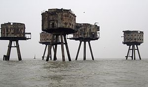
The Maunsell Sea Forts... It inspired me to make something similar to it..
What I did, was I took that idea and slapped one of these on top:

Anyway, I started on it and then noticed I ran into a few decisions to make which I will explain In a moment. While I was deciding if I should do what I wanted or not I continued doing the blockout which will also be the base for the Low-Poly mesh.
Link to Imageshack

That is what I got so far.. Please give comments and tips ^-^
On to the decision I had to make.. Should I make it possible for people to get on top of that thing? If I do there will be a hatch at the top as well as railing along the sides with sandbags stacked behind them for protection..
I am done for tonight sooo I will check back again tomorrow of nobody has replied then I shall motor on alone and hope for the best
Thanks in advance

The Maunsell Sea Forts... It inspired me to make something similar to it..
What I did, was I took that idea and slapped one of these on top:

Anyway, I started on it and then noticed I ran into a few decisions to make which I will explain In a moment. While I was deciding if I should do what I wanted or not I continued doing the blockout which will also be the base for the Low-Poly mesh.
Link to Imageshack

That is what I got so far.. Please give comments and tips ^-^
On to the decision I had to make.. Should I make it possible for people to get on top of that thing? If I do there will be a hatch at the top as well as railing along the sides with sandbags stacked behind them for protection..
I am done for tonight sooo I will check back again tomorrow
Thanks in advance
Replies
I shall try it out.
But as Cooljay suggests, I'd advise you play around with the shapes a lot more, what you have now as a blockout looks really very odd, maybe you should mix both architecture types, rather than simply stick that 40k bunker ontop of the stilts. It looks architecturally wrong.
Also this page has lots of great stuff http://www.project-redsand.com
But yeah >.< I kinda didn't see the suggestions till after I had started texturing >.<
Right sooo.. I need some help with texturing this thing please..
This is the 2k Diffuse I am using resized down to 1k for presentation on the forums.
If you don't mind I have a few points that I think might help:
Reference
I think you could stand to do a lot more research and reference gathering.
- The ladder seems more like an after thought than something that would actually be used. You should "industrialize it"
http://www.demuth.com/Ladder_Systems/Images/overall.jpg
http://image.shutterstock.com/display_pic_with_logo/856/856,1149596505,6/stock-photo-industrial-ladder-with-safety-guard-1406805.jpg
http://www.cubicdesigns.com/files/industrialCagedSafetyLadder.jpg
- You should think about how they're going to get supplies in and out of the bunker, I doubt anyone would want to carry live ammunition and other heavy supplies out of a rolling boat and up the ladder. Often those types of bunkers would have a winch or a crane, which is the fastest, most stable way to get cargo unloaded out of a moving object like a boat.
http://weburbanist.com/2008/04/20/creatively-converted-sea-forts-of-great-britain-strange-adaptive-reuse-of-military-architecture/
The unwrap and the material
- On the unwrap you have some wavy lines in your support posts, it would be better to square off the UV's so you're drawing straight pixel lines instead of wavy ones. This becomes more important the lower res your textures become. Texture sheets getting down res'ed toward the end of the project to lighten the games footprint and improve load times is pretty common. You also have to worry about how your asset will look when it mip maps down a level or two.
You can create the exact same asset with 1/4th the texture.
- The way the material is you could use a tile for the metal bits and lay the edge rivet details out in a single strip, possibly one that tiles horiz or vert. Laying the rivets out at an angle and on every piece requires more space and a higher resolution then if it was a straight strip that repeated.
- The support pillar UV's could be stacked then rotate the support geometry to disguise any tiling artifacts you might see, a lot of the UV pieces could be stacked as they are very similar.
- The planting seems kind of big and formed from one piece for each side. Almost all of the ref I look at and the ref you gathered isn't that way. I doubt it would be easy to manufacture such large pieces and even harder to transport and assemble them at sea, so it seems like more broken up details would be in order, panel seams, hatches. These seams and hatches could be points you use to introduce unique details while the rest of the metal is a small tile.
Although it seems like I am going to have to go back a few steps and model a bit more.. Which also means redoing the UVs.. and textures... holy crap that is going to be allot of work /o\
But who knows? It could become a good portfolio piece when I am done..
Things to do:
*Industrialise the ladder
*Create a 2nd tower variant that would have a winch or crane for supplies
*Play with shapes
*Smarter UVs
*Re-texture
I have kinda learned something.. I should organise my texture PSDs better for if I have to change things... You all would die if you saw what a mess it is currently xD
ANYWHO! I will have to start with this again tomorrow as I have some things I need to take care of today. Thanks again for the replies ^-^
PLing: I was actually thinking the same thing but was worried about Poly count.. Perhaps I could make an Alpha for the railing to solve the problem?
As for the pillars looking too clean I will work on that too.. Question though, how would I make an algae texture?
The salt content in the air due to the sea spray means one would expect to find a metal structure such as this falling apart if it were to be at sea for a long period. Probably the reasoning behind why the above image has concrete forts. This could do well by being excessively corroded.
As you are aware it is kind of lacking details. Make some additions such as sand bags, all soggy with algae and bird crap on the rood. An access hatch, gun emplacement/observation tower on the roof. Ventilation. A pulley system jutting out over the sea via the side to lift up supplies, this is apparent in the fort picture if you look closely. Barbed wire around the legs to stop intruders. Chunks of concrete missing from the legs. Dents in the metal from large caliber guns. Paint peeling. Paint spilled. Couple of ideas there, sorry if these have been mentioned already but I'm skim reading.
Just noticed a new addition, make a gantry just above the windows going around the main body, it would break up the solid shape nicely.
....and I noticed that if you took an average man in proportion to the ladders then the windows are impractical due to him not being able to reach it when inside. Either that or the ladders are very small. I can't remember seeing a window on a for before, however 'slits' for viewing/shooting are more practical, whereby you could fit at least 2 levels of windows in this structure. The main gun also has a 1 degree movement angle, check out German gun emplacements during the war for costal defenses, those bad boys optimised for large firing arcs, maybe consider extending the recess for the gun to either edge of the slope and back round the other side for a metre or so.... if you get my drift. This would expand the firing arc to just under 180 degrees, if not 180 bang on. I would do a doodle but it's 3 in the morning, maybe tomorrow
I also realize that saying "I wouldn't go back and fix it" might sound harsh and discouraging, which I didn't mean it to be, but that so much work has been put into it already that undoing would probably be as intensive as creating something new and it might just be demoralizing to finish something then strip it down again and re-do it, so might as well keep the momentum and swing into a new project with a few new tricks under your belt.
If you learned something from this project, then its a total win!