Jumper Mech

polycounter lvl 17
Starting to beef up my portfolio with this Jumper Mech I found on cghub.com.
Here's the concept by the amazing Soren Bendt Pedersen. I really love his concepts and visual language.
http://cghub.com/images/view/138398/
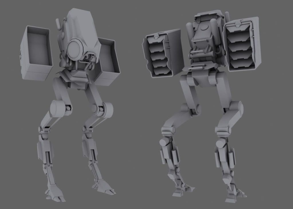
Here's my blockout.
LATEST UPDATE!
Here's the concept by the amazing Soren Bendt Pedersen. I really love his concepts and visual language.
http://cghub.com/images/view/138398/
Here's my blockout.
LATEST UPDATE!
Replies
Upper body and feet are still blockouts. Just fleshed out the legs at the moment.
this mech would fit in great in hawkens btw!
Cheers!
I would seriously rework the legs though, they look really thin and flimsy, imo they need to be more beefy, as in the concept.
Thanks guys. Yeah I'll have to do some beefing up of the legs. I'm actually seeing a lot of proportion issues the more i look at it.
-woog
I'm liking how it's coming together for sure. I can't wait to get to the texturing on this guy.
enjoy!
I did...
I want more and more and more of this one...
Thanks for sharing!
N88tr: I'd like to, but my concepting skills aren't very strong. I'll ask the guy who concepted this mech to see if he has anytime to create a weapons attachment for it.
Thanks for the love guys! Glad everyone's really liking it.
I do agree with not too noisy on the details for the mech. The needed detail is there for it
I really want one of the animators at work to take a run with him, i can see some pretty awesome animations coming from this guy. Like a hover idle, or walk cycle. Just something small and fun.
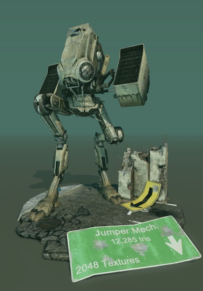
I'll post up the Lowpoly shots this week.
Tri count= 12,285
Texture size= 2048
any gun just something to go pew pew
Enjoy
i agree with Sneakymcfox about scratches and paint being too similar in color.
Darker paint , or maybe an halo of primer coat between the 2? (but that's always hard to do without messing up and making it all less realistic and painterly)
I'll follow the next steps of texturing with interest..
Enjoy!
Hope you enjoy
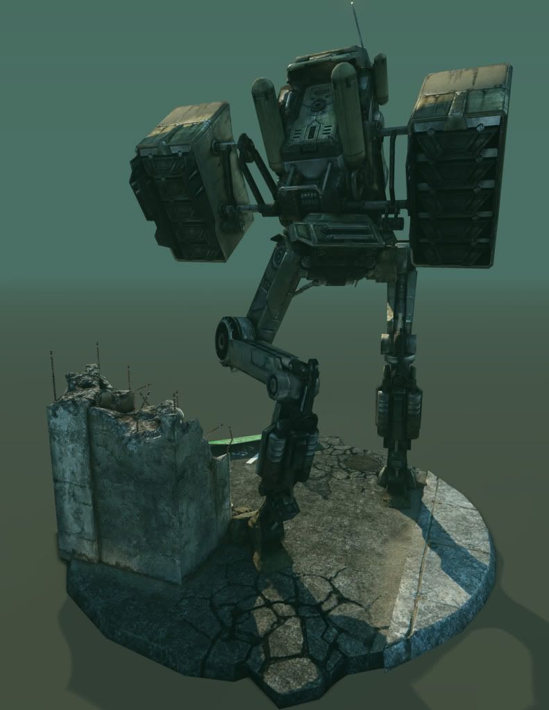
I really like the desaturated look. Personally I find it more realistic than too much color being used.
It kinda gives it that mid-afternoon in the city smog feel, which really suits the models base and its color scheme.
Rock on with your bad self sir, rock on!
Also, perhaps my personal preference, but I'd have added some more decals and signs to it, perhaps even a bold color with a unit logo or something..