Stargaze Hill
Working on a set of buildings to make up an astronomical observatory scene (hence the name)... Here's the first one:
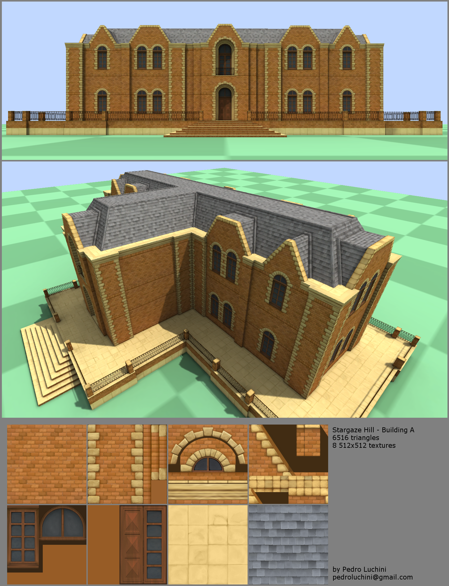
I'm just starting with 3D modelling, so any criticism is welcome.
I'm just starting with 3D modelling, so any criticism is welcome.
Replies
For the texture sheets there is a little wasted space on the window/panel sheet, it could be 256x512, or you could fit the window in with it and use a 64x64 or 128x128 texture for it.
Also be sure you look into some specular maps, I understand if you don't want to use normal maps for hand painted textures, but spec maps are almost a must for things like windows and sometimes tiles.
Nicely done keep it up
I know what you mean about the lighting. I'm actually going for a "bright & cheery" look, but I might have overdone it. :P
Thanks for the heads up about specular maps. I've heard about the term but never looked into it... will do as soon as I can!
The only way you could do that to my knowledge is if you use UV maps in your textures at high resolution, but that can end up looking bad. Either way no worries on that fancy presentation style, max screengrabs are fine.
For the bright and cheery lighting, it seems like it's too blown out, you can see shadows in your perspective shot but from the front on shot there are no shadows really. Will be waitin for those spec maps
This is a really great resource for reading about how you should get your materials looking correct based off of their conductivity. Good luck
wondering if they are all handpainted?
Right now I feel like the buildings are too repetitive (maybe it's because I've been staring at them for so long? :P) so I'll try to squeeze a few different window shapes in those empty texture spaces to see if that breaks up the monotony.
@Jungsik: Thanks! The textures are handpainted in Photoshop CS4. I'm trying to improve my skills with the software and get a cartoon look, so I deliberately avoided using photos as reference. My biggest inspiration here is the movie Steamboy, which has some drop-dead gorgeous backgrounds.